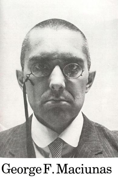
here's a random paperpost, from 18 March 2017:
Rediscovering George Maciunas
https://www.paperposts.me/rediscovering-george-maciunas
here's a random paperpost, from 18 March 2017:
Rediscovering George Maciunas
https://www.paperposts.me/rediscovering-george-maciunas

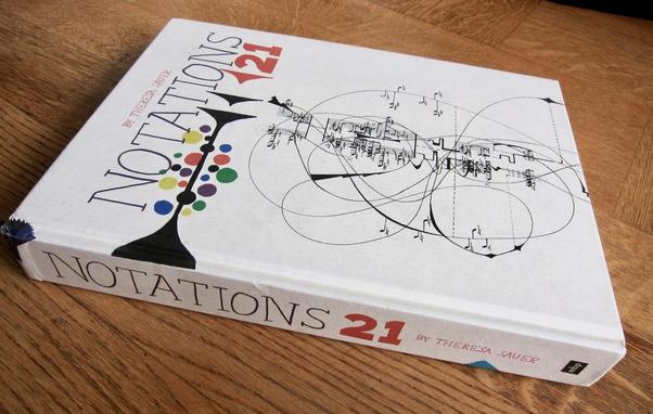
heres a random paperpost, from 19 September 2011:
Visualising music - 21 Notations
https://www.paperposts.me/visualising-music-21-notations
This is very cool - get the cockpit view from any one of 1000s of planes.
(Once you’ve picked a flight, scroll down the flight info to see the cockpit option)
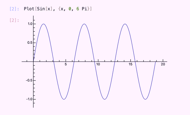
What do people use / recommend for plotting *publication quality* plots of mathematical functions.
Not plotting data, plotting functions.
---
In opensource, matplotlib is huge, but it is fundamentally plotting data points, and plotting functions means creating domain data points and calculating their mapping, and plotting that. Unsatisfactory imo.
Similarly for the other tool, ggplot2 in R, it is designed for data.
In proprietary software, Mathematica is also huge, but imho their plots have always look janky and not publication quality.
What I haven't explored is "latex packages" which purport to do function plotting. I'd be surprised if they did fancy things like not crashing at singularities. Is this what authors use for polished publications?
---
Attached image is mathics3, an open source implementation of the Mathematica language. Looks fine for blogs, but not for a book typeset in the style of the classic Springer texts imho,
The Digital Humanities Awards 2025 are open for voting!!
Check out all the nominated resources here: http://dhawards.org/dhawards2025/voting/
And remember to vote before April 17, 2026!
#DigitalHumanities #Awards #Vote #Projects #Visualisation #Resource #DH_for_fun #DHAwards