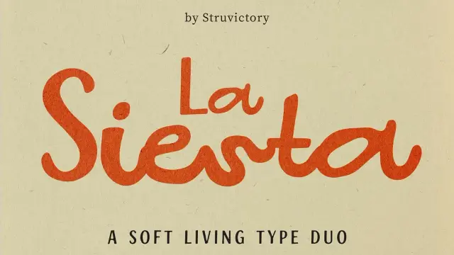
La Siesta Typeface: A Handwritten Font Duo by Struvictory.art
Typeface trends move fast. Yet some fonts arrive with a quality that makes them feel timeless before the trend even catches up. La Siesta, a contemporary handwritten font duo by Victoria Strukovskaya of Struvictory.art, is one of those rare designs. It doesn’t shout for attention. Instead, it earns it through contrast, rhythm, and a kind of typographic confidence that lifestyle brands increasingly need.
Why, then, is this font so relevant today? Due to a change in branding trends. Customers prefer human touch over corporate gloss, warmth over polish, and personality over perfection. That change is directly addressed by the La Siesta font. It combines an easy, casual lowercase script with bold, self-assured uppercase letterforms. That combination is strategic as well as aesthetically pleasing.
You can download the font duo for a low budget from:
Creative Market YouWorkForThemWhat Makes La Siesta Font a True Type Duo?
Most script fonts stand alone. They’re decorative, singular, and often fragile under real branding pressure. This typeface breaks that model entirely. It functions as a coordinated system — two distinct moods operating together as one voice.
The uppercase brings structure. Think clean, defined forms with visual weight that anchor a composition. The lowercase, meanwhile, flows. It carries the characteristic looseness of genuine handwriting — organic, warm, and unhurried. Together, these two registers create what I call the Contrast-Flow Principle: the idea that productive typographic tension generates rhythm rather than conflict.
This principle separates it from the vast majority of script typefaces on the market. Most font duos feel like a collision. La Siesta feels like a conversation.
The Contrast-Flow Principle Explained
Here’s what the Contrast-Flow Principle means in practice. When you set a brand name in bold uppercase La Siesta alongside a tagline in lowercase script, your eye doesn’t jump between them awkwardly. Instead, it travels — guided by the natural flow between weight and lightness.
That flow is deliberate. Strukovskaya designed the two styles to share an underlying rhythm. Consequently, they feel like they belong to the same design family. Most designers spend hours trying to pair fonts that achieve this. La Siesta gives you that relationship out of the box.
La Siesta typeface, a handwritten font duo by Struvictory.artYou can download the font duo for a low budget from:
Creative Market YouWorkForThemWhy Lifestyle Brands Are Reaching for Script Font Duos Right Now
The branding landscape has changed significantly over the past few years. Social media aesthetics — particularly in fashion, beauty, and hospitality — have moved decisively toward hand-touched, artisan-feeling visual identities. Brands no longer want to look corporate. They want to feel like a recommendation from a stylish friend.
Script font duos fill that gap precisely. They carry human energy without sacrificing legibility. Nevertheless, most script fonts fail at scale. They look beautiful on a logo mockup and fall apart on a price tag or a storefront sign. This is exactly where La Siesta font distinguishes itself.
Structural Softness — A New Standard for Handwritten Fonts
I’d argue that La Siesta operates according to what I call Structural Softness — a type design quality where geometric precision provides invisible scaffolding for apparent spontaneity. The handwritten lowercase doesn’t look constructed. Yet it holds together at every size, in every context.
That’s not an accident. Strukovskaya built careful spacing and letterform balance into the design from the beginning. Therefore, La Siesta performs equally well at small point sizes on packaging and at large display scale on editorial spreads. Very few handwritten font duos can honestly claim that range.
La Siesta Font Features That Make It Exceptionally Versatile
Let’s get specific. La Siesta font includes multilingual support — a feature that many boutique script fonts ignore entirely. For brands operating across European markets, this alone changes the conversation. You don’t sacrifice personality for linguistic range. La Siesta handles both without compromise.
Additionally, the letterform balance between uppercase and lowercase is precisely calibrated. This means designers don’t need to manually adjust weight, optical sizing, or tracking to make the two styles look related. The work is done. You open the file and start designing.
Multilingual Support and Real-World Usability
Multilingual typography remains undervalued in the script font market. Most buyers only discover the gap when a client needs an umlaut or an accent mark. La Siesta anticipated this need. As a result, it works for French, German, Spanish, Portuguese, and other Latin-script languages without visual compromise.
Moreover, the font’s usability extends across media types. Logos, packaging, social media graphics, editorial spreads, storefronts, menus, and product tags — La Siesta maintains visual integrity across all of them. That consistency reflects what I describe as Sunlit Usability: the capacity for a warm, expressive typeface to function without friction across a designer’s full toolkit.
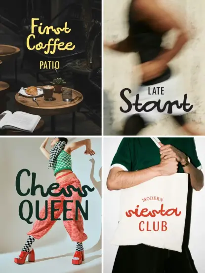
How to Use La Siesta Font in Branding, Packaging, and Social Media
Practical application is where a font proves its value. So how do you actually use La Siesta?
For logo design, set the primary brand name in uppercase for authority. Then pair it with a descriptor or tagline in lowercase script for warmth. The contrast handles the heavy lifting — you get hierarchy and personality simultaneously, without stacking multiple typefaces.
For packaging design, use the uppercase style for product names and category labels. Meanwhile, use lowercase for flavor notes, taglines, or any copy that benefits from a personal, artisan feel. The La Siesta font creates a natural information hierarchy without additional design intervention.
Type Duo Architecture for Modern Brand Systems
For social media, mix both styles freely. La Siesta has the editorial flexibility to anchor a quote graphic, headline a story template, or ground a logo lockup. Furthermore, it photographs beautifully — an increasingly important quality as brand identity travels through Instagram and Pinterest before it reaches print.
This brings me to a fourth framework worth naming: Type Duo Architecture. This refers to how a coordinated pair of typefaces functions as a single expressive voice across a full brand system — rather than as two separate tools that happen to coexist.
La Siesta exemplifies Type Duo Architecture. The uppercase and lowercase don’t just match — they extend each other. Consequently, brand designers can build entire visual identity systems around this single font duo without reaching for a third typeface to bridge the gap. That efficiency is genuinely rare.
Who Designed La Siesta? Meet Victoria Strukovskaya
Victoria Strukovskaya works under the Struvictory.art name and has built a recognized body of work in the lifestyle and editorial font space. Her approach centers on designing typefaces that serve real commercial needs — specifically in branding contexts where visual warmth directly drives consumer connection.
La Siesta reflects that philosophy clearly. It isn’t experimental typography for its own sake. Instead, it’s a precision tool with a clear purpose: give designers a system that feels human, performs professionally, and covers the full range of modern brand touchpoints.
Strukovskaya describes La Siesta as a font “made for expressive, sunlit design.” That phrase captures the intent precisely. The font carries light — not literally, but in the way it makes compositions feel open, warm, and inviting rather than heavy or clinical.
La Siesta Font vs. Generic Script Typefaces — The Real Difference
Here’s my honest take. Most handwritten fonts on the market are decorative in the weakest sense. They look charming in isolation and collapse under application pressure. La Siesta font, by contrast, shows the thinking of a designer who works inside complete brand ecosystems, not just specimen sheets.
The core difference lies in the dual register. A single script font, however beautiful, limits your compositional options. La Siesta’s Type Duo Architecture gives you contrast, hierarchy, and rhythm in a single purchase. Furthermore, the multilingual support and calibrated letterforms mean you spend less time compensating for a font’s weaknesses and more time designing.
That said, La Siesta isn’t a universal solution. If your brand needs extreme technical legibility — legal documents, dense editorial copy, or data-heavy interfaces — look elsewhere. However, for lifestyle, fashion, beauty, hospitality, and food and beverage branding, La Siesta sits at the top of its category. Comfortably.
You can download the font duo for a low budget from:
Creative Market YouWorkForThemFrequently Asked Questions About the La Siesta Font
What is the La Siesta font?
It’s a contemporary handwritten font duo by Victoria Strukovskaya of Struvictory.art. It pairs confident uppercase letterforms with a relaxed, effortless lowercase script — creating a typographic system built for modern branding in lifestyle, fashion, beauty, and hospitality.
Who created the typeface?
Victoria Strukovskaya, the type designer behind the Struvictory.art studio, created La Siesta. Her work focuses on commercial typefaces that balance warmth and usability across real-world brand design applications.
What design projects is the La Siesta font best for?
It works best for logo design, packaging, social media graphics, editorial layouts, storefronts, and menus. It performs particularly well in lifestyle, fashion, beauty, food and beverage, and hospitality branding.
Does La Siesta support multiple languages?
Yes. It includes multilingual support for Latin-script languages, covering the characters and accents needed for French, German, Spanish, Portuguese, and other European languages.
What makes La Siesta different from other handwritten script fonts?
This is a true type duo — not a single script font. Its paired uppercase and lowercase styles create built-in typographic contrast and hierarchy. The Structural Softness of its letterform design allows it to scale from small packaging copy to large editorial headlines without visual compromise.
Can designers use La Siesta as a complete brand typography system?
Yes. La Siesta’s Type Duo Architecture makes it function as a self-contained typographic system. Most brand design projects in lifestyle and hospitality categories need no additional typeface when using La Siesta.
Where can I find and purchase the La Siesta font?
It’s available through the Struvictory.art portfolio and major font marketplaces. Check the designer’s official shop for current licensing options and format availability.
Check out other popular typefaces here at WE AND THE COLOR.
#font #fontDuo #handwritten #LaSiesta #typeface