Pattern / 3

Edsger – A handwritten Clojure REPL for the reMarkable 2
https://handwritten.danieljanus.pl/2026-06-01-edsger.html
#HackerNews #Edsger #Clojure #reMarkable2 #Handwritten #REPL #TechInnovation
AtoZ Font: Discover New & Fresh Fonts for Every Creative Need
AtoZ Font is a comprehensive platform that offers a vast collection of high quality...
#Fonts #AtoZFont #AtoZFonts #A2ZFont #A2ZFonts #ttf #otf #Fontdownload #Downloads #Canvas #Party #Movieposter #Script #Regular #BoldFont #Calligraphy #handwriting #Arabic #Thai #Japanese #Tamil #Christmas #Wedding #Valentine #Gothic #Sansserif #Handwritten #Display #Serif #Blackletter #Hindi#Birthday #invitation #Korean

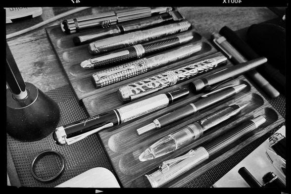
Hello #Manila ! Today a little outing... yes i´m a huge fan of #journaling and #fountainpens !
Anybody outhere in #PasigCity who can show me the shortest way to send #handwritten #letters to #germany ? i would love to send a #handwrittenletter to Dr. M. in Europe once a week :-) And are there other fountainpen-junkies like me outthere ? write me friends !
#outingself #PasigCity #Manila #fountainpen #fountainpens #handwriting #letters #journalingtime #journaling
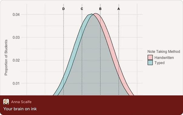
The research on handwritten notes is solid. Writing by hand forces you to think. You can't transcribe everything, so your brain does the work of deciding what matters. You synthesize. You understand. That's real. But let's be real: loose papers are a nightmare. You lose them. You can't search them. You can't backup them to the cloud. And if you need to reference something from three weeks ago? Good luck. What if we stopped choosing? The hybrid approach isn't a compromise, it's the actual upgrade. You handwrite your notes during lecture (get all those cognitive benefits), then scan them and store them digitally (get searchability, portability, backups). It takes maybe five extra minutes per lecture. And here's where it gets interesting: feed those scanned notes to an LLM. Let it pull out the key concepts, generate practice questions, create summaries, build study guides. You did the hard thinking work already. Why not let AI handle the busywork of organization? You get the best of everything. The learning happens in your hand. The access happens in the cloud. The AI handles what it's actually good at. It's not either/or. It's both, amplified. https://sites.google.com/view/paperstackpro/home
AtoZ Font: Discover New & Fresh Fonts for Every Creative Need
AtoZ Font is a comprehensive platform that offers a vast collection of high...
#Fonts #AtoZFont #AtoZFonts #A2ZFont #A2ZFonts #ttf #otf #Fontdownload #Downloads #Canvas #Party #Movieposter #Script #Regular #BoldFont #Calligraphy #handwriting #Arabic #Thai #Japanese #Tamil #Christmas #Wedding #Valentine #Gothic #Sansserif #Handwritten #Display #Serif #Blackletter #Hindi #Birthday #invitation #Korean