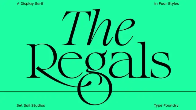
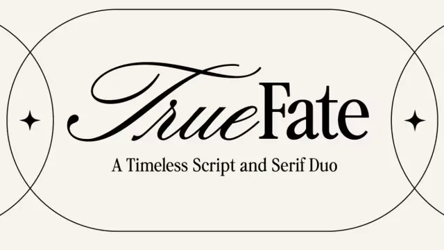
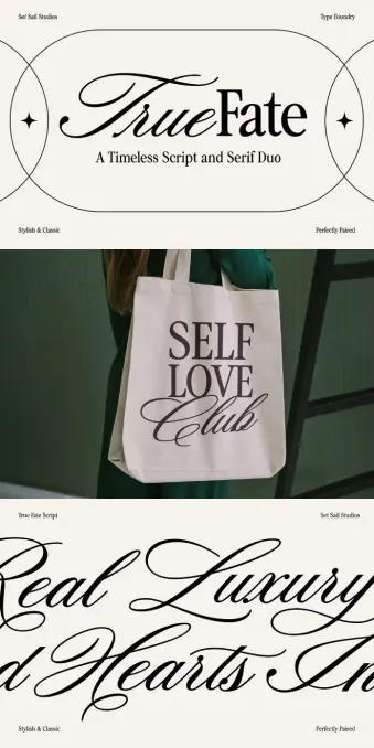
The Regals Serif Font by Sam Parrett of Set Sail Studios
Do you know how it feels to find something genuinely unique? It could be a piece of art, a song, or even just a perfectly brewed cup of coffee. It has resonance and simply feels good. When I actually sat down with The Regals for the first time, I felt pretty much like that. Sam Parrett, the owner of Set Sail Studios, created this serif font family, and to be honest, it’s a breath of fresh air.
Why am I discussing a typeface at all? Because typography is more than just the arrangement of letters on a page. It has to do with emotion. It involves creating an atmosphere, narrating a tale, and making a point without using any words. Furthermore, it has never been more crucial to stand out and establish a sincere connection in a world that is completely engulfed in digital noise. This is where The Regals comes into play—not just as a tool, but as a silent collaborator in your artistic endeavors.
You can purchase the typeface from:
Creative Market Set Sail StudiosWhat Makes The Regals More Than Just Another Serif?
We’ve all seen our fair share of serif fonts. Some are classic, some are stuffy, some try too hard. The Regals, though, it hits a sweet spot. Sam calls it a “crisp, modern spin on a classic transitional serif,” and he’s spot on. Think of those old, elegant books you might find in a dusty library, but then imagine them getting a sleek, confident glow-up. That’s The Regals.
It’s got this incredible balance. The serifs—those little feet and caps on the letters—they’re sharp. They’re precise. But the curves? They’re smooth, almost inviting. This isn’t a font that shouts; it commands attention with an understated confidence. It has a presence. A real, undeniable presence. I’ve always believed that a truly great font should feel like it has a personality, and The Regals? It’s got that quiet, sophisticated charm that just draws you in.
The Bones of The Regals: More Than Just Pretty Letters
The magic really starts when you look at the different styles. It’s not just a one-trick pony.
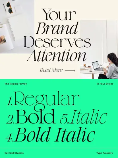
- The Regals Regular: This is your foundation. It’s elegant, readable, and incredibly versatile. Use it for a fancy heading or even for longer blocks of text where you want a touch of class without being over-the-top.
- The Regals Bold: When you need to make an impact, this is your go-to. It beefs things up, adds weight, and really makes your words pop. Think headlines that demand to be read.
- The Regals Italic: This is where the grace comes in. It’s flowing, artistic, and perfect for quotes or adding a softer, more sophisticated accent to your design.
- The Regals Bold Italic: My personal favorite for those moments when you need both power and panache. It’s got the strength of the bold, but with that beautiful, dynamic slant.
These four styles mean you’re covered for almost anything. From a slick new logo for a high-end brand to a thoughtful magazine layout or even just a stylish quote on Instagram, The Regals has the range.
The Regals Serif Font by Sam Parrett of Set Sail StudiosYou can purchase the typeface from:
Creative Market Set Sail StudiosThe Little Things That Make a Big Difference
This is where The Regals goes from “nice” to “oh wow.” We’re talking about ligatures and alternate characters. If you’re not familiar, ligatures are basically when two letters that might look a bit awkward next to each other (like “fi” or “th”) are elegantly joined into a single, seamless character. The Regals has 36 of these. Seriously, count ’em. It makes the text flow so much more beautifully. It’s a subtle touch, but it’s these little details that elevate a design from good to exceptional.
Then there are the alternates. For letters like S, Q, R, g, and t, you get these beautifully ornate versions. They’re not for every occasion, but when you need that extra bit of custom flair, that touch of bespoke luxury, they’re right there. Imagine designing a fancy invitation or a striking brand mark – these alternates give you that secret weapon to make it truly unique.
Don’t Sweat the Small Stuff: Getting Them to Work
Worried about figuring out how to use these special characters? Don’t be. Most modern design software (think Adobe Illustrator, InDesign, Photoshop) makes it super easy. Just toggle on “Standard Ligatures” or “Stylistic Alternates,” and boom, magic happens.
Even if you’re using software that’s a bit… less sophisticated, Sam’s got your back. The Regals is PUA encoded. That’s a fancy way of saying you can literally just copy and paste these special characters from your computer’s Font Book (Mac) or Character Map (Windows). No tech wizardry required. It’s all about making your life easier, right?
Why a Font Like The Regals Connects Us
In an age where everything is screaming for our attention, what makes us stop and look? Authenticity. Quality. A sense of something well-crafted. The Regals embodies this. When you use it, you’re not just picking a typeface; you’re making a statement about your brand, your message, your aesthetic.
It’s about “Brand Resonance,” I guess you could call it. When a font perfectly echoes what your brand stands for, that’s resonance. The Regals speaks of heritage, but with a confident, contemporary voice. It tells people you care about details, about elegance, about standing the test of time. This is invaluable, whether you’re a small boutique or a global enterprise. It helps build trust. It fosters connection.
I really do think about how a font feels. The Regals feels solid. It feels reliable. But it also feels light, airy, and not at all imposing. It’s like finding that perfect, classic leather jacket – it’s always in style, always makes you feel good, and it just works with everything. That’s The Regals for me. It’s a solid, beautiful choice you won’t regret.
My Two Cents: Why I Keep Coming Back to The Regals
I’ve played with countless fonts over the years. Some are fun for a moment. Some are trendy. But very few have that lasting power. The Regals is one of those rare ones. It’s become a trusted friend in my design toolkit.
It’s not trying to be flashy or groundbreaking in a loud way. Its genius is in its quiet confidence. It elevates whatever it touches without ever overshadowing the message. It’s the kind of font that makes people say, “That looks so good,” without them even realizing why it looks so good. That’s the hallmark of truly great design, isn’t it? It works its magic subtly.
You can purchase the typeface from:
Creative Market Set Sail StudiosSo, if you’re looking to add a touch of timeless elegance, a sprinkle of modern sophistication, and a whole lot of readable charm to your next project, give The Regals a serious look. You might just find your new favorite.
Quick Questions about The Regals (The Stuff You Actually Want to Know)
What exactly is The Regals?
It’s a beautiful serif font family. Think classic elegance with a fresh, modern twist.
Who created it?
Sam Parrett from Set Sail Studios. He’s got a real knack for this stuff.
How many different versions (styles) does it come in?
You get four: Regular, Bold, Italic, and Bold Italic. Enough to cover all your bases!
Can I use it for more than just English?
Yep, it’s got language support for a bunch of European languages, so it’s pretty versatile for global projects.
What are “ligatures” and “alternates,” and how do I use them?
Ligatures are those fancy combined letters (like “fi” becoming one elegant character). Alternates are special, decorative versions of certain letters. Most design software lets you turn them on easily with a click. If not, you can usually copy them from your computer’s font viewer.
Is The Regals good for logos?
Absolutely! It brings a classy, refined touch to any brand mark.
Can I use it for headlines and smaller text?
Totally. It’s clear and readable enough for body text, but it also shines as a headline font.
What makes it special compared to other serif fonts?
It hits that perfect sweet spot between traditional and contemporary, and all those extra ligatures and alternates give you so much creative freedom.
Check out other trending typefaces here at WE AND THE COLOR. In addition, feel free to take a look at our selection of the coolest new typefaces of early 2026.
#font #SamParrett #serifFont #SetSailStudios #TheRegals #typeface