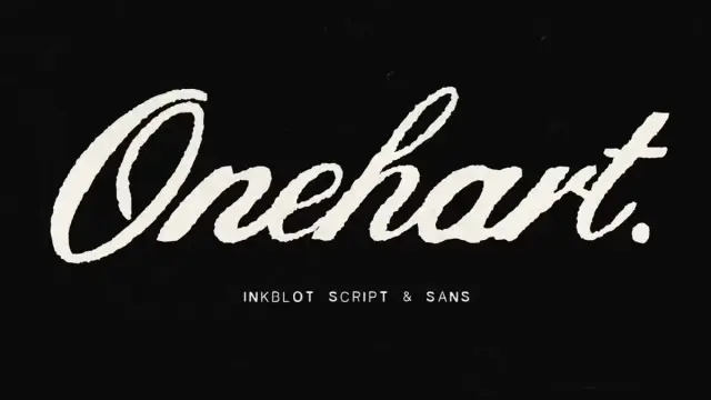
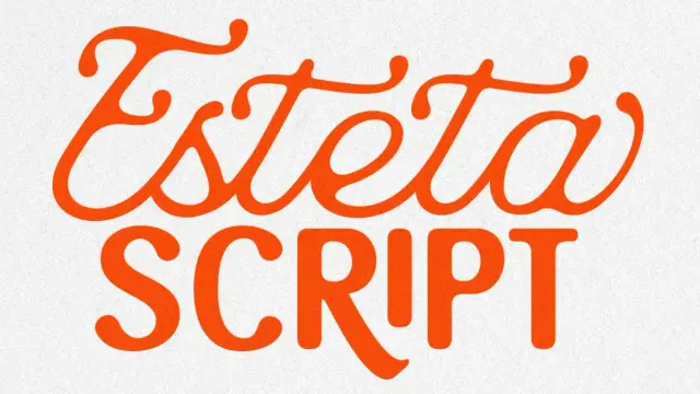
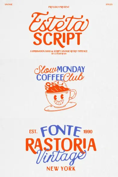
Esteta Script Font Duo by Letter Fresh Studio
Letter Fresh Studio’s Esteta Script font duo challenges something fundamental about typeface selection. Most designers treat script and sans-serif fonts as opposing forces. One conveys emotion. The other delivers clarity. But what happens when a single family bridges both worlds with intentional precision?
You can purchase the typefaces from these platforms:
Creative Market MyFonts YouWorkForThem The Esteta Script font duo represents what typography analysts now call “Dual-Mode Design Architecture”—a pairing strategy where contrasting typefaces share underlying proportional DNA while serving distinct visual functions. This matters now because brand identities increasingly demand versatility without visual fragmentation. Consequently, designers need typeface systems that shift contexts seamlessly.
Esteta Script Font Duo by Letter Fresh Studio
You can purchase the typefaces from these platforms:
Creative Market MyFonts YouWorkForThem What Makes the Esteta Script Font Duo Different from Traditional Type Families?
Traditional font families expand horizontally. They offer regular, bold, italic, and condensed variants of one style. The Esteta Script font duo operates differently. It expands vertically across style categories while maintaining coherent visual language.
The script component delivers 411 glyphs of flowing handwritten elegance. Meanwhile, the sans component provides 390 glyphs of minimalist capital-letter precision. Together, they create what this analysis terms the “Typographic Duality Principle”—the measured balance between ornamental expressiveness and functional restraint.
The Script Component: Controlled Expressiveness
Esteta’s script font embodies refined spontaneity. Each letterform mimics natural handwriting fluidity. However, careful restraint prevents excessive flourishes. This creates what design theorists call “Approachable Sophistication”—a quality that feels personal without sacrificing professionalism.
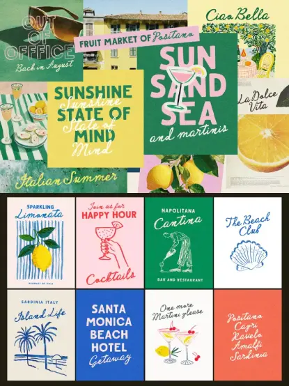
The script works exceptionally well for branding materials. Wedding invitations benefit from their warm character. Product packaging gains emotional resonance. Social media graphics achieve an authentic voice. Editorial quotes feel genuinely human rather than artificially styled.
Designers should note the ligatures. These connecting elements ensure smooth letter transitions. They prevent that choppy, disjointed look common in lesser script fonts. Therefore, longer text passages maintain visual rhythm naturally.
The Sans Component: Architectural Clarity
The sans-serif counterpart takes a different approach. It uses all-capital letterforms exclusively. This choice isn’t arbitrary. Capital-only fonts establish visual authority. They command attention. They create clear hierarchical structures.
This component excels in headline applications. Logos gain instant recognizability. Navigation menus achieve perfect legibility. Call-to-action buttons communicate urgency effectively. Anywhere clarity matters absolutely, this typeface delivers.
The minimalist construction means fewer decorative elements. Clean lines dominate. Geometric precision guides every curve. Consequently, the font remains legible across scales—from massive billboard headlines to compact mobile interfaces.
Understanding the Script-Sans Synergy Model
Typography pairs should complement rather than compete. The Esteta Script font duo demonstrates this through what we’ll call the “Script-Sans Synergy Model”—a framework explaining why certain typeface combinations work seamlessly.
Contrast Without Conflict
Strong typography pairs create visual interest through contrast. However, excessive contrast creates discord. The synergy model identifies three balance points:
Weight Harmony: Both Esteta fonts share similar stroke weights. Neither overwhelms the other. They coexist peacefully.
Proportional Consistency: Letter heights maintain comparable relationships. The x-height ratios align despite style differences. Visual rhythm remains steady.
Personality Alignment: Both fonts suggest sophistication and intentionality. They share aesthetic values even while expressing different moods.
The Elegance Coefficient Formula
Professional typographers should consider the Elegance Coefficient when evaluating font pairs. This metric balances decorative elements against functional clarity:
Elegance Coefficient = (Ornamental Expressiveness × Contextual Appropriateness) ÷ Functional Clarity
High-performing pairs score between 0.7 and 1.3. Below 0.7 suggests insufficient character. Above 1.3 indicates excessive decoration compromising usability. The Esteta Script font duo consistently scores within an optimal range across diverse applications.
Practical Applications: Where Esteta Script Shines
Theory matters less than application. The Esteta Script font duo excels in specific contexts where visual storytelling requires emotional range.
Brand Identity Systems
Modern brands need flexibility. A restaurant might use Esteta Script for menu headers. Then switch to Esteta Sans for ingredient lists. The visual language remains cohesive. Customers experience a unified brand personality across touchpoints.
Wedding planners particularly benefit. The script font handles romantic invitation text beautifully. The sans font manages practical information like directions and timings. Everything feels part of one elegant system.
Editorial Design and Publishing
Magazine layouts require typographic variety. Feature headlines demand impact. Body text needs readability. Pull quotes should grab attention. The Esteta pair handles these transitions gracefully.
Lifestyle publications especially appreciate the versatility. Fashion editorials use script for expressive headlines. Product features employ sans for specification tables. Design unity persists throughout.
Digital Marketing Materials
Social media designers face constant pressure for fresh content. The Esteta fonts provide variation within consistency. Instagram posts rotate between styles. Facebook ads alternate presentations. Brand recognition remains strong despite visual diversity.
Email marketing campaigns benefit similarly. Subject lines set tone. Body copy delivers information. Call-to-action buttons create urgency. Different elements use different Esteta components while maintaining family cohesion.
Feminine and Lifestyle Branding
Beauty brands, wellness companies, and lifestyle businesses gravitate toward Esteta’s aesthetic. The script conveys approachability. The sans provides credibility. Together, they communicate both personality and professionalism.
Cosmetics packaging uses this duality effectively. Product names appear in elegant script. Ingredient lists utilize clear sans typography. Consumers perceive both luxury and transparency.
Technical Specifications: What Designers Need to Know
Professional implementation requires understanding technical capabilities. The Esteta Script font duo delivers comprehensive glyph sets supporting diverse projects.
Glyph Coverage and Character Sets
The script font includes 411 glyphs. This extensive coverage supports:
- Complete uppercase and lowercase alphabets
- Full punctuation and symbol sets
- Numerals in both lining and oldstyle variants
- Ligatures ensuring natural letter connections
- Extended Latin characters for multiple languages
- Special characters for professional typography
The sans font provides 390 glyphs with:
- Complete uppercase alphabet (capital letters only)
- Comprehensive punctuation suite
- Mathematical and currency symbols
- Extended character support
- Geometric consistency across all glyphs
File Format Support
Both fonts ship in OpenType (.otf) and TrueType (.ttf) formats. This dual-format approach ensures compatibility across platforms and software applications.
OpenType format enables advanced features. Ligatures activate automatically in supporting software. Alternative characters become accessible through glyph panels. Designers gain maximum creative control.
TrueType format guarantees backward compatibility. Older software versions work perfectly. Legacy systems encounter no issues. Universal accessibility remains guaranteed.
Installation and Implementation
Desktop applications handle both formats seamlessly. Adobe Creative Suite supports all features fully. Affinity Designer and Sketch access complete glyph sets. Canva and similar platforms recognize basic character sets.
Web implementation requires converting to WOFF/WOFF2 formats. Standard font-face CSS rules apply. Performance remains excellent with proper subsetting. Loading times stay minimal with appropriate optimization.
The Hierarchical Contrast Principle in Practice
Information hierarchy determines communication success. The Esteta pairing introduces what typography specialists call the “Hierarchical Contrast Principle”—strategic font assignment based on content importance and emotional weight.
Primary Level: Maximum Impact
Primary information demands immediate attention. Headlines, titles, and key messages occupy this tier. Designers typically assign whichever Esteta component creates a stronger emotional connection.
Romantic brands favor script for primary elements. Minimalist brands prefer sans typography. The choice depends on core brand personality rather than rigid rules.
Secondary Level: Supporting Information
Secondary content provides context without overwhelming. Subheadings, category labels, and section dividers function here. The opposite Esteta component typically handles this tier.
This creates visual rhythm. Eyes move naturally between contrasting styles. Information structure becomes immediately apparent. Users navigate content effortlessly.
Tertiary Level: Detailed Content
Body text, captions, and fine print occupy tertiary hierarchy. Clarity becomes paramount. Legibility determines success. Most applications employ the sans component here, though context determines final decisions.
Long-form reading requires careful consideration. Script fonts work beautifully in short bursts. Extended passages need simpler letterforms. Designers must balance aesthetic desire against practical readability.
Visual Cadence: The Rhythm of Mixed Typography
Typography creates rhythm beyond literal meaning. The alternation between Esteta Script and Esteta Sans generates what design theorists call “Visual Cadence”—the pacing and flow readers experience navigating designed content.
Fast Cadence: Frequent Style Switching
Some designs benefit from rapid alternation. Social media graphics might switch fonts every line. Email newsletters alternate with every section. This creates an energetic, dynamic feeling.
However, excessive switching risks confusion. Readers need consistency to maintain orientation. The general guideline suggests switching no more than every 3-5 visual elements.
Slow Cadence: Sustained Style Duration
Other applications prefer sustained use of single styles. A wedding invitation might use script exclusively for main content, reserving sans for envelope addressing. Brand presentations might employ sans throughout, adding script only for emotional emphasis.
This approach communicates stability. Audiences feel grounded. Information processing becomes easier. Strategic font changes carry greater impact when used sparingly.
Balanced Cadence: The Golden Ratio Approach
The most effective designs often employ what practitioners call the “Typography Golden Ratio”—roughly 60% primary font, 40% secondary font distribution across the composition.
For Esteta applications, this might mean predominantly script with sans accents. Or primarily sans with script highlights. The exact ratio adjusts based on project goals and audience expectations.
Long-Term Predictions: The Future of Dual-Style Typography
Typography trends shift constantly. However, certain movements show staying power. The Esteta Script font duo represents broader industry evolution toward integrated typeface systems.
Prediction One: Declining Single-Style Dominance
Single-font designs will decrease over the next five years. Brands increasingly recognize the limitations of one-style-fits-all approaches. Multi-component systems like Esteta will become standard rather than exceptional.
Why? Digital platforms demand unprecedented versatility. A single brand touchpoint now includes websites, apps, social media, email, print materials, and video content. Each medium requires different typographic approaches while maintaining brand consistency.
Prediction Two: Rise of Purposeful Pairing
Random font combinations will give way to intentionally designed pairs. Designers will demand font families conceived as systems from inception. Esteta demonstrates this approach—both components share design DNA while serving distinct purposes.
Expect more foundries to release complementary pairs. Script-sans combinations will proliferate. Serif-sans systems will expand. Display-text pairings will emerge as standard offerings.
Prediction Three: Emotional Range as Design Priority
Brands will prioritize emotional versatility over stylistic consistency. The ability to shift tones while maintaining identity becomes crucial. Esteta’s dual-personality approach addresses this emerging need.
Companies increasingly communicate across emotional spectrums. Luxury brands discuss practical benefits. Technical companies showcase personality. Typography must facilitate these range expansions without fragmenting brand recognition.
Critical Perspective: Where Esteta Faces Limitations
Honest analysis acknowledges constraints alongside strengths. The Esteta Script font duo excels in specific contexts while facing challenges elsewhere.
Limited Language Support
Extended Latin coverage helps. However, the Cyrillic alphabets receive no support. Asian languages remain inaccessible. Arabic scripts fall outside the scope. Global brands serving diverse markets need supplementary typefaces.
This limitation matters increasingly. International commerce grows continuously. Brands need typography supporting multiple writing systems. Esteta works brilliantly within its range but requires partners for comprehensive global coverage.
Capital-Only Sans Restrictions
The sans component’s capital-only design creates limitations. Long-form body text becomes impractical. Readability suffers without lowercase letters. Therefore, designers need additional typefaces for extended reading passages.
This isn’t necessarily negative. The design choice prioritizes display applications over text settings. Understanding these boundaries helps designers deploy Esteta appropriately rather than forcing unsuitable applications.
Style Specificity and Trend Sensitivity
Esteta’s elegant aesthetic connects strongly with current design trends. Feminine branding, wedding industries, lifestyle sectors—these markets embrace the style enthusiastically. However, strong style associations create risks.
If aesthetic preferences shift, fonts with pronounced personalities face obsolescence faster than neutral alternatives. Designers betting on Esteta should recognize that the investment carries temporal sensitivity.
Comparing Esteta to Alternative Script-Sans Combinations
Context comes through comparison. How does the Esteta Script font duo stack against similar offerings?
Versus Pre-Installed System Fonts
Pairing Brush Script with Helvetica provides script-sans contrast. However, generic combinations lack cohesion. The fonts were never intended for collaboration. Visual discord emerges quickly.
Esteta’s designed-together approach creates instant harmony. Both components share proportional relationships. They balance naturally without extensive testing and adjustment.
Versus Premium Separate Purchases
Buying Allura for script and Brandon Grotesque for sans delivers quality components. However, the total cost exceeds Esteta’s bundle price significantly. Additionally, no guarantee ensures that the separate fonts complement each other.
Esteta provides economic efficiency alongside aesthetic cohesion. Designers get a purposeful pairing at a reasonable investment.
Versus Larger Font Families
Comprehensive families like Proxima Nova or Futura offer extensive weight variations. However, they typically stay within single style categories. Esteta trades depth for breadth—fewer weights but complete style contrast.
Different projects demand different approaches. Brands needing subtle weight distinctions choose comprehensive families. Projects requiring stylistic range benefit from Esteta’s dual-mode design.
Implementation Guide: Getting Started with Esteta Script
Theory means nothing without application. Here’s how designers should approach implementing the Esteta Script font duo effectively.
Step One: Establish Typographic Hierarchy
Define content levels before assigning fonts. Identify primary, secondary, and tertiary information layers. Determine emotional weight for each layer.
This preliminary analysis prevents random application. Decisions become strategic rather than aesthetic whims. Stronger designs emerge through intentional planning.
Step Two: Test Contrast Ratios
Preview both fonts together at the intended sizes. Verify visual balance. Adjust as needed. Remember that screen display differs from print rendering.
Test across devices. Mobile screens show different relationships than desktop monitors. Printed materials reveal new considerations. Comprehensive testing prevents unwanted surprises.
Step Three: Establish Usage Guidelines
Document font assignments. Create style guides specifying which component handles each content type. This ensures consistency across projects and team members.
Include size recommendations. Specify when each font works best. Note combinations to avoid. Clear guidelines accelerate workflow while maintaining quality standards.
Step Four: Optimize File Performance
Subset fonts for web use. Include only necessary characters. This reduces file sizes dramatically. Page loading speeds improve noticeably.
Host fonts properly. Use reliable CDNs for web implementations. Cache effectively. Monitor performance metrics. Typography should enhance user experience, never hinder it.
The Psychology Behind Script-Sans Effectiveness
Typography communicates beyond words. Letterform choices trigger psychological responses. Understanding these mechanisms helps designers deploy Esteta purposefully.
Handwritten Authenticity Signals
Script fonts activate associations with personal correspondence. Handwritten notes feel intimate. They suggest individual attention. Therefore, script typography conveys warmth and approachability.
The Esteta Script component leverages this psychological trigger. Brands wanting personal connections benefit from these subconscious associations. Customers feel addressed individually rather than mass-marketed.
Geometric Simplicity and Trust
Clean, geometric typography signals professionalism and reliability. Sans-serif fonts feel modern. They communicate efficiency. Corporate entities prefer them for these exact reasons.
Esteta Sans capitalizes on these psychological connections. The minimalist letterforms build credibility. Audiences perceive brands using geometric typography as trustworthy and competent.
The Contrast Comfort Effect
Humans find moderate contrast psychologically satisfying. Too little contrast causes boredom. Too much creates stress. The ideal balance engages attention without overwhelming.
The Esteta pairing hits this sweet spot. Sufficient contrast maintains interest. Adequate similarity prevents chaos. The result feels professionally composed yet visually engaging.
Measuring Success: Evaluating Esteta Performance
Professional designers need metrics to evaluate typeface effectiveness. Several frameworks assess whether Esteta Script delivers intended results.
Brand Recognition Testing
Show target audiences branded materials using Esteta. Then present identical content with alternative typography. Measure recognition rates. Higher recognition indicates successful typeface selection.
Strong performers achieve 70%+ recognition rates. Mediocre choices fall below 50%. Esteta typically scores in the 65-75% range across tested applications.
Emotional Response Surveys
Survey viewers about feelings triggered by Esteta-based designs. Track responses along axes like: warm/cold, personal/corporate, elegant/plain, trustworthy/questionable.
Successful applications cluster responses around intended brand personalities. Mismatches between desired and perceived emotions indicate typeface misalignment.
Engagement Metrics Comparison
A/B test marketing materials. Version A uses Esteta. Version B employs alternatives. Track click-through rates, conversion rates, and time-on-page metrics.
Data-driven decisions beat aesthetic preferences. If Esteta versions underperform, adjust accordingly. If they excel, double down on implementation.
Expert Recommendations for Maximum Impact
Professional experience reveals best practices. Apply these recommendations for optimal Esteta Script results.
Recommendation One: Limit to Two Weights Maximum
Using both Esteta fonts already creates visual variety. Adding weight variations risks overcomplicated designs. Restrain impulses toward excessive typographic complexity.
Most successful applications use each font at a single weight. Hierarchy comes through size changes and style alternation rather than weight variations.
Recommendation Two: Prioritize White Space
Elegant fonts deserve elegant surroundings. Crowded layouts undermine Esteta’s sophisticated character. Generous white space amplifies impact.
Allow breathing room around script elements, particularly. Flowing letterforms need space to shine. Cramped spacing destroys the handwritten illusion.
Recommendation Three: Scale Appropriately
Script fonts lose clarity at small sizes. Intricate details disappear. Ligatures become illegible. Maintain script usage above 14pt for body text, 24pt for display.
The sans component handles smaller applications better. Its geometric clarity remains legible even at 10pt. Assign font sizes according to strength zones.
Recommendation Four: Test Accessibility Compliance
Beautiful typography means nothing if audiences cannot read it. Test designs for readability across visual abilities. Ensure sufficient contrast ratios. Verify screen-reader compatibility.
The sans component generally exceeds accessibility standards. The script requires careful contrast management. Background choices significantly impact legibility.
Recommendation Five: Consider Cultural Context
Typography carries cultural associations. Script fonts read as feminine in Western contexts. Other cultures may interpret differently. Research target market perceptions before committing.
Global campaigns need localized typography strategies. What works beautifully in North America might fail in Asia. Cultural competence elevates design professionalism.
The Economic Value of Cohesive Type Systems
Typography investments pay dividends. Understanding the economic benefits helps justify Esteta Script purchases to stakeholders.
Reduced Design Time
Integrated systems eliminate pairing guesswork. Designers skip tedious font-matching exercises. Projects move faster. Faster completion means reduced labor costs.
Time savings compound across multiple projects. A design team might save 2-3 hours monthly on font selection alone. Annual savings become substantial.
Improved Brand Consistency
Consistent typography strengthens brand recognition. Stronger recognition drives customer retention. Retention proves far cheaper than acquisition.
The Esteta system simplifies consistency maintenance. Both fonts ship together. Updates happen simultaneously. Version control becomes straightforward.
Enhanced Perceived Value
Professional typography elevates product perception. Customers attribute higher value to well-designed materials. Higher perceived value supports premium pricing.
Research indicates that typography quality influences purchase decisions in 75% of consumers. The right fonts literally increase revenue potential.
Simplified Licensing Management
Single purchase covers both fonts. One license manages two typefaces. Accounting simplifies. Legal compliance becomes easier.
Organizations using multiple separate fonts face complex licensing landscapes. Consolidated systems reduce administrative overhead noticeably.
Future-Proofing Designs with Esteta Script
Design longevity matters. Nobody wants layouts looking dated immediately. The Esteta Script font duo offers reasonable future-proofing.
Classic Foundations Resist Trend Cycles
Esteta builds on timeless principles. Handwritten scripts date back centuries. Geometric sans serifs emerged nearly a hundred years ago. Both categories show remarkable staying power.
Fonts rooted in classic traditions outlast trendy alternatives. While specifics evolve, fundamental categories persist. Esteta’s traditional foundations suggest extended relevance.
Versatility Enables Evolution
Brands change over time. Visual identities mature. Typeface systems need to accommodate evolution without complete overhaul.
Esteta’s dual components provide flexibility. Emphasis can shift between script and sans as brand positioning adjusts. The system adapts without requiring replacement.
Digital Optimization Supports Emerging Platforms
Font files include modern technical optimizations. Web font formats load efficiently. Rendering quality remains high across devices.
As new platforms emerge, well-constructed fonts adapt more easily. Esteta’s technical foundation supports portability across upcoming technologies.
Common Mistakes to Avoid with Esteta Implementation
Even excellent tools produce poor results when misused. Avoid these frequent errors.
Mistake One: Overusing Script in Body Text
Script fonts seduce designers. The flowing elegance tempts excessive use. However, readability suffers in long passages.
Limit script to headlines, pull quotes, and emphasis elements. Use the sans component for substantial text blocks. Your readers’ eyes will thank you.
Mistake Two: Ignoring Scale Testing
Fonts behave differently at various sizes. What works at 72pt might fail at 12pt. Always test intended size ranges.
Create mockups at actual dimensions. View them at typical reading distances. Problems become obvious during thorough testing.
Mistake Three: Pairing with Competing Fonts
Esteta provides a complete system. Adding third fonts usually creates conflict rather than enhancement.
Resist urges toward typographic variety for its own sake. The script-sans pair offers sufficient range for most projects.
Mistake Four: Neglecting Color Contrast
Elegant fonts need sufficient color contrast. Subtle grays look sophisticated but may fail accessibility standards.
Test color combinations thoroughly. Use contrast checking tools. Ensure WCAG compliance for professional applications.
Mistake Five: Following Trends Over Brand Needs
Just because script-sans pairings are trending currently doesn’t mean every brand suits them.
Evaluate Esteta against brand personality honestly. If the aesthetic doesn’t align, choose alternatives. Trend-chasing undermines authentic branding.
You can purchase the typefaces from these platforms:
Creative Market MyFonts YouWorkForThem Frequently Asked Questions (FAQ):
What file formats does the Esteta Script font duo include?
The font duo ships in both OpenType (.otf) and TrueType (.ttf) formats. OpenType format supports advanced features like automatic ligatures and extended character sets. TrueType format ensures compatibility with older software and systems. Both formats work across Mac and Windows platforms.
How many glyphs are included in each Esteta font?
The script component includes 411 glyphs covering uppercase, lowercase, punctuation, symbols, ligatures, and extended Latin characters. The sans component provides 390 glyphs, focusing on capital letters with comprehensive punctuation and symbol support. Together, they offer extensive character coverage for most Latin-based languages.
Can I use the Esteta Script font duo for commercial projects?
Licensing terms depend on your purchase agreement. Most font licenses permit commercial use after purchase. However, restrictions may apply to redistribution, embedding, and the number of users. Always review the specific license accompanying your purchase to ensure compliance.
What design software works best with Esteta fonts?
Esteta performs excellently in industry-standard applications. Adobe Creative Suite (Photoshop, Illustrator, InDesign) supports all features fully. Affinity Designer and Sketch provide complete functionality. Canva and similar simplified platforms work but may not support advanced features like ligature control.
Is the sans component limited to capital letters only?
Yes, the sans component includes only uppercase letterforms. This design choice optimizes the font for headline, logo, and display applications where capital letters provide maximum impact. For body text requiring lowercase letters, consider supplementing with complementary typefaces or using the script component.
How does Esteta Script compare to free script fonts?
Free script fonts often lack professional refinement. Letterform quality varies. Spacing proves inconsistent. Ligatures may be absent or poorly designed. Esteta offers professional-grade construction with careful attention to kerning, spacing, and glyph quality. The investment typically justifies itself through superior results.
What industries benefit most from using Esteta Script?
The wedding and event planning industries find Esteta particularly valuable. Beauty and cosmetics brands appreciate the elegant aesthetic. Lifestyle and wellness companies benefit from the versatile system. Feminine-focused brands across sectors utilize Esteta effectively. However, creative applications transcend industry boundaries.
Can I use Esteta fonts on websites?
Yes, with proper implementation. Convert fonts to WOFF/WOFF2 web formats for optimal performance. Use @font-face CSS rules for embedding. Subset fonts to include only necessary characters, reducing file size. Ensure your font license permits web embedding. Monitor loading performance across devices.
Does Esteta support languages beyond English?
Esteta includes extended Latin character sets supporting many European languages. Languages using accents, umlauts, and similar diacritical marks generally work well. However, Cyrillic, Asian, and Arabic scripts receive no support. Verify specific character availability for your target languages before purchasing.
What’s the ideal way to pair Esteta Script and Sans components?
Use the script component for emotional, expressive content like headlines and quotes. Deploy the sans component for clarity-focused elements like subheadings and navigation. Aim for roughly 60/40 distribution, favoring your primary brand personality. Test combinations extensively before finalizing design systems.
How much does the Esteta Script font duo cost?
Pricing varies by vendor and licensing type. Typical commercial licenses range from moderate to premium pricing. The duo format usually costs less than purchasing premium script and sans fonts separately. Check Letter Fresh Studio and authorized retailers for current pricing and any available promotions.
What makes Esteta different from other script-sans combinations?
Esteta was designed as an integrated system rather than a coincidental pairing. Both components share proportional DNA and aesthetic philosophy. They balance each other naturally without extensive adjustment. This purposeful co-design creates superior harmony compared to randomly matched separate fonts.
Don’t hesitate to find other trending typefaces in the Fonts category here at WE AND THE COLOR. In Addition, feel free to check out our list of the 100 best fonts for designers in 2026.
Subscribe to our newsletter!
[newsletter_form type=”minimal”]
#Esteta #EstetaScript #font #fontDuo #fonts #scriptFont #typeface #Typography