boost if you are tired

CodingPanic
@codingpanic
- 83 Followers
- 244 Following
- 50 Posts
Geek. Hobby Computer Enthusiast. Information Security Professional.
Wow! This is the most beautiful #Cyberdeck I've ever seen. 😍
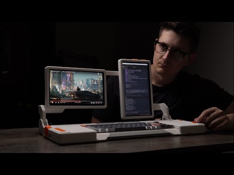
DIY Dual-Screen Cyberdeck: Sleek Design, Ultimate Functionality

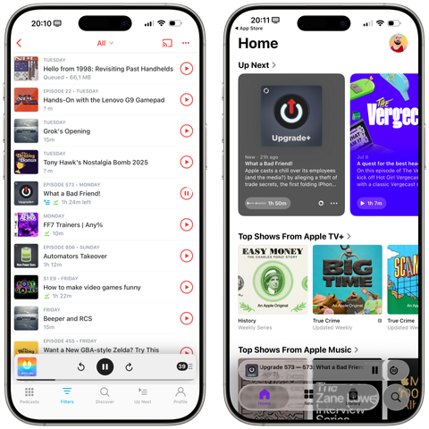
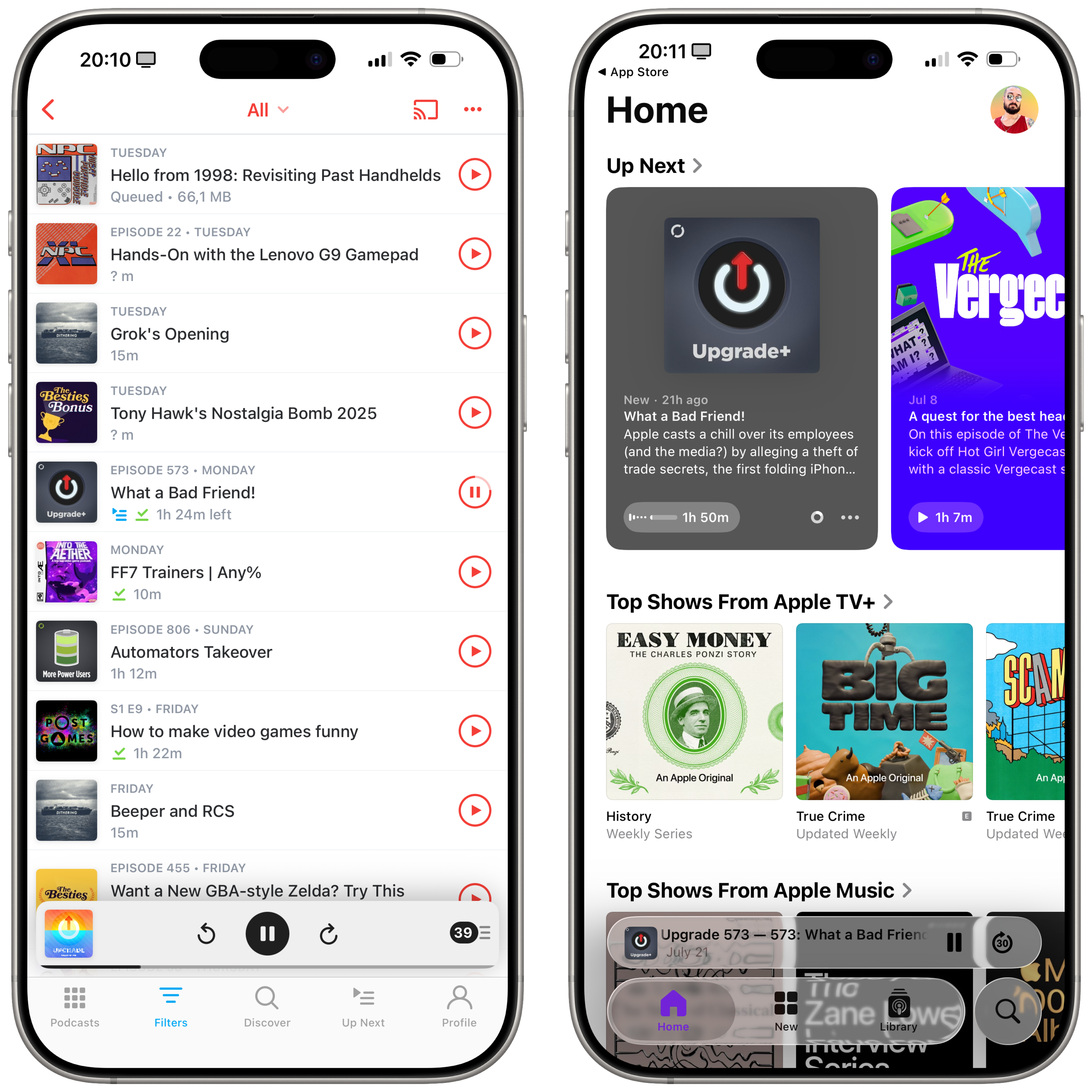
Pocket Casts for iOS 18 on the left, Apple Podcasts for iOS 26 on the right.
Between the illegible glass and the tab bar that disappears on scroll, I honestly have no idea who can take a look at this and say "Yes, that'll do it. That's good."
Liquid Glass is a mess so far, *especially* on iOS. Actually pushing me to use apps without Liquid Glass.

We said goodbye to one of dogs last night. Damnit I’m going to miss you Yoshi. So very much.

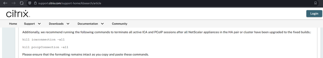
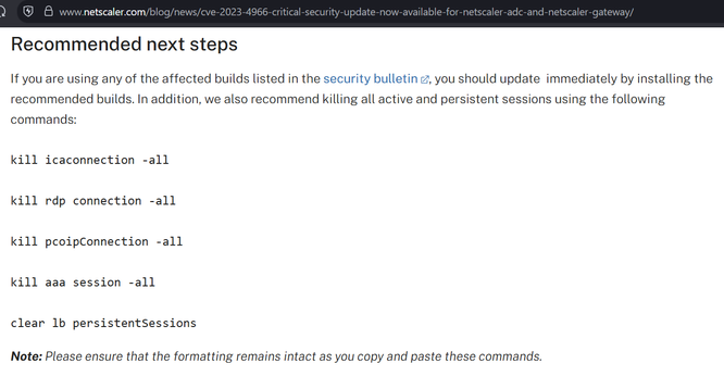
I believe Citrix may have made a mistake in the patching instructions for CitrixBleed2 aka CVE-2025-5777.
They say to do the instructions on the left, but they appear to have missed other session types (e.g. AAA) which have session cookies that can be stolen and replayed with CitrixBleed2. On the right is the CitrixBleed1 instructions.
The net impact is, if you patched but a threat actor already took system memory, they can still reuse prior sessions.
Tell anybody you know at Citrix.
@siracusa fired up my G4 mini running 10.3 yesterday and I was instantly reminded of how far Apple has fallen in design. Tahoe’s lack of interface density looks like a Tonka toy in comparison. Interface inflation and bloat is very real.
A free Playdate app to sideload: xkpd, Paul Straw's xkcd reader—check out the latest comic, go to a specific one, or jump around randomly. Cool use of the new networking APIs!

Sorry, MacOS Tahoe Beta 2 Still Does the Finder Icon Dirty
https://daringfireball.net/linked/2025/06/24/sorry-macos-tahoe-b2-finder-icon
https://daringfireball.net/linked/2025/06/24/sorry-macos-tahoe-b2-finder-icon

@geerlingguy crazy question… I’m looking at switching some of my systems to Wayland… but graphical remote access seems to mostly be limited to RDP on Ubuntu. I’m currently using vnc extensively… do you know of a vnc server that works with Wayland, that isn’t wayvnc? (It needs wlroots compositors)

 :vthicc: