| 🐦 | https://twitter.com/keir |
| 🥳 | https://keir.omg.lol |
| 🌍 | https://www.keiransell.com |
| 🌍 | https://bento.me/keir |
Keir
@keir@mastodon.design
- 590 Followers
- 427 Following
- 4.2K Posts
Design Systems Manager @ Sketch, Photographer, Gamer, Tech Geek, Hobbyist Astronomer
Actor Mandy Patinkin’s plea for Jews to consider how what Netanyahu’s Israeli government is doing to Gaza is not just harming Palestinians and killing kids — but also endangering Jews across the globe.
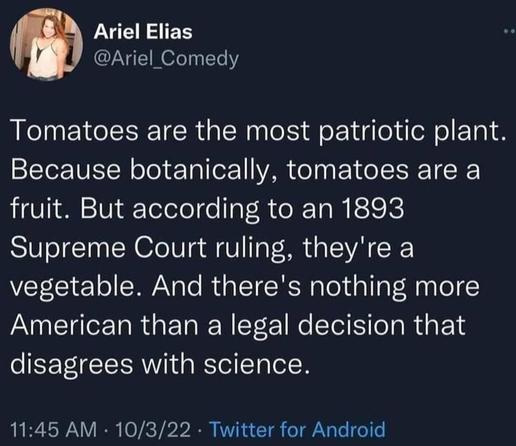
Nothing more American
Hey, go get your icons done by these awesome designers at @Iconfactory Look at this little robot dude they did for me. LOOK AT HIM! He's adorable. Worth every penny.
https://mastodon.social/@bigzaphod/114835065685492567
https://mastodon.social/@bigzaphod/114835065685492567
What if…?
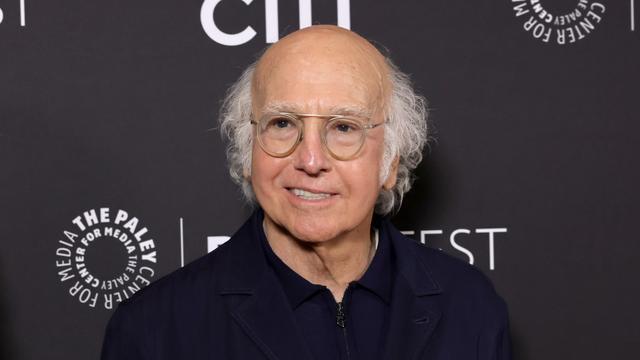
“I’ve sat across the table from some of the world’s most difficult leaders and wrestled with some of our most intractable problems. Nothing has prepared me for working with Larry David,” the former president [Obama] said in a statement.
https://www.hollywoodreporter.com/tv/tv-news/larry-david-hbo-american-history-sketch-series-1236311349/
https://www.hollywoodreporter.com/tv/tv-news/larry-david-hbo-american-history-sketch-series-1236311349/
and a video for a better demonstration
Just a quick mockup and obviously not perfect, but sorts out a the horrible active state, background muddiness at times, improves legibility and still has enough glass to still call it glass.
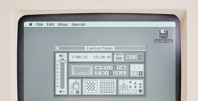
This is INCREDIBLE; the Macs alongside the text aren't showing screenshots, it's booting emulators so you interact with what's being written about, and even includes the NeXT https://aresluna.org/frame-of-preference/
There should be Epstein signs and reminders that are everywhere that Donald Trump and JD Vance travel to. Keep talking about him. This is clearly under rattling him and throwing him off. If you are participating in the next no kings protest don’t forget your Jeffrey Epstein-Donald Trump sign.


