Sorry, MacOS Tahoe Beta 2 Still Does the Finder Icon Dirty
https://daringfireball.net/linked/2025/06/24/sorry-macos-tahoe-b2-finder-icon
https://daringfireball.net/linked/2025/06/24/sorry-macos-tahoe-b2-finder-icon
This assumes that any of the top brass use Macs, or care
@daringfireball "the right side (the face in profile) looks like something stuck on top of a blue face tile. That’s not the Finder logo."
Isn't it an abstract depiction of a happy Mac screen being looked at by a happy human user isn't it?
Logically the human head would be on top. The original icon visually cued this in with the human's profile lines continuing out of the Mac shape.
Mac screens aren't tiny anymore. The new icon depicts the whole happy head in front of a larger happy Mac. No?
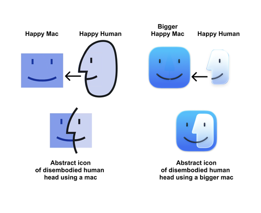
@daringfireball Basically, unless we don't agree that the left is a Mac and the right is a human, I'd argue the right side has always been on top, and that's even clear by the drop shadow on the face introduced when they got rid of the extended lines in 2014.
And maybe it looks weird on the new icon that the human head is disembodied... but so is the original Mac icon. They are both abstract representations of the same thing conceptually to me.
Either way it's fine to not like it visually.
@daringfireball the phaaaantom of the opera is here
inside your mind!
I totally agree with you.
1) I quite like the latest iteration and, as another commenter has pointed out, your concept of the Mac logo (or your concept of the “appliqué”, if you have to be pretentious about it) is wrong anyway.
2) Titling articles with the “Sorry, but…” construction is a far worse crime against style and good taste than anything Apple has done with the Finder logo.
3) I hope they keep this new logo, if only for the spectacle of your continued annoyance.
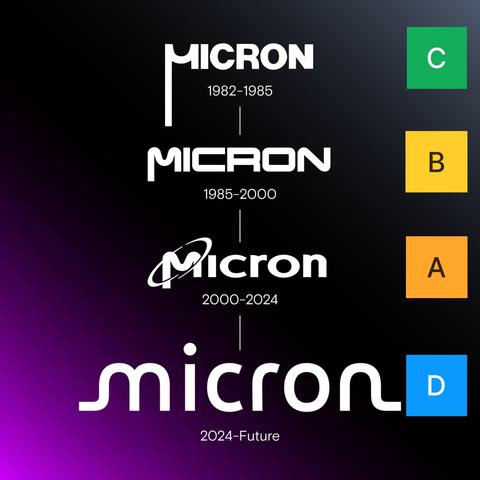
Attached: 1 image @atpfm@mastodon.social My company, Micron (the American DRAM maker) rebranded last year. It has not gone over well. I've tier-ranked the 4 logos since 1982. We also went to the san-serif, lower-cased, smooth and blobby, all-text logo... just jumping on that train for some reason. This came out a couple weeks before the disastrous Janguar rebrand with similar results. 1/4
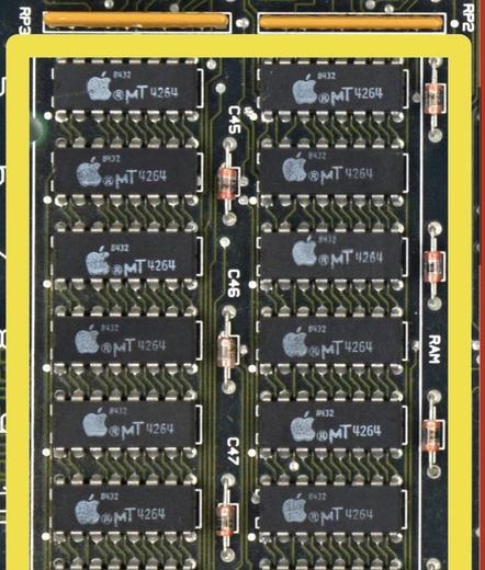
@daringfireball the same μ which was, by the way, printed in every memory chip in the 128K Macintosh
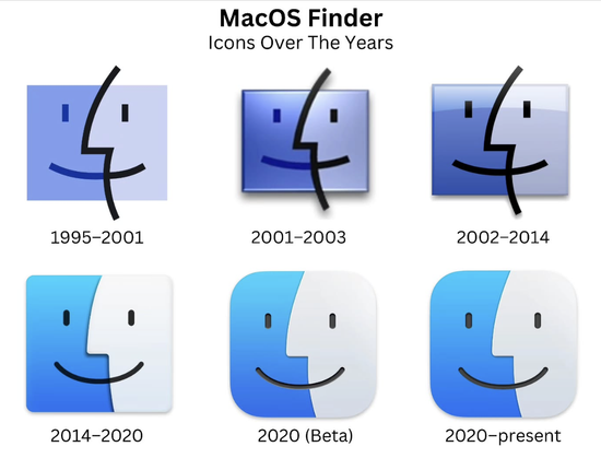
@daringfireball The semi-profile face was indeed the Mac icon before the Finder’s.
It is reminiscent of various icons in Apple's little-used PowerTalk workgroup software. And I believe it was first used upon startup in Mac OS 7.6, when "Mac OS" was first used because the clones couldn't call themselves a Macintosh.
The Finder never had a user-facing icon until OS X, once always in the dock.
(in classic System Folder, it had a generic classic-mac kind of icon most people wouldn't see)