Andy Norman

@andynormancx@mastodon.online
9 Followers
37 Following
421 Posts

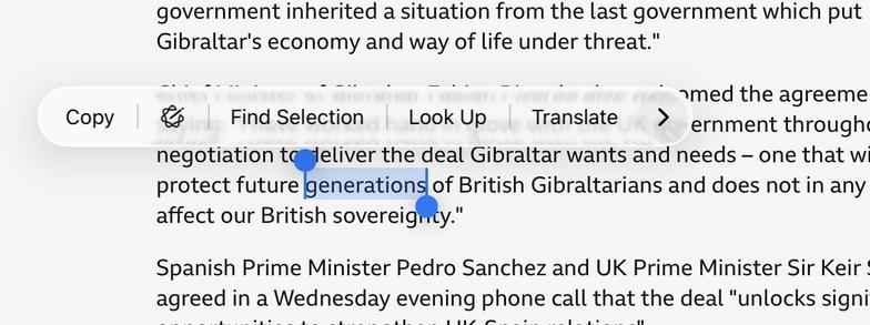
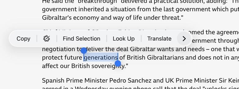
Liquid Glass’ blurred content everywhere is especially cruel to those of us who use reading glasses or progressives.

The reflex to seeing blurry text on our phones is to adjust our sight angle or distance to sharpen it. But, of course, it’s not our fault, doesn’t sharpen, and just causes eyestrain.

Text on my phone should never be blurry.
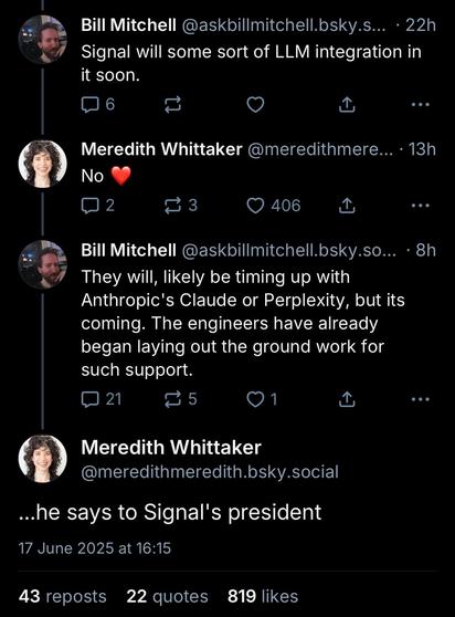
@marcoarment Don’t ask an LLM a factual question that you can’t test!

But here we are with a new visual design language that somehow manages to compromise on both the content area *and* the UI.

I’m *living* on macOS Tahoe and I’m here to tell you that the apps that are a pleasure to use are the ones that haven’t adopted Liquid Glass (in essence... all the third-party apps.)

This should be a blog post. But I need to collect my thoughts and write it all better. So consider this a beta version. lol

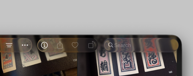
You know, I could write a whole blog post about this—and I might—but I think we need to start addressing the very likely possibility that the *entire thesis* that “UI should get out of the way” and “apps should focus on content” is wrong.

Apps aren’t just for looking at photos or videos. They’re for navigating through these things, organizing them, editing them. The tools to do those things should not get out of the way. They should be clearly defined and separate from the content.

I love a good mansplain smackdown.

@marcoarment @siracusa @jsnell I just don’t understand why anyone wants to see a corrupted version of some of their “content” through a UI control or text that has been made deliberately harder to read/understand than it would be otherwise ?

Especially where that content is text and therefore unreadable through the “glass” anyway.

I don’t get it.

I fucked up my repo so bad
@marcoarment @siracusa @jsnell I think I might end up using an automation to turn on “Reduce transparency” for the first few hours each day, until my 54 year old eyes have woken up

@marcoarment @siracusa @jsnell Apple have gone to so much effort to make text on a transparent background over other text as readable as they can…

(or at least I hope they have)

…but you know what would be a hell of a lot more readable, not making the background of the topmost text bloody transparent in the first place !

I remember now why I never used those always trendy transparent terminal windows for more than about three minutes 😉

@siracusa surely with Tim’s money the Liquid Glass physical mockups were transparent aluminium 😉