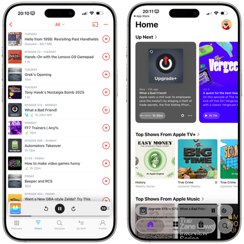
Pocket Casts for iOS 18 on the left, Apple Podcasts for iOS 26 on the right.

Between the illegible glass and the tab bar that disappears on scroll, I honestly have no idea who can take a look at this and say "Yes, that'll do it. That's good."

Liquid Glass is a mess so far, *especially* on iOS. Actually pushing me to use apps without Liquid Glass.

@viticci The glassy scrubber in the Weather app is a disaster of a UI element
@nileane @viticci oh wow… (screenshot from iPadOS 26 beta 4)
@andreitorres @nileane @viticci When you don’t need a tool to determine that buttons lack an accessible color contrast between foreground and background, I'm wary of the rest of the UI.
@andreitorres @viticci @nileane is it still like this? I went back to iOS 18 because on beta 3 my phone started constantly lagging even after reboots, but at this point I'll wait for iOS 26.1 before updating
@fuomag9 @viticci @nileane I think we will need a new 'snow leopard'-like release to adjust everything that's off on 26.
@andreitorres @fuomag9 @viticci @nileane
I think what we need is a new C-level product person at Apple—someone with good taste and common sense—to rein in Alan Dye’s ridiculous ideas and refocus on the overall user experience instead of just self-indulgent, minimalist aesthetics.
@andreitorres @nileane @viticci meanwhile in Mail. Invisible controls on bottom.

@Sonikku @andreitorres @nileane @viticci

Come on. This is simply a bug. Look at the navigation controls, they work the way the bottom controls will also work. This is beta 4 …

@andreitorres @nileane @viticci but who could have predicted the background to the map would have been pale ?!
@nileane @viticci Some apps like Weather and Music miss the scroll edge blur effect and some like Notes have just a gradient without blur at the top and bottom, which I think is a bug. I believe it looks worse than it would with those in place. Not that there are no other issues, but still.
@nicoreese @nileane @viticci and the blurred section at the bottom in Safari is not all scrollable, with no way of guessing where the scrollable “content” begins (that would have been hidden before). And when you let your swipe start too far down the screen it feels like the UI has locked up as it doesn’t scroll
@nileane @viticci turns out separating UI controls and the actual content made it easier to use, who could have guessed /s
@nileane @viticci Can’t wait to explain to my mom how to do stuff with UI elements she’ll barely even notice. Yay!
@nileane @viticci I genuinely just sat here tapping that image because I assumed the greyed out effect was because my Mastodon client hadn't fully loaded the image yet or something
@nileane @viticci RIP anybody with difficulty perceiving contrast differences, people viewing their phones in sunlight, or anybody viewing their device at night with lower brightness, I guess
@nileane @viticci what am I even looking at?