 Marco Arment
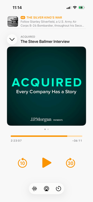
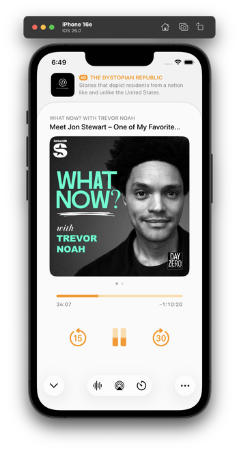
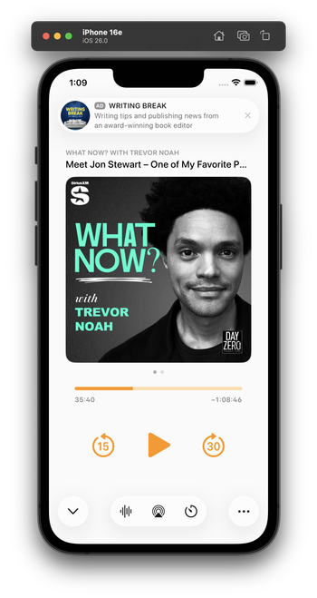
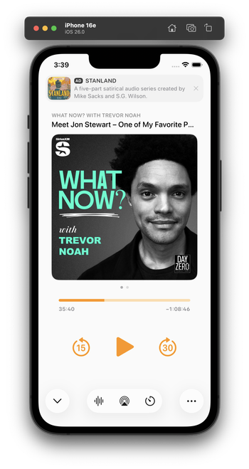
Integrating my now-playing controls with the new design language is hard. The biggest challenge: Where do I put the ad?
The system button-shadow style looks best at the screen edges, and can't stack (system-style toolbar buttons AND a capsule-style ad look bad next to each other).
Some options I'm playing with:


 Joe Rodricks
 Thomas Brock
 ToddLa
 FreediverX
 toastedmilk
 Paul Hoffman
 Ben Smith
 Valter Hemmi
 Orlando Gabriel Herrera, SOC
 Jan Philipp Sachse
 Chris De Jabet
 Michael Cook
 Eugene Kim
 Scott Edwards
 commandoptionp
 Steven Op de beeck
 Marc Robinson
 Stuart Barnes
 Ramón 🇨🇴
 deemy
deemy Alex
Alex Gary
Gary Nate Barham
 Mike Rastiello
 Jarrod Blundy
 TheEJJ 🇨🇦
 Brooks Seymore
 Nick Schaedel 🏳️🌈
 Jeff Rock
 Jon Maddox
 Josiah Wood
 colen
colen Tony Dehnke
 Daniel O’
 Thom Bullock
 Brandon Butler
 charlesesmith
 BenRiceM
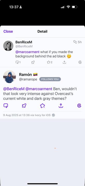
 Cesare Forelli
 Robert
 David Saker
 sukh
sukh HirteDerMeere
 Tim Fengler
 Arcticulate
 Fabian Pimminger