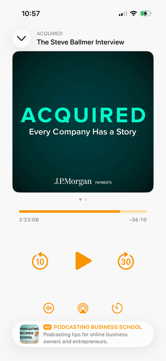
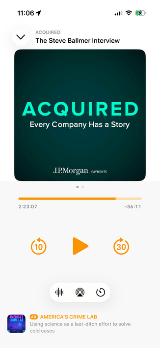
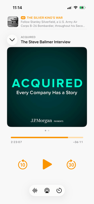
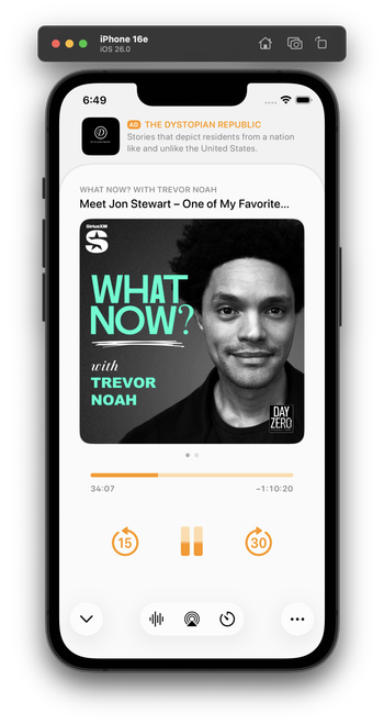
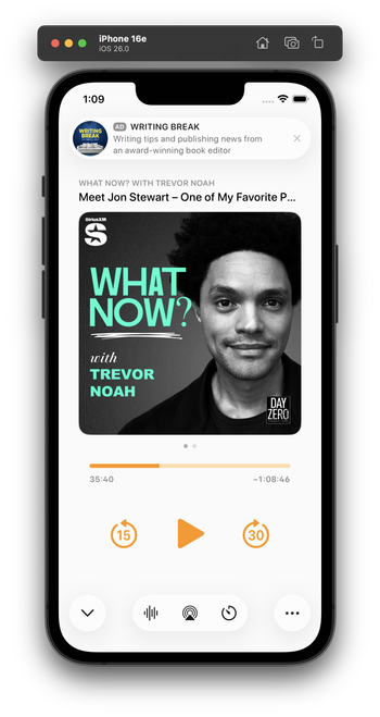
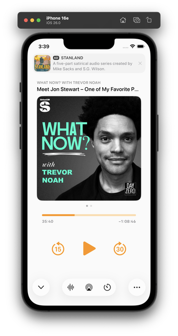
Integrating my now-playing controls with the new design language is hard. The biggest challenge: Where do I put the ad?

The system button-shadow style looks best at the screen edges, and can't stack (system-style toolbar buttons AND a capsule-style ad look bad next to each other).

Some options I'm playing with:

1 is the closest to the status quo.

2 seems safe, but I don't love the toolbar-style buttons floating in the middle like that.

Leaning toward 3 myself, but it's pretty different from the status quo.

Do you have a clear preference?

1: Bottom capsule ad, orange bottom controls
23.2%
2: Bottom flat ad, toolbar-style bottom controls
20.3%
3: Top flat ad, toolbar-style bottom controls
56.5%
Poll ended at .
I played with this wild idea a bit for a top ad. I don't think I like it, but I'm glad I tried it.

Everyone loves this one! I did, too, as a screenshot. But I build and use all of my designs to test them. This one’s downsides:

- It confuses the sheet-presentation metaphor

- When swiped to the show notes, it creates 3 levels of card depth, which is cluttered and doesn't fit the 26 design

- It needs a lot of vertical padding, which pushes the playback controls quite far down

This is why I build and live with my designs. I wouldn't find these tradeoffs in mockups or screenshots alone.

I've been using this design today. I think it looks great in screenshots, and improves a lot of those issues, especially in show-notes view (which lets the content scroll under the glass ad capsule).

In practice, though, it has a fatal flaw:

It always looks like I have a notification. And that's very distracting when it's sitting on a counter as I do stuff and I see it out of the corner of my eye.

Which I never would’ve realized until I lived with it on my phone for half a day.

Trying this variant for the second half of the day. It's less notificationey.

(I tried a border around the ad, but that doesn't fit 26's style and immediately looks old in context with the rest of the OS. And the low contrast between the backgrounds is, in this case, actually an upside — it makes it look less like a notification. I'm about 75% satisfied with this.)

(By FAR, the most time-consuming part of Overcast's design has always been the now-playing screen. You can see why it's so complicated!)

@marcoarment what’s the Alan Dye button for?

It feels off to me to have some buttons be the new UI and some the standard Overcast buttons.

@marcoarment Wouldn't the proper liquid glass-hole thing to do be to place the play/pause and skip buttons all shiny and clear over the artwork? #HalfKidding
@marcoarment I honestly appreciate the insight into the design thought process. Cool to watch it iterate.
@marcoarment I’ve got an audiobook application and share the same thoughts. My app needs a bit of a deeper refresh than Overcast did and I’m dreading the now playing screen.

@marcoarment and yet after years of using it, I still find it confusing.

Labels would help me a lot.

@marcoarment any of these styles from Phone provide some ideas?
@marcoarment I like the utility of the sheet dismiss button being at the bottom of the screen. Can you still swipe down on the sheet to dismiss it though?
@marcoarment have you considered moving the podcast title lockup below the artwork? It would be less busy up there where the ad meets the title.
@marcoarment it’s definitely the best revision you’ve come up with so far. Ads in Overcast were so thoughtfully designed to be unobtrusive, but being at the top of the screen it tends to keep drawing my attention in an unpleasant way. Don’t envy your decision making process 🍺
@marcoarment Does this work well on an iPhone mini?
@marcoarment The reason why i like the the idea of the ad on the the top is because the player controls are on the bottom. The user won’t accidentally trigger the ad this way.
@marcoarment Have you tried applying some sort of floaty drop shadow aesthetic to the transport control buttons, too? It feels like they should visually be on the same layer/level as the liquid glass bottom buttons.
@marcoarment My wife says “I dunno, they all looked good to me. I’m sure Marco will make a good choice.”

@marcoarment I’m not in love with how the bottom controls don’t have labels. It’s hard to tell what they are at a glance.

(And yes, I’m aware that the current design has this issue too)

@marcoarment What if you made the ad “dark mode” and integrated it into the status bar/ Dynamic Island area, making it look like the app starts slightly lower?
@marcoarment I’m sure this is a dumb question but - did you ever consider making the playback controls Liquid Glass?
@marcoarment you don’t prefer the main design language of the toolbar in bottom left with a ••• and the primary action (chevron) bottom right?
@marcoarment Had you considered making the entire ad space (and above) black so it appears almost separate?
@marcoarment As aside I really like the fullscreen playback screen and hope you keep it. 🙂
@marcoarment an #AD is basicly an unwanted notification, so I think you #NailedIt

@marcoarment
> looks like I have a notification.

Ugh, good point.

@marcoarment mmm I think people would just get used to it unless maybe it has some visual indicator.
@marcoarment "looks like I have a notification" is the reason I voted for putting it at the bottom. Many people like notifications, but no one wants ads that fool them.

@marcoarment Have you tried putting the ad between the podcast title and the podcast artwork? Then when sliding to the show notes, the title and the ad could be static and the show notes could slide in. The date of the episode on the show notes screen would be in the way, but this might give you the best of both worlds.

Might look terrible, but it might fix the persistent notification look

@marcoarment I think the now playing screen doesn’t need any Liquid Glass buttons except for maybe the “minimize” toolbar button in the upper left.

I think your existing screen would look good as is within a redesign. I would focus on the layer below with a search tab bar, accessory view for the mini player and updated navigation bar. My 2 cents. 🙂

@nstrm @marcoarment I agree that glass buttons don’t seem to belong outside the toolbar or not on top of scrolling content. Glasseffect floating in plain white or black appears over-designed
@marcoarment tbh, the „ad at the top“ placement to me makes this whole screen feel… cheap? Idk why or what it is, but I really, really prefer it anywhere else. I suppose because it’s the first thing I see when looking at the screen(shot)? Using it could be way different though
@marcoarment What if that same ad style went between the cover art and the progress bar? Or between the progress bar and player controls?
@marcoarment Oh wow it really does doesn’t it.
@marcoarment I think that’s the biggest flaw of the entire Liquid Glass design philosophy. It claims to get out of the way of your content but the shininess of it actually catches your eye and draws it away.

@marcoarment Place the ad between the pause/resume and audio controls.

Hide the ad for a moment when a user first opens the playback screen. Then have an animation that slides the ad up behind the bottom controls. With Liquid Glass, the ad would move under these controls which gives the indication that this is below the content/control layer and the animation would indicate that that it’s not a part of the content/control layer and instead a temporary element that is separate.

@marcoarment I think this is your best option, unfortunately. Keeps the ad out of the wasteland in the middle and out of the bottom.
@marcoarment Liquid Glass looks kind of boring and white without background :/ For me one of the bigger downsides of this design. Not every interface will have floating content beneath.
@marcoarment is putting the ad between the title and the image an option? or does that interrupt the main information of the episode to much?
@marcoarment Lower play buttons would be easier to reach IMO
@marcoarment, what if, instead, the ad is on a black background, as if the sheet doesn’t reach the top and whatever was behind faded to black, leaving space for the ad?
@marcoarment Yeah I like the look of that version, but when you think about it, it’s making the ad look like the permanent content while the podcast looks like a card that’s temporarily slid up in front of it.
@marcoarment I think the one you showed the other day with the simple divider line between them was the best one.
@marcoarment Apple designers would have stopped at the design looking good in mockups.

@marcoarment yet to see a posted design of yours that I hate. Prefer some over others but none suck.

You’re right tho. It’s different using vrs a screenshot

If only Dye recognised that.