 Marco Arment
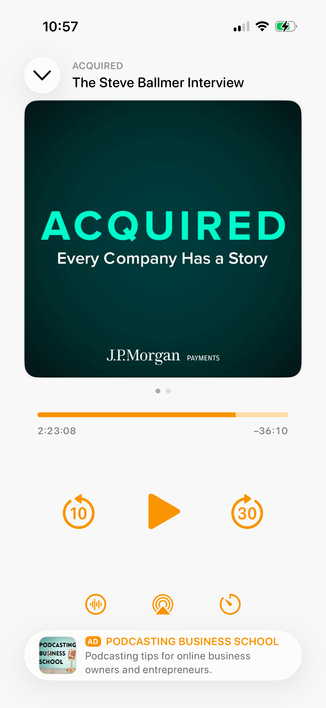
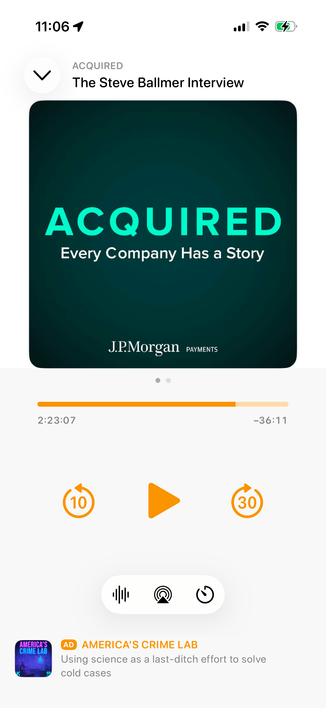
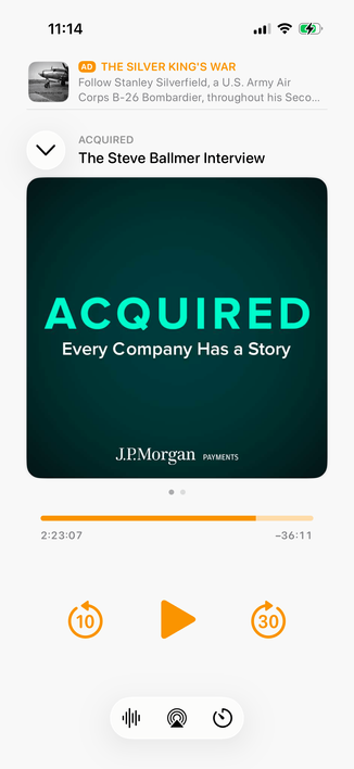
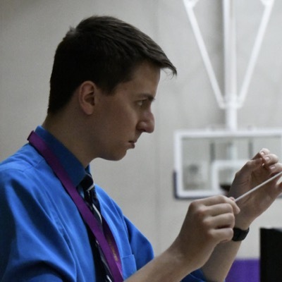
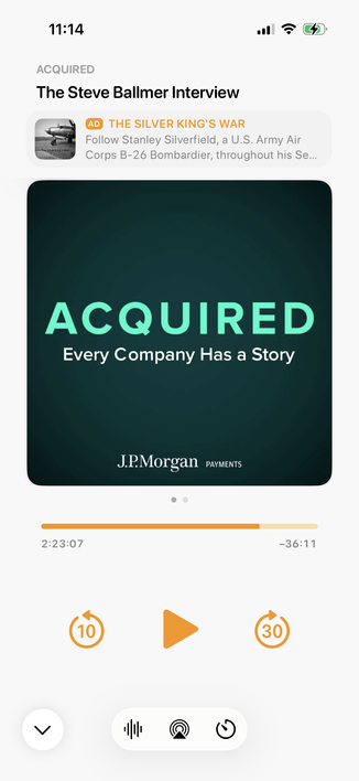
Integrating my now-playing controls with the new design language is hard. The biggest challenge: Where do I put the ad?
The system button-shadow style looks best at the screen edges, and can't stack (system-style toolbar buttons AND a capsule-style ad look bad next to each other).
Some options I'm playing with:
 Ehler
Ehler Jim Mc
 Michael Boyle
 ziplyne
 tambourineman
 Ramón 🇨🇴
 Thom Bullock
 Marc Bizer
 Scott Edwards
 Steven Op de beeck
 Marc Robinson
 BenRiceM
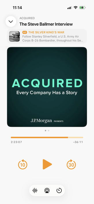
 Adam Bell
 Ste Grainer
 Jason Snell
 Jari Pennanen
 Jan Lehnardt
 Dimitry
 Nathan Snelgrove
 Warner Crocker
 Cory Birdsong
 John Appleseed
 Michael Cook
 Stuart Gibson
 LeleSōchō - Gabriele
 Adam Meyer
 Brandon Butler
 Neil Henning
 Craig Hockenberry
 Matt Christensen
 Chase Carroll
 Orlando Gabriel Herrera, SOC
 Scott Wright 🏳️🌈🏳️⚧️
 Jon Anderson
 Jason Petersen (he)
 Graham Ballantyne
 Dean Mayers
 Hans has moved
 Jiji, the cat
 Duncan Blair
 Wade
Wade David Lynch