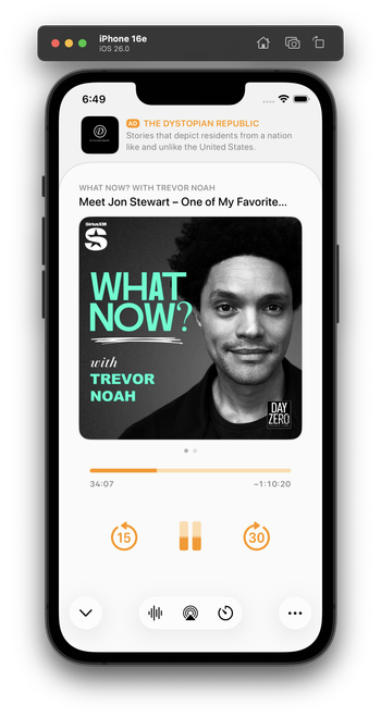
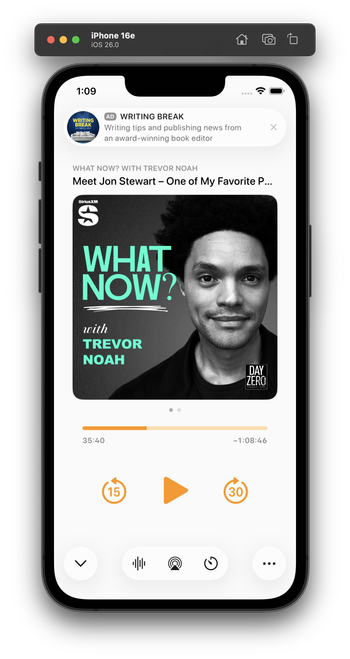
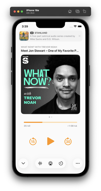
Integrating my now-playing controls with the new design language is hard. The biggest challenge: Where do I put the ad?

The system button-shadow style looks best at the screen edges, and can't stack (system-style toolbar buttons AND a capsule-style ad look bad next to each other).

Some options I'm playing with:

1 is the closest to the status quo.

2 seems safe, but I don't love the toolbar-style buttons floating in the middle like that.

Leaning toward 3 myself, but it's pretty different from the status quo.

Do you have a clear preference?

1: Bottom capsule ad, orange bottom controls
23.2%
2: Bottom flat ad, toolbar-style bottom controls
20.3%
3: Top flat ad, toolbar-style bottom controls
56.5%
Poll ended at .
I played with this wild idea a bit for a top ad. I don't think I like it, but I'm glad I tried it.

Everyone loves this one! I did, too, as a screenshot. But I build and use all of my designs to test them. This one’s downsides:

- It confuses the sheet-presentation metaphor

- When swiped to the show notes, it creates 3 levels of card depth, which is cluttered and doesn't fit the 26 design

- It needs a lot of vertical padding, which pushes the playback controls quite far down

This is why I build and live with my designs. I wouldn't find these tradeoffs in mockups or screenshots alone.

I've been using this design today. I think it looks great in screenshots, and improves a lot of those issues, especially in show-notes view (which lets the content scroll under the glass ad capsule).

In practice, though, it has a fatal flaw:

It always looks like I have a notification. And that's very distracting when it's sitting on a counter as I do stuff and I see it out of the corner of my eye.

Which I never would’ve realized until I lived with it on my phone for half a day.

Trying this variant for the second half of the day. It's less notificationey.

(I tried a border around the ad, but that doesn't fit 26's style and immediately looks old in context with the rest of the OS. And the low contrast between the backgrounds is, in this case, actually an upside — it makes it look less like a notification. I'm about 75% satisfied with this.)

(By FAR, the most time-consuming part of Overcast's design has always been the now-playing screen. You can see why it's so complicated!)

@marcoarment what’s the Alan Dye button for?

It feels off to me to have some buttons be the new UI and some the standard Overcast buttons.