glamcode

@glamcode@openbiblio.social
347 Followers
1.4K Following
5.2K Posts
Software Engineer at a scientific library. Personal account.
Currently working on#DSpace #OpenAccess #Publishing
Favourite programming language#Pharo #Smalltalk
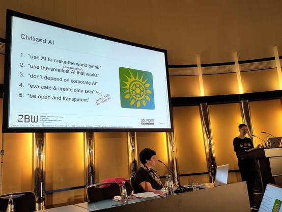
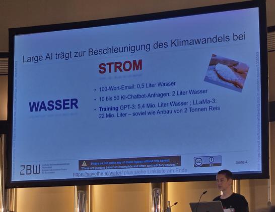
Gerade spricht @SemAntiKast auf der #BiblioCon25 über sozial-ökologische Auswirkungen von Large-Scale AI #LLMs und Wege zu einer klima- und sozialverträglichen Nutzung von Künstlicher Intelligenz. Ein zentraler Gegenwurf ist auf der Folie im Foto zu sehen. #KI #GenerativeKI #bid25 #BibliothekenEntschlossenDemokratisch
Hier übrigens noch die Strichliste zu dem Veranstaltungsblock "KI + Veränderung" gerade eben auf der #BiblioCon25. Kann gerne zu Forschungszwecken verwendet werden.
#KI #GenerativeKI #LLMs #Bibliotheken #Informationskompetenz #bid25 #BibliothekenEntschlossenDemokratisch

Instagram collects scary amounts of your data 🫣 Mastodon on the other hand - None! ✅

What do we learn? There are great services available that do not abuse your data.

Ich hab mich auf den #bibliocon25 Beitrag von @SemAntiKast zur klima- und sozialverträglichen Nutzung von #KI gefreut: Die Auswirkungen werden sehr gut nachvollziehbar gemacht: Fürs Generieren einer 100-Wort-Mail könnte das eigene Smartphone 7x geladen werden. Eine Unterhaltung mit einem KI-Chatbot verbraucht schnell 2 Liter Wasser. Natürlich zahlen wir auch persönlich mit Daten und Privatsphäre. Also: Eigene KI-Nutzung reflektieren und als #Bibliothek fürs Thema sensibilisieren.

PSA: Vaccination schedules on the CDC website have already started changing under RFK Jr., so Scientific American published a guide to the evidence-based vaccine recommendations in place *before* all 17 members of the advisory panel were abruptly dismissed by the new administration.

https://www.scientificamerican.com/article/see-vaccine-recommendations-backed-by-science-in-these-handy-charts/

See Vaccine Recommendations Backed by Science in These Handy Charts

These graphics will guide you through science-based vaccine guidelines for children and adults

Scientific American

Dear @creativecommons ,

I read your article about your initiative for new licenses for dataset holders in the AI industry.

Let’s be clear: I do not want to re-license my hundreds of CC-By comic pages to please AI giants.

I wish you would support CC artists suffering from massive plagiarism. You should enforce your own existing licenses against AI mass crawling. It seems you’ve joined the battle only after the casualties and still managed to side with the wrong people.

https://creativecommons.org/2025/06/25/introducing-cc-signals-a-new-social-contract-for-the-age-of-ai/

Introducing CC Signals: A New Social Contract for the Age of AI - Creative Commons

CC Signals © 2025 by Creative Commons is licensed under CC BY 4.0 Creative Commons (CC) today announces the public kickoff of the CC signals project, a new preference signals framework designed to increase reciprocity and sustain a creative commons in the age of AI. The development of CC signals represents a major step forward…

Creative Commons
As requested by @rvr, here's a control sample from Lion, the reimagined Lion by @realmacdan, Sequoia, and Tahoe beta 2.

Six months ago: get attacked in multiple executive orders that declare everything you work on in STEM education "illegal", funding pulled from your field

Now: get EDI award as you continue to do the work anyway, as you always have and always will

You absolute badass @analog_ashley

Anthropic destroyed millions of print books to build its AI models
Company hired Google's book-scanning chief to cut up and digitize "all the books in the world."
https://arstechnica.com/ai/2025/06/anthropic-destroyed-millions-of-print-books-to-build-its-ai-models/?utm_brand=arstechnica&utm_social-type=owned&utm_source=mastodon&utm_medium=social

📣 Wir haben gelernt: Fachliche Expertise allein reicht nicht. Was wir brauchen, ist mehr Aufmerksamkeit und öffentlicher Druck.

🔐 In der aktuellen Weltlage ist eines besonders wichtig: sichere und vertrauliche Kommunikation.

#ProtectEU #Chatkontrolle

×
As requested by @rvr, here's a control sample from Lion, the reimagined Lion by @realmacdan, Sequoia, and Tahoe beta 2.
To be more fair to Tahoe, here's a version where I re-aligned the controls to accommodate the new metrics. I've also included Yosemite in this one. (I'd add more, but there's apparently a four-picture limit.)
A few more older ones, plus Tahoe beta 2 dark mode.
Here are some great “reimagined” Retina-resolution images of some older versions of Mac OS X created by @kylehalevi
@siracusa it was just the time of my first Mac but I’ll always love snow leopard.
@siracusa What happened to the indeterminate progress bar?
@manum @siracusa Doesn’t it go side to side like KITT in Knight Rider?

@manum @siracusa Computing became perfectly deterministic, of course.

/s

@manum I think maybe it animates back and forth.

@siracusa My favourites are always the oldest ones. It’s true that the deeper blues in the newer versions add more contrast and what’s active stands out more, but the UI of the older Mac OS X versions didn’t need all that contrast to begin with. The active state of buttons and checkboxes was pretty much evident in context.

Thanks for posting these!

@siracusa Tahoe dark mode looks a lot better than Tahoe light mode which is kind of disappointing given that I hate dark mode.
@siracusa I think Snow Leopard’s UI with the legibility of Mavericks would be perfect.
@siracusa not having translucence on controls that were previously translucent when you're trying to promote your design as "liquid glass" seems like a pretty major miss with Tahoe. The buttons, progress bars, and stoplight controls are so flat and boring
@siracusa Also, they cannot be described as "lickable", the true hallmark of OS X design!
@Alphacheez @siracusa Agreed. The traffic lights not being made of Liquid Glass is a huge miss for [1] UI legibility, [3] "looks cool" consistency, and [3] candid throwback/nostalgia.
@siracusa Tahoe beta 2 dark mode looks like a discarded theme from a Kaleidoscope 13 years old enthusiast…
@siracusa is everything a lot more cramped now or is the scaling playing tricks on me?
@callin Some of those images are Retina and some are not, so that probably accounts for what you’re seeing.
@siracusa I *loved* the "lick-able" Aqua UI. Panther/Tiger was peak Aqua days.
@siracusa I really prefer how defined and readable everything is in the Lion/Mavericks versions. Aqua was so refined looking at that point.
@siracusa I forgot how much Lion refined Aqua.
@siracusa what about Platinum? 😉
@siracusa it’s like they’re using one of those bags you put clothing in and vacuum all the air out, but for detail, whimsy, and usability.
@siracusa The enabled but not selected button looks disabled. I wonder how it compares to an actual disabled button.
@siracusa thanks for the updated version. Now my mind can focus on hating Tahoe's lack of contrast and the vertical alignment of the date field 

@siracusa Now in Tahoe the “Button” in the middle row is barely detectable as such, just tiny bit of contrast makes the button. Similar with the “Test | One | Two“. Someone should read the AHIG.

And I hope that “high contrast” “disability mode” fixes this.

@siracusa Tahoe is the worst for legibility.
@BucciaBuccia @siracusa It really is terrible for legibility. The lack of contrast is boggling. Everything after Aqua has been a downgrade, even taking into account some of Aqua's excesses (and even that is debatable).
@siracusa @rvr Sequoia and Tahoe are so much worse 😩
@siracusa @rvr @realmacdan I thought we were moving away from flat design.
@siracusa @rvr @realmacdan It just keeps getting worse over time to my eyes.

@siracusa @rvr @realmacdan

"It's glass! You know, matte, flat glass with no specular reflection at all."

@siracusa @rvr @realmacdan also, am I the only one bothered by the spacing and alignment in the Tahoe version?
@andreitorres @rvr @realmacdan You can blame that on the GUI sample project, which doesn't account for the new control metrics.
@siracusa @andreitorres @rvr @realmacdan That would explain why it looks more cramped than the Sequoia version.

@siracusa @rvr @realmacdan

The indeterminate progress bar is awful in Tahoe and Sequoia.

@siracusa @realmacdan The only improvement from the Lions are the tab controls
@siracusa @rvr @realmacdan I can't... Tahoe is such a mess! 🙈
@siracusa I think my biggest annoyance is that things haven't gotten any bigger. They seem a little too small these days.
@siracusa Lion nostalgia is a hell of a drug
@jsnell @siracusa live action Disney remakes included
@jsnell @siracusa And yet it was a really rocky experience when it was released.
@siracusa Tahoe is so bad. Haven’t installed the beta yet and this doesn’t encourage me to do so.
@siracusa @rvr @realmacdan I have this idea in my head that a button is something you push. So a button has to be convex. Sequoia buttons look flat and Tahoe buttons look concave. My eyes do not believe these buttons can be pushed. I guess, i can’t trust them. Sigh.

@siracusa @rvr @realmacdan Now we just need to wait about a decade to get back to the same level of usability and functionality that we have now, only to then have it undone by another redesign!

History really is cyclical.

@siracusa @rvr @realmacdan i like the reimagined lion best.
@siracusa @rvr @realmacdan Lion-Retina looks best to me.
@siracusa @realmacdan @rvr @mescutia, I’m not a fan of rounded corners up top, pointy down below, though. :/
@volemo @siracusa @realmacdan @rvr @mescutia The high-res Lion seen here is a recreation. The actual UI from that era has rounded corners at the bottom of the window as well, just like the non-Retina version.

@tuomas_h @siracusa @realmacdan @rvr @mescutia, yeah-yeah, I know. But Mike was talking about the Lion-Retina specifically.

Plus, I'd choose even Tahoe over non-Retina experience. :P

@volemo @siracusa @realmacdan @rvr @mescutia Yeah I might have misunderstood the intent of the toot. Just wanted to clarify that this isn’t what you would’ve seen at the time on a retina screen.

Anything post-Big Sur basically requires a retina (2x) screen. The experience on 1x monitors is so bad, it’s like they don’t even test it on those, with all the blurry and distorted icons everywhere. I’m still not sure if I would prefer Tahoe over the old design that looked gorgeous at 1x 🤔

@tuomas_h @siracusa @realmacdan @rvr @mescutia

> Just wanted to clarify that this isn’t what you would’ve seen at the time on a retina screen.

Wait, Lion supported Retina displays? I had it on a 2012 MackBook Air and at that point didn't know Retina was a thing.

@volemo @siracusa @realmacdan @rvr @mescutia Yes, indeed it did. It was the version that came on the first Retina Macs (15” MacBook Pro to be exact) in 2012.
@tuomas_h @siracusa @realmacdan @rvr @mescutia, now I think maybe I never used Lion proper and my first Mac was running Mountain Lion. :/
@siracusa I’ve never gotten the lickability paradigm all these years until this series of screenshots and Lion was my first personal Mac experience. @rvr @realmacdan
@siracusa what in the hell is happening over there?

@siracusa I guess they forgot about combo box 🤷‍♂️

I kind of hoped silently that they'll bring small depth of Big Sur/Sequoia macOS design to iOS - but sadly the other way around happened.

To be honest: AppKit apps with "classic" controls now looks like Win 95 apps on Windows XP - same vibe…

@siracusa @rvr @realmacdan If I had a choice I’d go back to Lion.
@siracusa @rvr @realmacdan Where's the glass in Tahoe? 🥃❓