I hope I live long enough to see this style philosophy come back around. https://mastodon.social/@realmacdan/113792374380828124
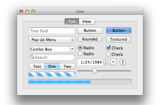
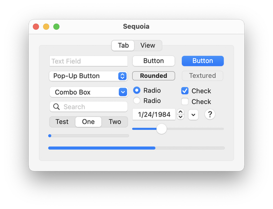
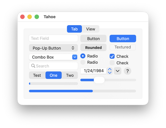
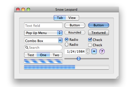
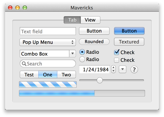
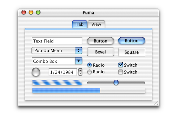
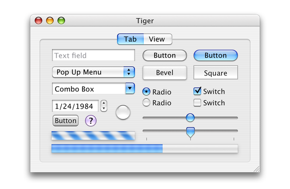
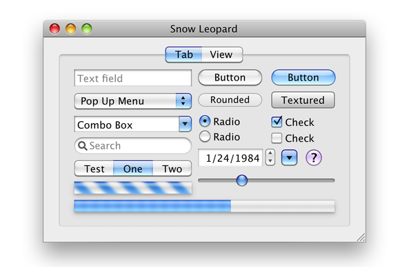
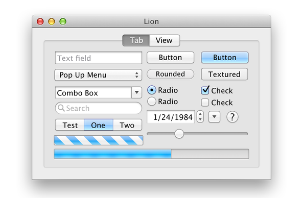
As requested by @rvr, here's a control sample from Lion, the reimagined Lion by @realmacdan, Sequoia, and Tahoe beta 2.


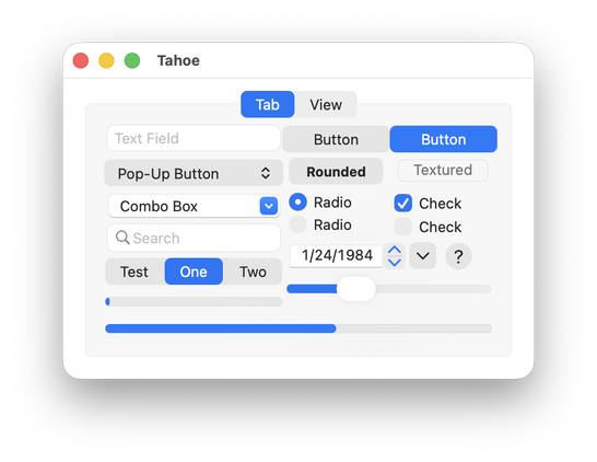
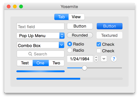
To be more fair to Tahoe, here's a version where I re-aligned the controls to accommodate the new metrics. I've also included Yosemite in this one. (I'd add more, but there's apparently a four-picture limit.)

Here are some great “reimagined” Retina-resolution images of some older versions of Mac OS X created by @kylehalevi
@vmachiel I’ve only been using Macs since 2019, but I would pay so much money for an OS redesign with that much visual clarity.
You’re not biased, Apple has just forgotten where its priorities should lie.
@niekvdpas yeah, it’s pretty to look at these days. But we don’t look at our devices: we use them.
@siracusa If you had to choose one of these styles to go back to (with Retina-quality, of course), what would you choose? I think Lion might actually be my favorite in some ways.
@siracusa What happened to the indeterminate progress bar?
@siracusa My favourites are always the oldest ones. It’s true that the deeper blues in the newer versions add more contrast and what’s active stands out more, but the UI of the older Mac OS X versions didn’t need all that contrast to begin with. The active state of buttons and checkboxes was pretty much evident in context.
Thanks for posting these!
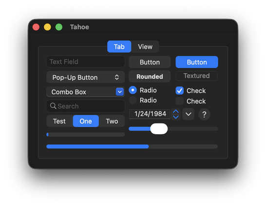
@siracusa Tahoe dark mode looks a lot better than Tahoe light mode which is kind of disappointing given that I hate dark mode.
@siracusa I think Snow Leopard’s UI with the legibility of Mavericks would be perfect.
@siracusa not having translucence on controls that were previously translucent when you're trying to promote your design as "liquid glass" seems like a pretty major miss with Tahoe. The buttons, progress bars, and stoplight controls are so flat and boring
@siracusa Also, they cannot be described as "lickable", the true hallmark of OS X design!
@Alphacheez @siracusa Agreed. The traffic lights not being made of Liquid Glass is a huge miss for [1] UI legibility, [3] "looks cool" consistency, and [3] candid throwback/nostalgia.
@siracusa Tahoe beta 2 dark mode looks like a discarded theme from a Kaleidoscope 13 years old enthusiast…
@siracusa is everything a lot more cramped now or is the scaling playing tricks on me?
@callin Some of those images are Retina and some are not, so that probably accounts for what you’re seeing.

@siracusa I forgot how much Lion refined Aqua.
@siracusa it’s like they’re using one of those bags you put clothing in and vacuum all the air out, but for detail, whimsy, and usability.
"It's glass! You know, matte, flat glass with no specular reflection at all."
@siracusa @rvr @realmacdan also, am I the only one bothered by the spacing and alignment in the Tahoe version?
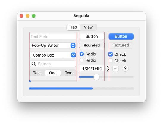
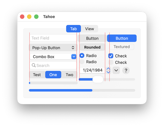
@andreitorres @rvr @realmacdan You can blame that on the GUI sample project, which doesn't account for the new control metrics.
@siracusa @andreitorres @rvr @realmacdan That would explain why it looks more cramped than the Sequoia version.
The indeterminate progress bar is awful in Tahoe and Sequoia.
@siracusa @realmacdan The only improvement from the Lions are the tab controls

@siracusa I think my biggest annoyance is that things haven't gotten any bigger. They seem a little too small these days.
@siracusa Lion nostalgia is a hell of a drug
@siracusa Tahoe is so bad. Haven’t installed the beta yet and this doesn’t encourage me to do so.
@siracusa @rvr @realmacdan I have this idea in my head that a button is something you push. So a button has to be convex. Sequoia buttons look flat and Tahoe buttons look concave. My eyes do not believe these buttons can be pushed. I guess, i can’t trust them. Sigh.
@siracusa @rvr @realmacdan Now we just need to wait about a decade to get back to the same level of usability and functionality that we have now, only to then have it undone by another redesign!
History really is cyclical.
@siracusa @realmacdan @rvr @mescutia, I’m not a fan of rounded corners up top, pointy down below, though. :/
@volemo @siracusa @realmacdan @rvr @mescutia The high-res Lion seen here is a recreation. The actual UI from that era has rounded corners at the bottom of the window as well, just like the non-Retina version.
@tuomas_h @siracusa @realmacdan @rvr @mescutia, yeah-yeah, I know. But Mike was talking about the Lion-Retina specifically.
Plus, I'd choose even Tahoe over non-Retina experience. :P
@volemo @siracusa @realmacdan @rvr @mescutia Yeah I might have misunderstood the intent of the toot. Just wanted to clarify that this isn’t what you would’ve seen at the time on a retina screen.
Anything post-Big Sur basically requires a retina (2x) screen. The experience on 1x monitors is so bad, it’s like they don’t even test it on those, with all the blurry and distorted icons everywhere. I’m still not sure if I would prefer Tahoe over the old design that looked gorgeous at 1x 🤔
@tuomas_h @siracusa @realmacdan @rvr @mescutia
> Just wanted to clarify that this isn’t what you would’ve seen at the time on a retina screen.
Wait, Lion supported Retina displays? I had it on a 2012 MackBook Air and at that point didn't know Retina was a thing.
@volemo @siracusa @realmacdan @rvr @mescutia Yes, indeed it did. It was the version that came on the first Retina Macs (15” MacBook Pro to be exact) in 2012.
@siracusa I’ve never gotten the lickability paradigm all these years until this series of screenshots and Lion was my first personal Mac experience. @rvr @realmacdan
@siracusa what in the hell is happening over there?
@siracusa I guess they forgot about combo box 🤷♂️
I kind of hoped silently that they'll bring small depth of Big Sur/Sequoia macOS design to iOS - but sadly the other way around happened.
To be honest: AppKit apps with "classic" controls now looks like Win 95 apps on Windows XP - same vibe…