Hallo, Welt. 👋
@KIT_Karlsruhe läuft ab sofort auf der eigenen Instanz social.kit.edu. 
Die Instanz läuft zunächst als Pilotprojekt und dient als Informations- und Vernetzungsplattform für die #Wissenschaftskommunikation von Einrichtungen und Projekten des #KITKarlsruhe. Nach Ablauf der Pilotphase wird entschieden, ob die Instanz dauerhaft weiterbetrieben und für weitere Personengruppen freigegeben werden soll.
Spread the word!
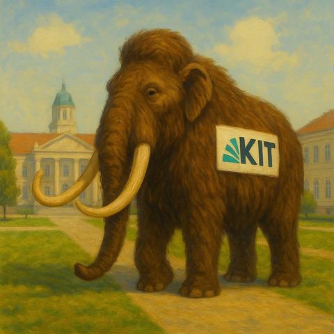
(Bild KI-generiert)
#neuhier - die Instanz. 😜