glamcode

@glamcode@openbiblio.social
408 Followers
1.6K Following
6.8K Posts
Software Engineer at a scientific library. Personal account.
Currently working on#DSpace #OpenAccess #Publishing
Favourite programming language#Pharo #Smalltalk

I know many of you who follow me don't work in climate science, but this is the biggest story in climate right now. Breaking up NCAR makes us all less safe and is another act of self-harm that will take decades to recover from.

https://wapo.st/4p3YwDx

Trump officials to dismantle ‘global mothership’ of climate forecasting

Russell Vought, who directs the White House Office of Management and Budget, announced plans to split up the National Center for Atmospheric Research in Boulder, Colorado, citing concerns about “climate alarmism.”

The Washington Post
Watched this quite a bit as a youngster - thanks to Dad's VHS and Bergman fandom, can't believe my last watch was a couple of decades ago.
Most gorgeous black and white watch - Casablanca
#Movie #MovieNight
Umdenken für eine lebendige Torstraße - Die Zukunft unserer Stadt mit den Menschen gestalten - Online petition

Die Torstraße, eine der wichtigsten Straßen im Berliner Bezirk Mitte, soll erneuert und umgestaltet werden. Über 10 Mio. Euro will der Berliner Senat allein für den ersten Bauabschnitt zwischen Chausseestraße und Rosenthaler Platz ausgeben. Es kommt selten vor, dass eine bestehende Straße auf der ganzen Breite - von Haus zu Haus - erneuert wird. Das bietet die einmalige Chance, die künftige Straße zukunftsfähig zu gestalten, denn so wie die Straße heute gebaut wird, muss sie die nächsten 50 bis

openPetition
@peterjelinek OMG, während alle Welt Solaranlagen und Batteriespeicher baut werden wir ein Freilichtmuseum für Atomkraft und Verbrennungsmotoren? Vielleicht kommen ja Touristen um sich das anzusehen. Und dazu der Schwenk auf die 85-jährigen Stoiber und Weigel und der Söder schläft auch schon ein 🤦

Believe it or not, I’m still figuring out where HTML got its angle brackets.

But despite grabbing a lot of interlibrary items, I am not sure I’m getting any closer. I still have some ideas, but one involves going to a museum in Maine, which might take a while.

However, good news (for someone?): There are now over 40 papers and books I scanned that deal with history of markup. Enjoy!

https://archive.org/details/wicharytypewriter?tab=collection&query=subject%3A%22markup%22

Internet Archive: Digital Library of Free & Borrowable Texts, Movies, Music & Wayback Machine

Kann nur hoffen, dass bei Eintreten dieses Unsinns ein paar Absolvent:innen mit durchschnittlicher Digitalkompetenz und Restanstand den IT-Bums hacken und stattdessen die Internationale abspielen. Einfach. Aus. Prinzip.
JOB @UB_HUBerlin! Wir suchen eine Leitung des neu zu gründenden Open-Access-Referats. Rückfragen gerne an mich! https://www.hu-berlin.de/universitaet/arbeiten-an-der-hu/stellenangebote/details/an42925
Leitung Open-Access-Referat (m/w/d) - Humboldt-Universität zu Berlin

Tag der Menschenrechte - bedeutet auch:

* Keine Kürzungen beim Bürger*innengeld
* Wohnungen und Unterstützung auf Augenhöhe für obdachlose Menschen
* keine Vertreibung von bettelnden Menschen aus Innenstädten
* mehr finanzielle Mittel gegen Armut
* keine Abschiebungen
* Recht auf anwaltliche Vertretung von Asylsuchenden
* Recht auf Selbstbestimmung für trans und nicht-binäre Menschen
* Gesetzlich verankerte Übernahme von medizinischen Transitionsmaßnahmen durch die Krankenkassen
* mehr Mittel zur Unterstützung von an ME/CFS erkrankten Personen
* mehr Barrierefreiheit
* mehr Psychotherapiemöglichkeiten (für alle Menschen)
* uvm.
* und natürlich: all dies immer und überall gegen Rechte jeder Couleur zu verteidigen.

Das Desaster bei der Bahn (Verspätungen Zugausfälle etc) ist der CSu geschuldet, es war und ist ihr Verantwortungsbereich, mittlerweile gewinnt man den Eindruck das war gewollt, um dem Auto den Vorrang einzuräumen...
×
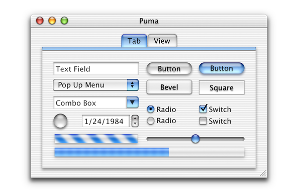
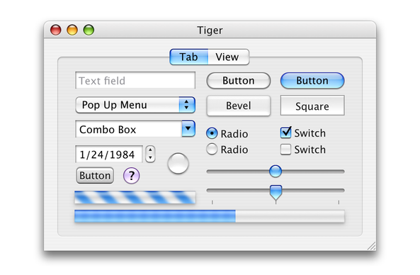
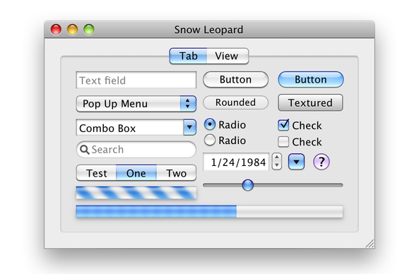
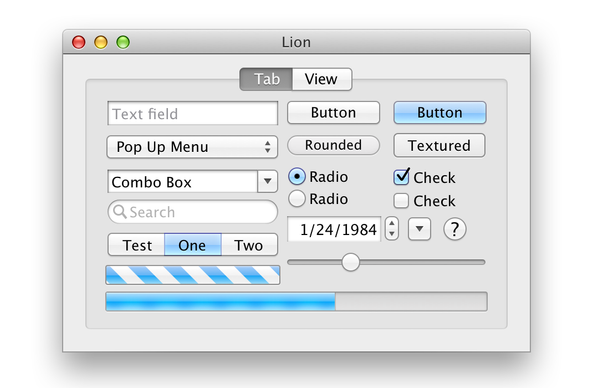
A few more older ones, plus Tahoe beta 2 dark mode.
Here are some great “reimagined” Retina-resolution images of some older versions of Mac OS X created by @kylehalevi
@siracusa If you had to choose one of these styles to go back to (with Retina-quality, of course), what would you choose? I think Lion might actually be my favorite in some ways.
@trentshell @siracusa I know my favorite would be Snow Leopard. It's the most refined version with the pill buttons and feels the most Aqua.
@trentshell They all had their own issues, but I think Tiger would be a fun balance of nostalgia and usability.
@siracusa @kylehalevi I would take pinstripes over Liquid Glass any day.
@siracusa @kylehalevi I will take any of them over Liquid Gl**ass**
@siracusa In my opinion Lion was perhaps the best UI of all time. It took the visual distinctiveness & fun of original Aqua and made it clean & elegant yet still a joy to use.
@siracusa @kylehalevi oh, that Tahoe dark mode is a delight, but the snow leopard is lovely too. Honestly, I’d take any of these!!
@siracusa was Mavericks considered Aqua? I remember I upgraded from my 2008 15” MBP to a late 2013 15” and Mavericks just felt really good and stable.
@LoganHighlen Apple's use of the term "Aqua" faded once the buttons stopped looking like clear candies, but you'd still hear it from time to time (and it appeared in Apple's code constants).
@siracusa @kylehalevi
IMO, Lion was the perfect amount of Aqua. Subtle, elegant, functional.
Unfortunately, we will have to wait several versions until Liquid Glass will be finessed the same way.
@siracusa @kylehalevi I can’t decide between Lion or Snow Leopard.
@siracusa @kylehalevi I think folks at Apple were already working on high DPI/"Retina" back in Tiger days - you could increase the user interface scale using Quartz Debugger: https://www.interact-sw.co.uk/iangblog/2005/05/20/tigerresolution
Resolution Independence in OS X Tiger

Ian Griffiths' Weblog

Mac OS X 10.4 Tiger

Apple's latest OS X release (10.4) is about to hit the streets. Tiger brings a …

Ars Technica
@siracusa @kylehalevi Ah crap, I had a feeling you probably covered this back in the day, but quick Google search on "mac os x tiger high dpi" pointed me towards that blog instead of your articles at Ars Technica. Sorry. 😅

@siracusa @patryk @kylehalevi back especially with 10.5 Leopard, HiDDPi seemed perpetually and frustratingly just over the horizon.

It did only take … uh oh … another 5 years until first Retina MacBook Pro!

@siracusa @kylehalevi definitely the Snow Leopard era of contrast and separation of concerns era for me.
@siracusa @kylehalevi What’s really great about these early Aqua designs (the buttons in particular) – they looked translucent without actually being translucent. So they looked cool and glassy but also had perfect legibility at the same time.
@siracusa I didn’t realize how much I’ve missed the rounded buttons of the earlier UI designs

@siracusa @kylehalevi hehe just had to waste a half hour in Workbench just for the memes :) #GNOME

(oops, only after posting i've noticed that the tab switcher wasn't centered after i gave it margin, lmao)

@valpackett @siracusa @kylehalevi You may want to use Adw.ViewSwitcher for the flat header bar ;)
@FineFindus none of this is supposed to be idiomatic Adwaita/HIG design, it's replicating the original in a silly way hehe

@valpackett @siracusa @kylehalevi Is it just me or the color palette here are just a little bit different than what actually GNOME is using?

Also, damn it looks nice!

@proficiency the window itself? it is stock adwaita in 48.2, accent reset to blue for the screenshot.

the screenshot background gradient is whatever :)

@valpackett I think the graphical high anti aliasing just plays a trick on me, kinda weird seeing how not-jagged the fonts and the edges are.
@siracusa @kylehalevi I got iPhone 5S that came with iOS 7, then I got a MacBook Air that immediately updated and removed all skeuomorphism. Was a bit sad to miss this era with Apple.
@siracusa @kylehalevi I’m wishing for Retina 7.5.5

@siracusa My favourites are always the oldest ones. It’s true that the deeper blues in the newer versions add more contrast and what’s active stands out more, but the UI of the older Mac OS X versions didn’t need all that contrast to begin with. The active state of buttons and checkboxes was pretty much evident in context.

Thanks for posting these!

@siracusa Tahoe dark mode looks a lot better than Tahoe light mode which is kind of disappointing given that I hate dark mode.
@siracusa I think Snow Leopard’s UI with the legibility of Mavericks would be perfect.
@siracusa not having translucence on controls that were previously translucent when you're trying to promote your design as "liquid glass" seems like a pretty major miss with Tahoe. The buttons, progress bars, and stoplight controls are so flat and boring
@siracusa Also, they cannot be described as "lickable", the true hallmark of OS X design!
@Alphacheez @siracusa Agreed. The traffic lights not being made of Liquid Glass is a huge miss for [1] UI legibility, [3] "looks cool" consistency, and [3] candid throwback/nostalgia.
@siracusa Tahoe beta 2 dark mode looks like a discarded theme from a Kaleidoscope 13 years old enthusiast…
@siracusa is everything a lot more cramped now or is the scaling playing tricks on me?
@callin Some of those images are Retina and some are not, so that probably accounts for what you’re seeing.
@siracusa I *loved* the "lick-able" Aqua UI. Panther/Tiger was peak Aqua days.
@siracusa I really prefer how defined and readable everything is in the Lion/Mavericks versions. Aqua was so refined looking at that point.
@siracusa I forgot how much Lion refined Aqua.
@siracusa what about Platinum? 😉
@siracusa it’s like they’re using one of those bags you put clothing in and vacuum all the air out, but for detail, whimsy, and usability.
@siracusa I miss the Snow Leopard era so much. I feel like that's right when they had Aqua fully optimized and began to move on.