Color Psychology in Fintech Branding: How the Right Palette Builds User Trust
Trust is the only real product a fintech company sells. Before a user reads a single line of copy, before they check your security certifications, before they scan your reviews — they feel something. That feeling comes from color. It is instantaneous, non-negotiable, and almost entirely subconscious. And yet, most fintech brands treat color as decoration rather than strategy. That is a costly mistake.
Color psychology in fintech branding has moved from interesting theory to measurable business outcome. Adobe’s consumer research shows that 54% of consumers identify blue as the most trusted brand color. Furthermore, one in two people has chosen one brand over another based on color alone. In fintech — where users hand over their financial data, their savings, their vulnerability — that statistic carries enormous weight.
This is not just a UX conversation. It is a brand strategy conversation. And right now, the fintech sector is one of the most visually sophisticated and emotionally complex environments in which color does its work. So let’s talk about what is actually happening, why it matters, and how to use it deliberately.
Why Does Color Psychology Matter So Much in Fintech?
Most industries earn trust over time. Banks historically relied on physical presence — the heavy marble lobby, the polished brass, the uniformed staff. That architecture was doing psychological work. It said: we are permanent, stable, serious. Neobanks and fintech platforms have none of that. They earn trust entirely through their interface.
Think about what a user faces when they open a new fintech app for the first time. They are being asked to connect a bank account, verify their identity, or enter a payment card. That moment requires a significant leap of faith. The visual environment either supports that leap — or it undermines it.
Color is processed by the limbic system, the part of the brain that governs emotion, memory, and instinct. This happens before conscious reasoning kicks in. Within roughly 90 seconds of encountering a product, users form a subconscious judgment — and research consistently shows that between 62% and 90% of that assessment is based on color alone. That window is your brand’s first and most powerful argument for trust.
Moreover, the stakes in fintech are uniquely high. Users are not choosing a restaurant or a streaming service. They are deciding who gets to touch their money. That anxiety is real, and color either calms it or inflames it.
The Emotional Stakes Are Higher Than You Think
Consider what makes someone abandon a fintech onboarding flow. Often, it is not a technical error. It is a vague, undefined discomfort. Something felt off. The colors were too aggressive, too chaotic, or simply unfamiliar to what users expect from a credible financial platform. That gut feeling is color psychology at work — and it costs companies real conversion rates.
Interfaces with cluttered or poorly chosen color schemes increase cognitive load. When users have to work harder to process visual information, stress rises. Stress in a financial context translates directly into doubt and abandonment. This is why calm, structured color systems are not just aesthetically pleasing — they are functionally necessary.
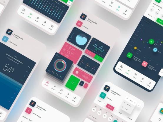
Smartphone Mobile App Ui Template by Liquid Layout for Adobe Illustrator Download the Illustrator template from Adobe Stock.The Fintech Color Trust Hierarchy: A New Framework for Palette Strategy
I want to introduce a framework I call the Fintech Color Trust Hierarchy — a tiered model for thinking about how different colors perform specific psychological jobs in a fintech brand system. This is not about choosing “pretty” colors. It is about assigning each color a role and letting it do that job consistently.
The hierarchy has three tiers:
Tier 1 — Anchor Colors establish foundational credibility. These are the dominant, high-frequency colors that users see on login screens, dashboards, and primary navigation. Their job is to immediately signal legitimacy and stability. Blue is the archetypal Tier 1 color in fintech. It is calm, globally recognized as trustworthy, and accessible to the widest range of users — including approximately 10% of the population who are red-green colorblind.
Tier 2 — Action Colors guide behavior without creating anxiety. These are the colors applied to buttons, CTAs, confirmations, and micro-interactions. Green excels here. It connects neurologically to completion signals — the green tick, the approved status, the “payment successful” screen. It reduces the anxiety associated with irreversible financial actions. Using green for positive confirmations is not a coincidence. It is a deliberate neurological lever.
Tier 3 — Personality Colors express brand differentiation and emotional character. These are accent or secondary colors that distinguish one fintech brand from another in an increasingly saturated market. This is where the real brand strategy lives. Monzo’s hot coral, Revolut’s gradient experimentation, N26’s restrained black-and-white — these Tier 3 choices are the ones users actually remember and talk about.
Why the Hierarchy Matters More Than Color Choice Alone
Most fintech brands get their Tier 1 color right — they pick blue or a deep neutral. But they misuse Tier 2 and Tier 3. They apply a bold Personality Color to a CTA button, which creates visual tension at the exact moment users need reassurance. Or they use red in micro-interactions that are actually neutral, training users to feel anxiety during routine tasks.
The Fintech Color Trust Hierarchy is not just about individual hue selection. It is about role clarity. Every color in your system should have a job description — and that job description should be built around the emotional state you want users to inhabit at each touchpoint.
Blue Dominance in Fintech: Justified or Lazy Shorthand?
Here is a question worth sitting with. Does blue actually build trust in fintech — or have we simply trained ourselves to associate blue with finance, creating a self-reinforcing cycle? The honest answer is: probably both.
Blue has genuine psychological properties. It activates a sense of calm and deliberation. Studies suggest both male and female participants respond faster to blue contrasts, making it an accessibility-conscious choice. And the cultural conditioning argument is not a weakness — it is a feature. When users open a financial app and see deep navy or professional cobalt, their brain pattern-matches it to the category of “trusted financial product.” That is brand equity working instantly.
However, blue has become so dominant in fintech that it now risks becoming invisible. When every neobank, payment platform, and investment app leads with the same family of blues, the signal stops differentiating. Users stop noticing. And a brand that cannot be noticed cannot be trusted — because it cannot be remembered.
This is why the most sophisticated fintech brands use blue strategically rather than reflexively. They anchor their Tier 1 palette in blue but make their Tier 3 personality color do the memorable, category-defying work. The brand feels trustworthy and distinctive at the same time. That combination is rare and enormously valuable.
The Rise of the Alternative Anchor: Dark Neutrals and Monochromatic Systems
A growing number of premium and crypto-adjacent fintech brands are challenging blue’s dominance with dark monochromatic systems — deep charcoals, near-blacks, and slate palettes. These communicate a different kind of trust: exclusivity, sophistication, and technical precision. They are borrowed from luxury branding and applied to finance.
Apple’s titanium card is the most visible example. The removal of all surface information and the use of a single near-neutral metal finish communicate security through restraint. Less visible means less exposed. Less exposed means more protected. That visual argument is extremely powerful — and it does not use a single shade of blue.
This suggests that color psychology in fintech branding is evolving beyond its classic blue phase. The next generation of premium fintech platforms will likely use restraint, not color, as the primary trust signal.
Green, Red, and the Emotional Grammar of Financial Feedback
Inside a fintech interface, color becomes a language. Users learn to read it fluently and quickly. Green means good. Red means stop, caution, or loss. These associations are so deeply embedded — partly cultural, partly trained through decades of financial UI conventions — that breaking them carries real risk.
Green’s dominance in positive financial feedback states is well-earned. It connects to multiple layers of psychological association: nature, growth, health, prosperity, and the physical color of currency in many markets. When a payment processes successfully and the screen shifts to green, users experience a micro-dose of reward. Studies suggest this green-confirmation state triggers dopamine responses associated with completion and relief. That is not trivial. It is the emotional foundation of user loyalty.
Red, meanwhile, is a more nuanced tool. It is effective for genuine warnings — failed transactions, insufficient funds, and security alerts. But overusing red for neutral states (minor errors, optional alerts, secondary information) trains users to feel chronic low-level anxiety inside the product. Over time, that anxiety becomes associated with the brand itself. Users start to feel vaguely uncomfortable without knowing why. They switch to a competitor whose interface feels calmer.
The Concept of Chromatic Anxiety in Fintech UX
I want to name something that does not yet have a standard term in UX discourse. I call it Chromatic Anxiety — the accumulated psychological stress produced by inconsistent, high-stimulation, or poorly calibrated color use across a fintech interface. It is distinct from any single color choice being “wrong.” Instead, it describes the systemic effect of color mismanagement over an entire user journey.
Chromatic Anxiety manifests when users encounter too many competing color signals, when warning colors appear in non-warning contexts, or when the color system shifts tone between different sections of the same app. The result is a persistent sense that the product is disorganized — and disorganized financial products feel dangerous.
The antidote is what I call Chromatic Coherence — a principle stating that every color decision across a fintech product must be consistent with a single, unified emotional narrative. That narrative might be “calm control,” “confident growth,” or “premium simplicity.” But every color in the system must serve that story without contradiction.
FinFlow is a banking, finance, and fintech WordPress theme by UICore The WordPress theme is available from ThemeForestHow Neobanks Are Rewriting the Color Rules in Fintech Branding
Traditional banks did not experiment with color. Their palettes were institutional, conservative, and deliberately unremarkable. The implicit message was: we are boring, and boring means safe. That strategy worked for decades — until fintech disrupted not just the technology but the entire visual language of finance.
Neobanks proved something important: users do not actually want financial brands to be visually boring. They want them to be emotionally clear. There is a meaningful difference. Boring signals avoidance — the brand is hiding behind convention. Emotionally clear signals confidence — the brand knows what it stands for and expresses it directly.
Monzo’s hot coral is the case study every brand strategist should study. Hot coral is not a “safe” fintech color. It carries energy, warmth, and a mild provocation. In a sea of conservative blues and greys, it screams visibility. But Monzo paired that bold Tier 3 personality color with impeccably clean, low-anxiety interface design. The product itself felt calm and organized. The brand felt like a personality. That combination built a fiercely loyal user base that evangelized the product.
Revolut went in a different direction — sequential visual experimentation, shifting gradient schemes, and aggressive product-tier differentiation through color (Standard, Plus, Premium, Metal, Ultra). Each tier communicates a different status and emotional register through color alone. Users understand the hierarchy instantly. They aspire upward through it. That is color psychology operating as a retention and upsell mechanism — not just a branding exercise.
The Visual Trust Signal Framework: What Every Fintech Brand Needs
Beyond individual color choices, successful fintech brands deploy what I call the Visual Trust Signal Framework — a system of four coordinated color behaviors that collectively communicate reliability to users.
The first behavior is Color Predictability: the same color always means the same thing. If green signals success, it must signal success consistently — not sometimes success, sometimes decoration. Predictability trains users, and trained users feel in control. Feeling in control reduces anxiety and builds confidence in the platform.
The second behavior is Tonal Restraint: the palette uses fewer colors with greater intention. Restraint communicates discipline. A financial platform with a tight, coherent color system suggests organizational discipline — the same discipline users want applied to their money.
The third behavior is Contextual Appropriateness: colors modulate to the emotional context of the interaction. Onboarding should feel welcoming and calm. A large transfer confirmation screen should feel serious and reassuring. An investment gains screen should feel celebratory. One color system, multiple emotional registers — achieved through saturation shifts, shade variations, and strategic use of whitespace.
The fourth behavior is Accessibility Integrity: the color system works for all users, including those with color vision deficiencies. This is not just ethical — it is strategic. Approximately 10% of the population cannot fully distinguish red from green. A fintech interface that relies solely on red/green for positive/negative states excludes that segment entirely. Accessible design expands trust because it signals that the brand sees and respects all of its users.
Color Psychology Fintech Branding: The Cultural Dimension
Global fintech brands face a challenge that domestic players can ignore: color does not mean the same thing everywhere. White, the default color of “clean, professional UI” in most Western contexts, is associated with mourning in several East Asian cultures. Red, a warning color in financial interfaces, is the color of prosperity and celebration in China. Gold, which signals luxury in many Western markets, carries ceremonial weight in South Asian contexts that can either strengthen or complicate a fintech brand’s positioning.
The smartest global fintech brands are beginning to treat color localization as seriously as linguistic localization. This is not about making a different version of the brand for each market. It is about understanding which colors carry dangerous, unintended meanings in specific cultural contexts — and designing a color system flexible enough to avoid those landmines while maintaining brand coherence.
This cultural dimension of color psychology in fintech branding will become increasingly important as platforms expand from their home markets. A startup launching in the UK, expanding to India, and entering Southeast Asia within three years cannot afford to treat color as a static brand asset. It needs to be a dynamic system — anchored in universal trust signals, flexible at the personality layer.
The Next Frontier: AI-Adaptive Color Systems
Here is a prediction worth making explicitly: within the next five years, leading fintech platforms will deploy Adaptive Chromatic Intelligence — AI-driven color systems that modulate the user interface palette based on real-time user context signals. These signals might include time of day, transaction type, spending pattern anomalies, or even inferred emotional state derived from interaction speed and navigation behavior.
The concept is not science fiction. Thirty percent of users already express interest in adaptive “living” palettes that reflect personal mood or preferences. The technology to deliver this is emerging rapidly through AI-driven UX personalization systems. The psychological logic is sound: a user checking their balance after an unexpected expense needs a calmer visual environment than a user celebrating a savings milestone. The same interface, delivering opposite emotional experiences — and color is the fastest dial to turn.
This evolution will require fintech brands to shift from thinking about color as a fixed identity asset to thinking about it as a dynamic emotional delivery system. The brand’s core trust signal remains constant. But its expressive range expands to meet users where they actually are. That is not a small shift. It is a fundamental reimagining of what a fintech brand’s visual identity can do.
Practical Color Psychology Principles Every Fintech Brand Should Apply Today
Theory is useful. Actionable principles are better. Here are the core color psychology principles that every fintech brand should be applying to its visual identity right now.
Start with your emotional thesis. Before choosing a single color, define the precise emotional experience you want users to have across their entire journey with your product. Not “trustworthy” — that is too generic. Something like “confidently informed,” or “calmly empowered,” or “quietly exceptional.” Every color decision should serve that thesis directly.
Test your palette under stress conditions. Run your color system through the highest-anxiety user scenarios — large fund transfers, identity verification, and disputed transactions. If the interface still feels reassuring in those moments, your color system is working. If it feels chaotic or alarming, it needs recalibration.
Audit your red use ruthlessly. Count every instance of red across your interface. Ask whether each one represents a genuine user-facing risk or alert. Every unnecessary red is a small injection of anxiety into the user experience. Over hundreds of interactions, that accumulates into Chromatic Anxiety and eventual churn.
Use whitespace as a color decision. In fintech, whitespace (and its dark mode equivalent) is not empty space — it is a deliberate trust signal. Generous whitespace around financial data communicates that the brand is organized, honest, and not hiding anything. It reduces cognitive load and lets users think clearly about their financial situation. Cramped design, by contrast, creates the visual equivalent of fine print.
Build a color token system before you build a product. A color token system assigns semantic meaning to every color in your palette — not just the hex value but the emotional role. “Success green,” “caution amber,” “neutral text,” “anchor navy.” This system prevents color drift as the product scales, ensuring Chromatic Coherence across an increasingly complex interface.
What Consistently High-Trust Fintech Interfaces Have in Common
After studying fintech brands across the trust spectrum, a clear pattern emerges. High-trust interfaces share specific color behaviors: structured grid layouts with generous whitespace that reduce cognitive load; consistent color application with zero ambiguity about what each color means; a dominant Tier 1 color that occupies at least 60% of the visual field; and action confirmation states — payments, transfers, approvals — that use green or a positive accent color with sufficient contrast to feel decisive.
Low-trust interfaces tend toward the opposite: multiple competing accent colors, red used for non-critical messages, overcrowded layouts where color loses its signal value, and inconsistent application of what colors mean. Users cannot articulate these differences. But they feel them immediately.
Color in Fintech Branding Beyond the App: Cards, Marketing, and Physical Touchpoints
Color psychology in fintech does not live only inside the app. For digital-first brands with no physical branches, the debit or credit card is often the only physical object a user holds that represents the brand. This makes card design a critical — and underutilized — trust and identity vehicle.
Neobanks understand this acutely. Monzo’s coral card is famous enough to be identified across a crowded room. Revolut’s gradient metal cards signal tier and aspiration. N26’s minimal black card communicates a specific kind of European sophistication. In every case, the card is not just a payment instrument. It is a portable brand ambassador — and its color does psychological work in the real world, where users see it and where others see users using it.
The trend toward numberless card fronts — adopted by Chime, Brex, Mercury, N26, and others — adds another color psychology dimension. By removing numerical clutter from the card’s face, brands gain a cleaner color canvas. The card becomes a pure color and form statement. The color works harder because there is nothing else competing for attention.
Marketing materials, social media presence, and investor communications must maintain color coherence with the product itself. When a fintech brand’s app feels calm and trustworthy but its advertising feels brash and high-pressure, users experience a dissonance that erodes confidence. Color continuity across every touchpoint is not a design preference — it is a trust maintenance strategy.
The Future of Color Psychology in Fintech: Predictions for 2025 and Beyond
Several trajectory shifts are already visible. First, the decline of default corporate blue as the automatic first choice for fintech Tier 1 palettes. As the sector matures and differentiates, more brands will seek distinctive Anchor Colors that still carry trust signals — deep teal, warm charcoal, refined forest green — rather than retreating to the same congested blue territory.
Second, the rise of dark mode as a trust-aligned design strategy. Dark mode is not just a user preference feature. In fintech, dark interfaces can communicate premium positioning, security, and technical sophistication. For crypto platforms and investment apps targeting more experienced users, dark mode signals that the brand is serious and advanced. The color psychology of dark fintech interfaces deserves its own dedicated research space — and it will get it.
Third, the integration of accessibility as a brand differentiator rather than a compliance checkbox. Fintech brands that build genuinely accessible color systems — high-contrast, color-blind-friendly, screen-adaptive — will attract users who feel seen and respected by the product. In a category where trust is everything, feeling seen by a brand is a powerful loyalty driver.
Fourth — and most transformatively — the emergence of Adaptive Chromatic Intelligence as described earlier. AI-driven color personalization will not just change how fintech interfaces look. It will change what users expect from financial products at an emotional level. Once users experience an interface that modulates to their emotional context, static palettes will feel crude by comparison. The brands that experiment with adaptive color now will own an enormous head start.
A Personal Perspective on Where Fintech Color Gets It Wrong
I spend a lot of time analyzing fintech visual identities — and the single most common mistake I see is not a bad color choice. It is a lack of color intention. Most fintech brands pick colors that test well in isolation, then apply them inconsistently across a growing product. Over time, the color system becomes accidental rather than intentional. The brand looks professional from a distance and feels disorganized up close.
The second most common mistake is mistaking novelty for personality. A neon accent color or an unexpected gradient can look exciting in a product mockup. But if it serves no psychological role — if it does not calm, guide, signal, or differentiate in a meaningful way — it is visual noise. And visual noise in a financial product is not just ugly. It is a trust liability.
Color psychology in fintech branding should be approached with the same rigor applied to risk modeling or compliance architecture. Because at the moment a user decides whether to trust a new financial platform, color is doing more work than any of those systems. It deserves equivalent respect.
FAQ: Color Psychology in Fintech Branding
What is color psychology in fintech branding?
Color psychology in fintech branding is the strategic application of color to influence user emotions, perceptions, and behaviors within financial technology products. It involves selecting and deploying colors across interfaces, marketing, and physical touchpoints to communicate trust, guide user actions, and differentiate the brand in a competitive market.
Why is color so important for user trust in fintech apps?
Fintech apps ask users to share sensitive financial data and make high-stakes decisions. Users form emotional judgments about an interface within 90 seconds — and between 62% and 90% of that judgment is based on color. Color is, therefore, the first and fastest mechanism a fintech brand has to establish credibility and reduce user anxiety before any other trust signal has a chance to activate.
Why do most fintech brands use blue?
Blue consistently tests as the most trusted brand color globally, with 54% of consumers identifying it as their most trusted choice. It conveys stability, security, and calm — all critical qualities in financial services. Blue is also accessible to users with red-green color blindness, making it a practical as well as psychological choice. However, its dominance in fintech is increasingly a competitive liability, as differentiation requires moving beyond the default.
What does green mean in a fintech interface?
Green is the primary Action Color for positive confirmation states in fintech. It signals success, approval, growth, and completion. Green payment confirmation screens activate dopamine responses associated with relief and reward. Consistent use of green for positive feedback states trains users to associate the color with safety and forward progress within the product.
What is Chromatic Anxiety in fintech UX?
Chromatic Anxiety is an original editorial concept describing the accumulated psychological stress created by inconsistent, over-stimulating, or poorly calibrated color use across a fintech interface. It occurs when warning colors appear in non-warning contexts, when the palette lacks coherence across screens, or when too many competing color signals reduce the interface’s legibility. It leads to user discomfort, reduced confidence, and increased churn.
How should fintech brands use red?
Red should be used sparingly and only for genuine user-facing risks or errors — failed transactions, security alerts, or insufficient funds. Overusing red for neutral messages or minor errors creates chronic low-level anxiety in the user experience. Every unnecessary instance of red represents a micro-injection of stress into an interaction that users associate, over time, with the brand itself.
What is the Fintech Color Trust Hierarchy?
The Fintech Color Trust Hierarchy is an original framework that organizes fintech color strategy into three tiers: Tier 1 Anchor Colors (dominant colors establishing foundational credibility, such as navy blue), Tier 2 Action Colors (colors guiding behavior at critical moments, such as confirmation green), and Tier 3 Personality Colors (accent colors expressing brand differentiation and emotional character, such as Monzo’s hot coral).
Will AI change how fintech brands use color?
Yes — significantly. AI-driven Adaptive Chromatic Intelligence systems will enable fintech interfaces to modulate their color environment in real time based on user context signals, including transaction type, time of day, and inferred emotional state. This shift will move color from a fixed identity asset to a dynamic emotional delivery system, making static palettes feel increasingly limited by comparison.
How do neobanks use color differently from traditional banks?
Traditional banks used conservative, institutional color palettes — primarily to signal permanence and authority. Neobanks disrupted this by demonstrating that users respond better to emotionally clear design than to emotionally boring design. Brands like Monzo, Revolut, and Chime use distinctive, personality-driven color systems that build recognition and loyalty, while still anchoring the interface in calm, organized visual environments that reduce financial anxiety.
What long-tail keywords should fintech brands consider for color-related content?
Relevant long-tail terms include: “best color palette for fintech app trust,” “how color affects user trust in banking apps,” “fintech UI color psychology blue vs green,” “color design for neobank branding,” “psychological color choices for financial services,” and “how to reduce user anxiety in fintech with color design.” These reflect the specific questions users and designers are asking when building or evaluating financial products.
Browse WE AND THE COLOR’s Branding, Graphic Design, and Web Design categories to learn more.
#branding #ColorPsychology #colors #consumerResearch #fintech #research #trust #ui #ux