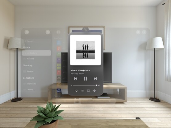
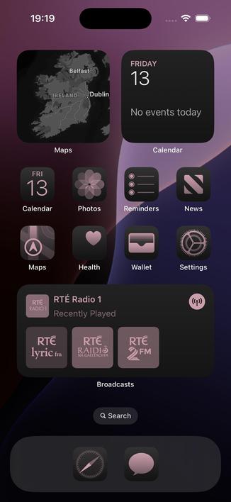
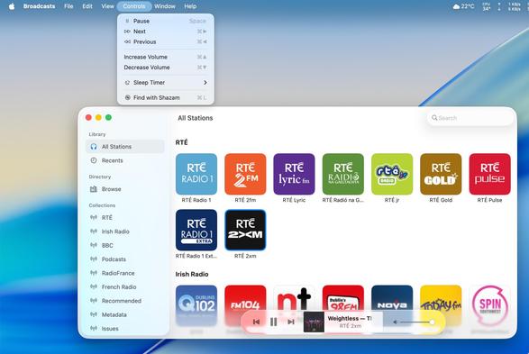
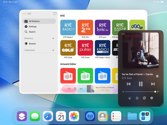
I don't think I showed how I'm spawning the mini player window in @broadcastsapp, so here’s a quick one. Once you have the window, you can move it anywhere you like
Working on all the auxiliary panels now; new UIKit toolbar is in, and I've given the two editors an initial pass for the new metrics and styles. What I'm finding with visionOS is any layout that doesn't work out of the box suggests more than anything that *I’m* doing it wrong, and I should probably rewrite it for other OSes too. It's good at highlighting focus areas in my apps that need work
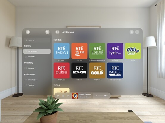
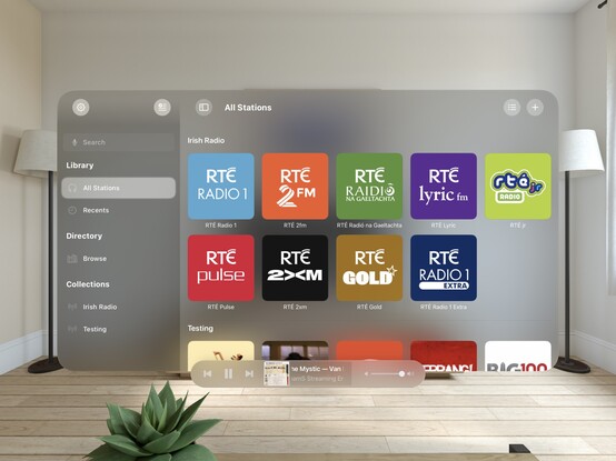
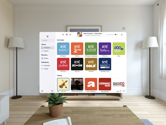
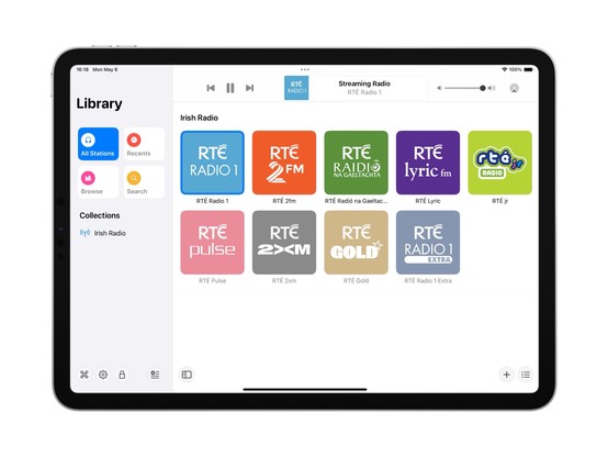
Another UI down; @broadcastsapp's search screen has been visionOSified
I haven't officially branched yet, but I think what I'm working on now will become Broadcasts v4.0. So that will be Broadcasts for visionOS, plus the revamp I want to perform on the iPad version's UI, and the payment model changes I've talked about before. Maybe the new watchOS app, if everything else goes well. I'm not sure yet if that will mean a minimum OS version bump, as I am loath to cut off hardware
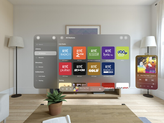
Not sure if I'll go with this, but I did a little experimenting with 3D layering/z-depth in @broadcastsapp just to see how a real UIKit app might approach this. I think 'sparingly' is the right answer, but unlike many of Apple's platforms, there really are no physical bounds or rules to tell you not to. It’s a lot easier for a SwiftUI app to use 3D transforms and z-depth, so you'll probably see it used/abused much more in indie apps than e.g. Photoshop or Office
Screenshot roundup for @broadcastsapp at the end of the first week of the visionOS SDK. Honestly, I'm ready to start testing on actual hardware, which is a very expensive-sounding prospect 🫥
'You're my friend now’ /cc @jsnell
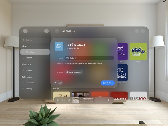
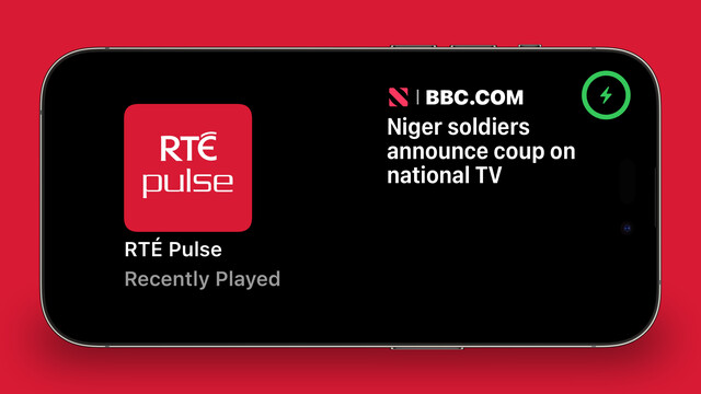
Also a fun excuse to see how URL handling works in visionOS — and it does!
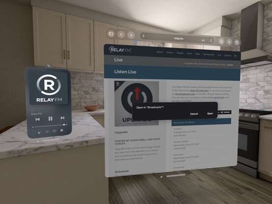
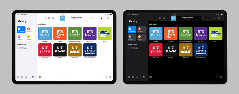
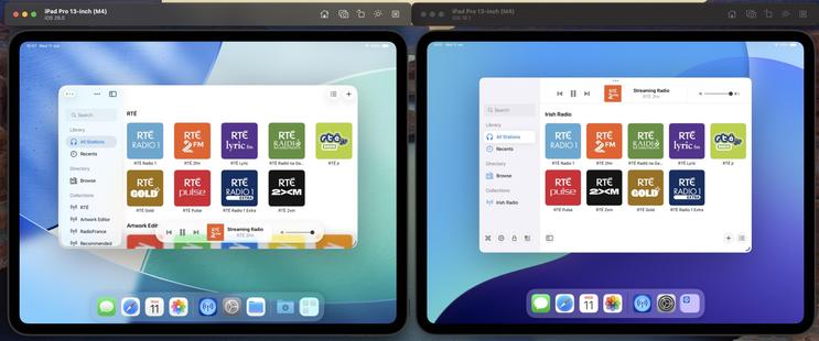
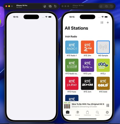
Realized I never posted a picture of the iPad version of Broadcasts running on visionOS, as I went straight for a native app instead. Here's a side by side, just for fun!
Tempted to leave this alternate toolbar style in @broadcastsapp as an easter egg, to go along with the existing pinstripes setting 👀
Starting some initial work on unifying @broadcastsapp's sidebar design language with @pastelapp and @takeoneapp by using the Reminders-style group cell. I think this calls for me to create a custom class I can use across all of them — I'll have to put some thought into that. Take One has the best variant so far, so I will probably use that as the template
I'm also experimenting with a new bottom-aligned floating toolbar style, but I haven't committed to it yet (I can toggle it while debugging)
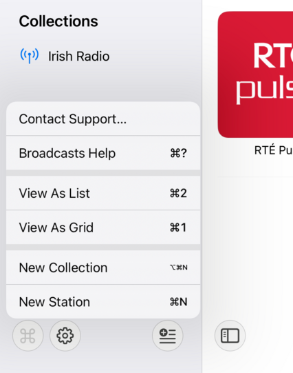
I do currently plan to remove Broadcasts’ command menu. It came about in an era where iPadOS did not have dropdown or context menus, or a system menu panel. It served its purpose, but there are better ways to go about this now
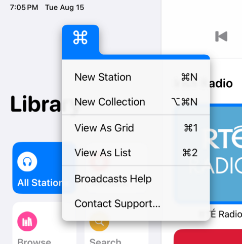
If UIMenu allowed for variable image widths, you could do something like this by rendering the shortcut symbols to an image. The 'New Collection' item is sadly how it works today. I am quite tempted to just not show multi-modifier commands in this menu though, since the effect works great otherwise…
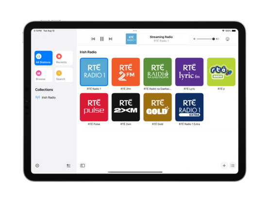
The layout and colors might change a bit, but this is the overall look I'll be going with for the next version of Broadcasts on iPad — a friendlier, more-modern sidebar design
Revisiting the Broadcasts watch app in terms of a watchOS 10 baseline so I can actually use some of the new stuff, like toolbar buttons. Using @_Davidsmith’s technique, on earlier versions of the OS it loads up the existing WatchKit code, and on watchOS 10 it's all SwiftUI. I think I'm much happier going this route than trying to build a SwiftUI interface that works across all the different OS designs. I might actually ship it this time round
SharePlay over AirDrop is very cool, especially with the new ‘bump your phones together’ UI. I wired up @broadcastsapp so that it supports handing off playback between people just like that
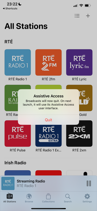
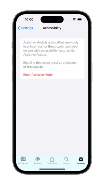
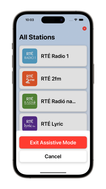
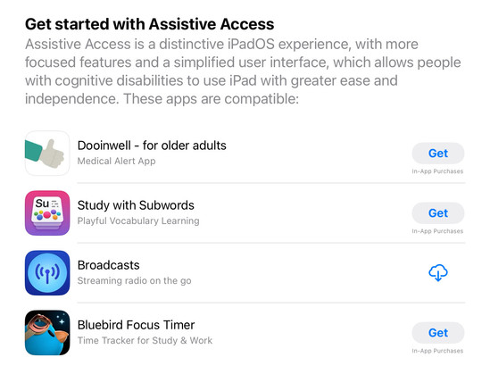
Though there’s no real system support for it, having lived through a similar situation this year I feel like my custom Assistive Access mode is too important to not ship in some form. So I'm going to do the next best thing: a temporary custom URL scheme that can toggle Broadcasts in and out of this mode, until real APIs are available. In Assistive Access mode, Broadcasts just shows a list of stations that can be played, and turns off all other features and UI. No accidental deletions, no nothing
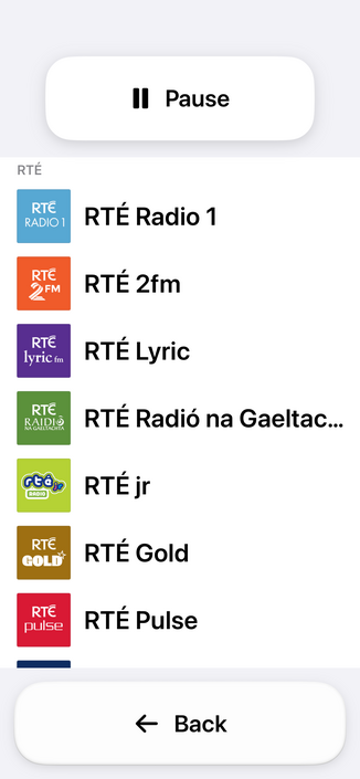
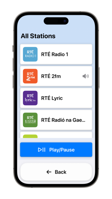
Having spent the day working with the actual Assistive Access SPI (https://mastodon.social/@stroughtonsmith/111072449541807169), I decided to replicate as much of it as I could in SwiftUI directly. In doing so, I ported my new watchOS app code to iOS and used it as the basis of my faux-Clarity UI. It's not perfect, but it kinda works! And this one I can ship
I didn't have a whole lot prepared for iOS 17, just a amorphous collection of features I'd been working on for @broadcastsapp in some form or other over the summer, while the core of the app was revamped quite a bit for visionOS. Nonetheless, they've kinda taken form over the past few days into something I can call v3.3.
I've got:
• Assistive Access mode
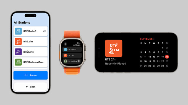
• A refreshed app for Apple Watch
• Interactive widgets & Stand By support
• SharePlay via AirDrop
On top of that, Broadcasts has a whole visionOS app pretty much ready to go, but I have no intention of shipping this before I have a device to do final iteration & testing with. A lot has gone into the app over the past few months!

I decided to elevate Broadcasts' Assistive Mode from 'hidden feature' to just 'feature’. There's a new panel in the settings tab that allows you switch to Assistive Mode at will. And now there's a close button that lets you exit Assistive Mode, too. I think this is the right thing to do
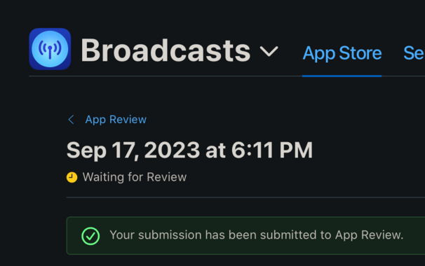
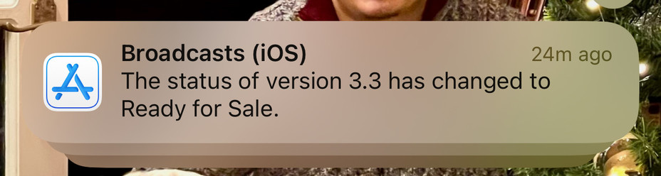
I’m calling it on Broadcasts v3.3, anything else is a ‘we'll fix it in post’. To App Review!
I would have to be real silly to be crunching to ship @broadcastsapp for the visionOS launch, huh?
…👀
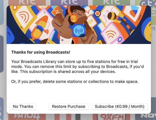
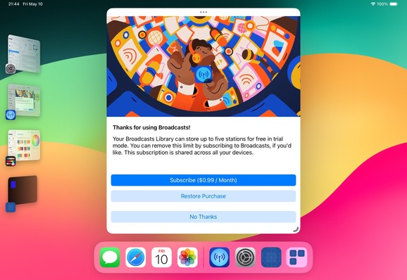
Finally going in and putting together the systems to enable Broadcasts’ switch to a subscription model. Still have a lot of UI to redesign and re-word, but successfully subscribed using my sandbox account so that's a win so far.
As a reminder, existing users won't need to switch to subscription — if you've bought the app, you've bought the app, and that purchase will last for several years to come. New users will be offered subscription pricing
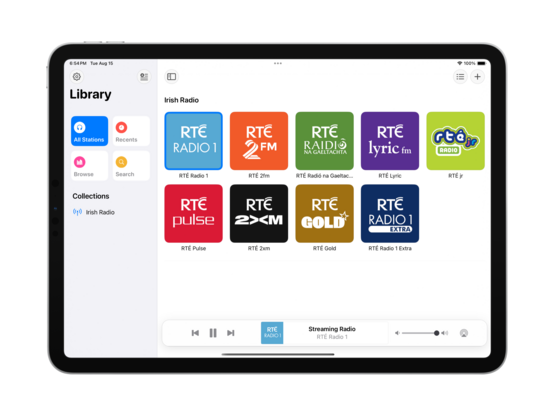
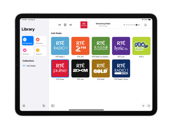
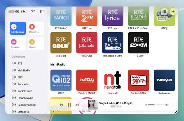
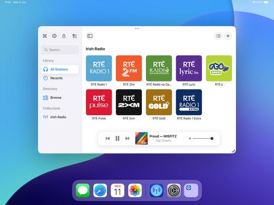
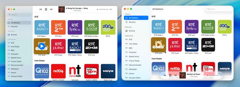
Came across these screenshots from August in my screenshots folder and realized I'd completely forgotten I had a big @broadcastsapp iPad redesign underway before I got distracted with iOS 17 🤦♂️
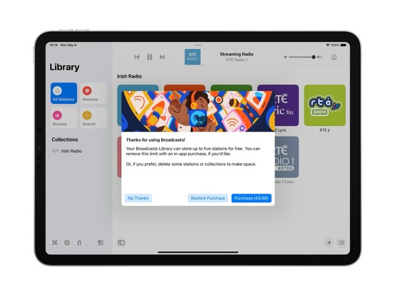
I'm going to be streamlining @broadcastsapp’s license flow a little in the next release, shifting where the library cap is exposed from the Add Station panel to the main UI instead — dimming any stations beyond the cap but letting them stay in your library. Tapping a dimmed station presents the IAP panel. It's a little more upfront, and a whole lot less confusing
Extracting Broadcasts' purchase panel out into its own project for a while, so I can iterate on it and easily resize it. The idea being to make it a flexible shared component I can use across different apps. Need to also bring it up to scratch for the switchover to a subscription model (for new users) and meet all of Apple's guidelines 😪
Fun fact: Broadcasts has received 110-ish updates across four platforms since it launched in 2020. If you add in Pastel, that brings it to 180 or so, or 45 shipping builds a year. Kinda highlights how silly it was to not move to subscriptions much earlier; the longer it gets from launch, the more I’m stretching that original $5 purchase price
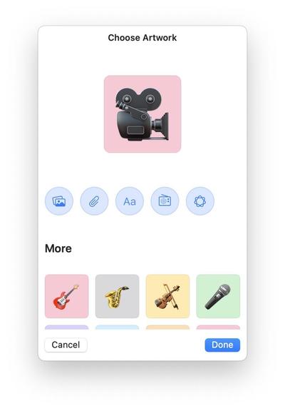
There's an obvious place for Image Playgrounds in @broadcastsapp, and that's in the station artwork picker. I’m not running the betas yet, so I'll see how appropriate the results actually are, but I've built in the support regardless and can turn it off if it doesn't work
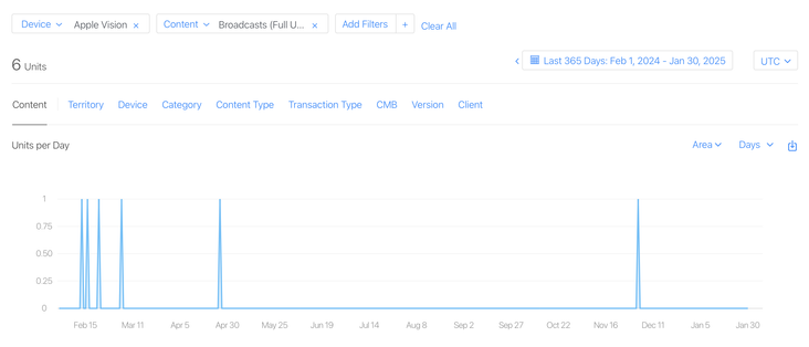
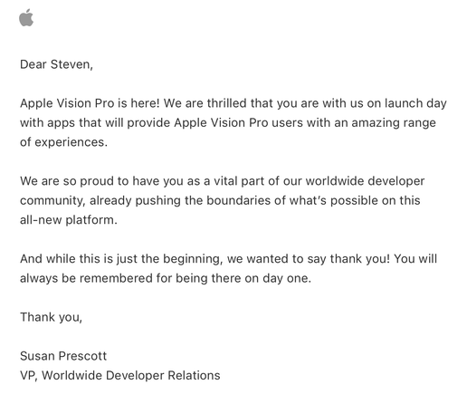
I have a whole year of sales data for @broadcastsapp on visionOS now!
In total, six full copies of the app were purchased on the platform in the past 12 months, and it has about 400 users total there.
This is my best-performing app on Apple Vision Pro, and it took about seven months of work to create 🤡
Apple offered a pat on the head in lieu of a devkit
Verifying that my older @broadcastsapp alternate UI feature flags still work before the WWDC keynote — always good to build yourself some options before you need them. Next time we see this, I expect it will be with an unhealthy amount of frosted glass
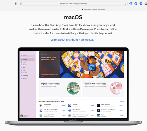
Complete double-take while browsing Apple's Developer site.
"…hey, wait a second, I know that app…"
Threading the needle on targeted if statements that won’t also break the app across older OS designs on Mac, iOS, and visionOS 😂
This may not be the UI layout I ship, but I’m opting in all my custom views into the new stuff to see where that gets me before I start worrying about making decisions
Getting closer to a reasonable starting point for @broadcastsapp in iPadOS 26 using my existing feature flags, before I start actually writing any new code or doing new layout. Progressive blurs and new glass effects all present and accounted for

I have toned down the glass effect from the default by setting its background color to be 80% white. I expect that somewhere over the beta period Apple is going to do something similar (maybe meet somewhere in the middle). Or maybe the user base will get used to it, and decide they want something more like the glassier version. It will be an easy thing to tweak, if so

I will try to maintain dual-compatibility with iPadOS 26 and earlier versions of the OS as we move through the summer. Maintaining two different design languages, *per platform*, is going to be a struggle, but we'll see how it turns out. I built Broadcasts to be flexible, and it has paid off so far
The new layout does work on the old design language too, so that's something I could consider down the road as features coalesce into a Broadcasts 4
If I were making my living on designing app icons, I would be pretty upset with Icon Composer. Apple has gradually defined whole classes of designers out of existence throughout this era, but this is a K.O.
As a developer, though, this stuff is great!
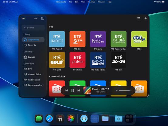
Had a couple of tiny tweaks to make, but my starting point for Broadcasts on macOS 26 is looking OK. If I manage to build and ship no other features this summer, this is at least how it will look like on the new OS
Alternate Broadcasts layout, should all the bottom toolbar stuff stick on macOS.
When you see it all laid out like this, I'm almost surprised Apple didn't make macOS more like visionOS, and move the sidebar and the bottom bars out of the window chrome like visionOS' ornaments
Adding icons to all my menu items, as per the new HIG. UIKit has made the Liquid Glass transition surprisingly easy — benefit of such a flexible framework that runs on everything from watch to headset — and it still looks and runs like it used to on older OSes at the same time
Side by side, the old and new. I'm not afraid to lean into it, if this is really the way the wind is blowing. The more time you spend on this OS, the more you get used to the new way of doing stuff. It does seem pretty stark, looking in from the outside, but when /all/ your apps look like this, it does feel better to lean in and try more ambitious things
I'm at the 'ripping up all my layouts' stage of transitioning to the modern-tab-bar-with-alt-compact-view-controller stuff and hoping I'll be able to put the pieces back together again before I give up 😅
I have reduced Broadcasts to its platonic ideal on iOS 26 😜
Trying to shoehorn all the new stuff into my existing view controller hierarchy was just overcomplicating things; I'm going to start over from first principles, and I think that means using the modern iPad (/mighty morphin') tab bar structure that I so hated upon its introduction last year. But I think it makes a lot more sense now, now that there's a spectrum across device sizes
I'd be lying if I said I knew what I was doing with these APIs, chat, but we'll get there
Getting somewhere, at least. I am always so glad that I built all my new apps in a composable form, as it has made all these new layouts and platforms over the past years so much easier
If iPadOS only respected the window scene size restrictions maximum size, as well as minimum (which it now does), I could enable more of my expanded featureset on iPad — like my Mini Player window. I think it would be worth doing 🤷♂️
I'm kinda tempted to spawn windows now on iPadOS instead of presenting view controllers like I used to. I feel like now the OS has enough flexibility for me to enable all the workflows that I've kept locked to macOS and visionOS previously, which is fun
@stroughtonsmith What happens in iPadOS 26 when you spawn a new window while in fullscreen mode?
@stroughtonsmith Apps can have multiple windows now??
@callin apps can have had multiple windows since iOS 13 😅

@stroughtonsmith yeah I’m having the same debate with Delta. I’ve had a prototype that opens games in new windows by default on iPadOS for a while, and now it feels like it could at least be an option?
Not to mention the WWDC videos are recommending document-based apps open each document in a new window by default anyway…
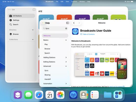
@stroughtonsmith Which framework have you used for „Table of content“ and the introduction ?

@stroughtonsmith did Apple give any suggestions for this? Having the same debate about our apps. When to present a window vs a view controller.
@stroughtonsmith is there a way to detect when you’re in windowed mode so that you can default to open-in-new-window behaviour? (And also hide my own close buttons now that we have traffic lights)
@stroughtonsmith can you hide the dock when in multitasking mode? All the screenshots I see the first thing that comes to mind is that the dock takes wayyy too much screen real state
@cmaciasjimenez it hides automatically (and way too eagerly, IMO) as you move windows around
@stroughtonsmith thank you! They will surely need to dial in lots of things before release…

@stroughtonsmith love the minimal design!
@stroughtonsmith I wonder why they did not go with the iOS tab bar style with its icons for iPadOS this year as well. I still think it's odd that they went away.

@stroughtonsmith nice work, that actually looks really nice.
@stroughtonsmith Maybe a silly idea but I'd think of integrating the player in the sidebar, above the source lists. Floating feels weird for a permanent UI element, apart from from the legibility issues.
@stroughtonsmith The thing that really jumps out, in a bad way, is the shadow under the search field. It's so overbearing. I also wish the controls at the bottom were a bit more opaque. I think (hope) those will be dialed in as the betas progress. The rest looks pretty nice, though! Good job!
@stroughtonsmith after living with macOS 26 for a few days, I think it’s the sidebar treatment that’s the most awkward. It stands out to me here as well — so much space lost to making it inset… and the fact that it’s on top almost feels primary instead of secondary.
@voxmatt @stroughtonsmith it's going to take a while to get used to having the traffic light buttons on that sidebar too. Looking at them it feels like they're only going to affect the sidebar not the whole window. I hate to say things like "I don't like it" and "It's wrong" but also I really don't like it because it's just plain wrong. 😆
@stroughtonsmith the round volume control on the right is still using the old design, no? the music controls inside the elongated pill feels less readable. And how does this design does put content at the center compared to the previous one as controls are sitting on top of the content? 🤔
@numericcitizen I have not redesigned my volume slider as of yet, no
@stroughtonsmith Looks great! The funny thing, though, is Apple claiming this is all about giving more space to your content, but more often than not, it actually results in less space. In this case, 3 vs. 2.5 rows of stations.
@jncn @stroughtonsmith Came here to say the same thing. This whole “cede the UI to the content” is just complete BS. The UI is literally obstructing the content - all in the name of *shiny*

@stroughtonsmith I think that it makes more sense to have the controls at the top of the window, as you showed about 9h ago.
You lose the "liquid glass" shininess in the controls, but the space is more logically distributed. It is so weird to have the controls over some of the app's content when you have all that space at the top of the window.
Anyway, that's just my opinion; it does not matter.
Good job.
@stroughtonsmith What about items that could have a checkmark… indicating that they are selected? Is this not a thing anymore?
https://developer.apple.com/documentation/applicationservices/kaxmenuitemmarkcharattribute
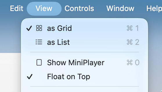
@stroughtonsmith Ah, OK. Thanks.
@stroughtonsmith would just be easier to not manage all the content that's laid out behind it right?
@stroughtonsmith There’s just so much wasted space in these bottom toolbar layouts and I don’t really see the benefit on macOS of having the UI at the bottom instead of the top
@designedbyappleincalifornia @stroughtonsmith Where the hell does the draggable area of the window begin or end?
@stroughtonsmith looking good. Does the positioning of the search text look a bit off or it’s just me?
@nanu it is off, metrics have changed
@stroughtonsmith I’m really struggling to understand why the new sidebar design is it‘s own layer visually. It‘s on top but nothing can go underneath. Like what’s the point?
@codemusings @stroughtonsmith Feels to me like title bar controls are depreciated in the new design; there shouldn't be anything under the sidebar because other UI controls and displays should also be floating in their own space, not part of the window framework.
I think when done well it could work really great, but for some apps it'll definitely require deeper work to not look awkward.
@buffaloseven @codemusings @stroughtonsmith Even if content could flow under it I am struggling to find the utility. There just isn’t enough peeking through to be of any utility, and it could easily be distracting.
This seems like an it-looks-neat change.
@stroughtonsmith Nice work!
@stroughtonsmith the Camera app icon gives me hope that not all is lost for those who wanna buck the trend a little bit!
@stroughtonsmith The new layout seems only negative. Why go over the content when you have all that empty space for it at the top?
@stroughtonsmith Is the opacity per component or per app?
@lasombra_br per component
@stroughtonsmith I don't love how "not prominent" the actual player is
@buck same! You should see the system apps 😜