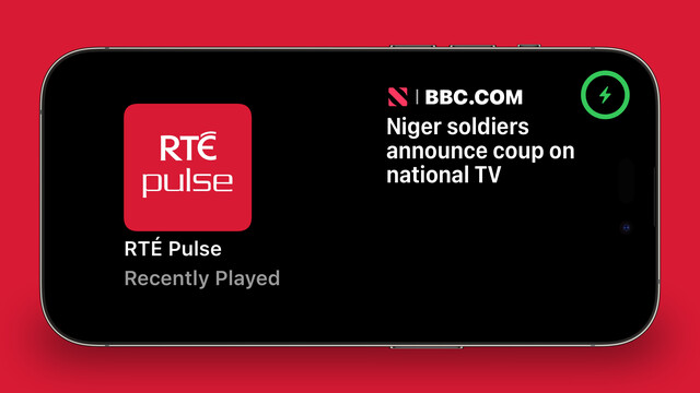
I didn't have a whole lot prepared for iOS 17, just a amorphous collection of features I'd been working on for @broadcastsapp in some form or other over the summer, while the core of the app was revamped quite a bit for visionOS. Nonetheless, they've kinda taken form over the past few days into something I can call v3.3.
I've got:
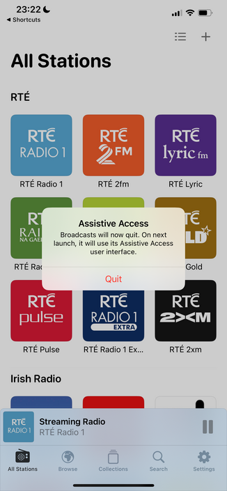
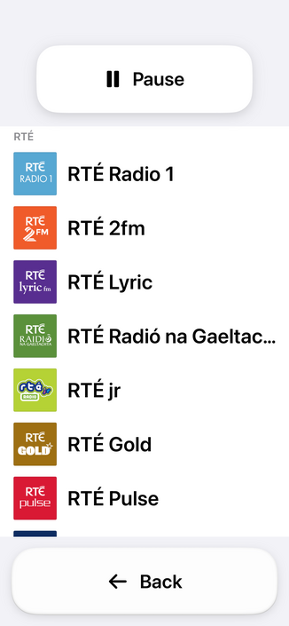
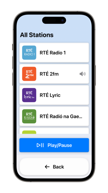
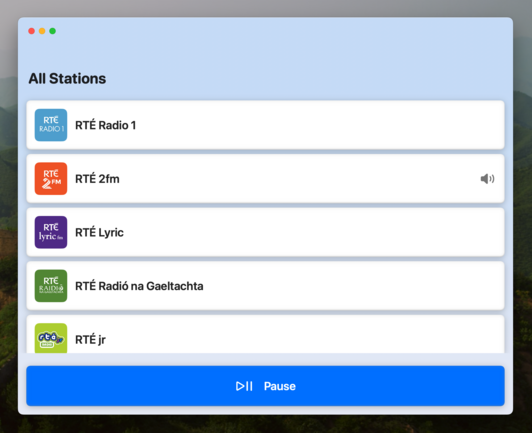
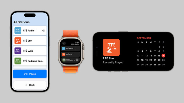
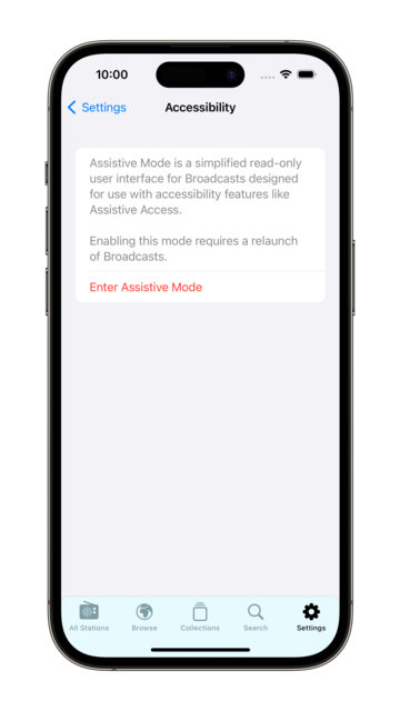
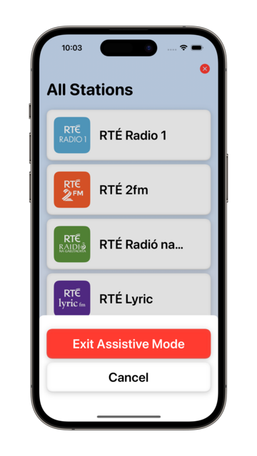
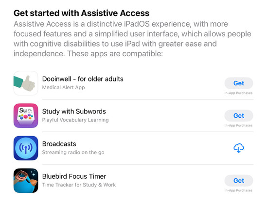
• Assistive Access mode
• A refreshed app for Apple Watch
• Interactive widgets & Stand By support
• SharePlay via AirDrop

I would have to be real silly to be crunching to ship @broadcastsapp for the visionOS launch, huh?
…👀
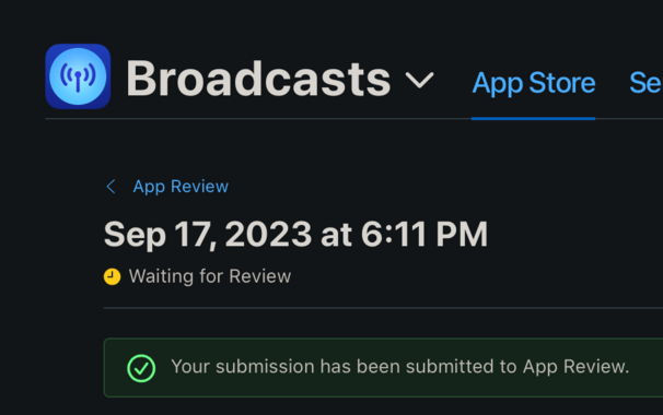
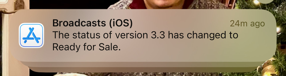
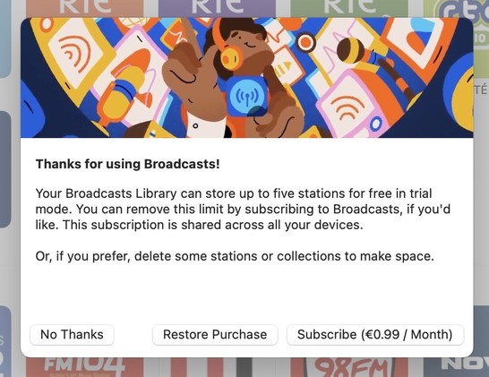
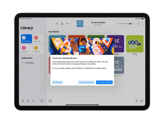
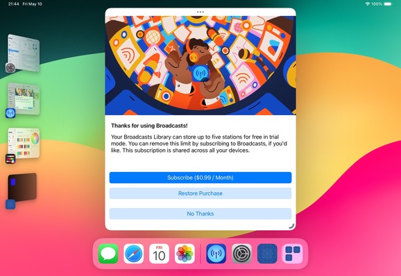
Finally going in and putting together the systems to enable Broadcasts’ switch to a subscription model. Still have a lot of UI to redesign and re-word, but successfully subscribed using my sandbox account so that's a win so far.
As a reminder, existing users won't need to switch to subscription — if you've bought the app, you've bought the app, and that purchase will last for several years to come. New users will be offered subscription pricing
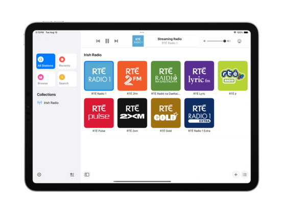
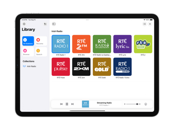
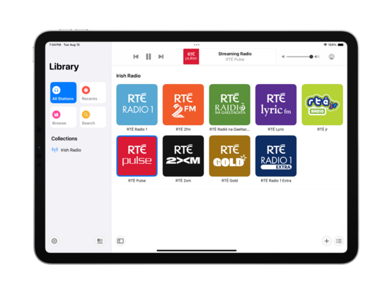
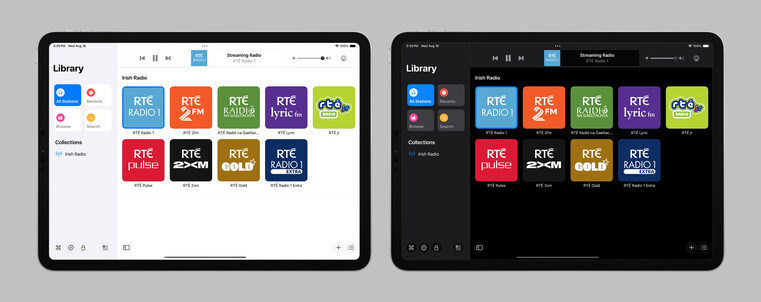
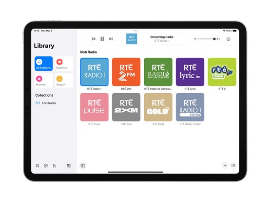
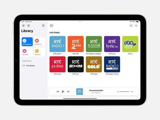
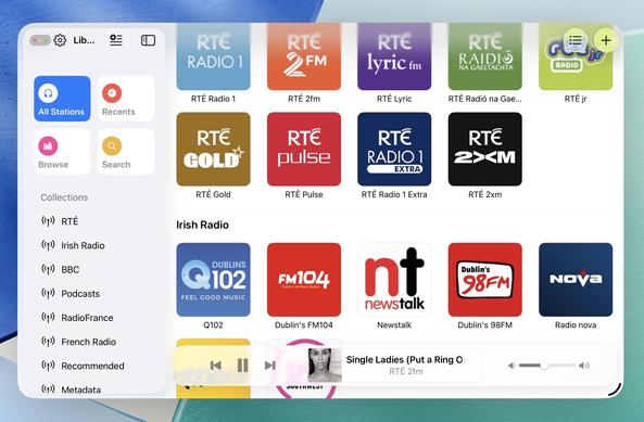
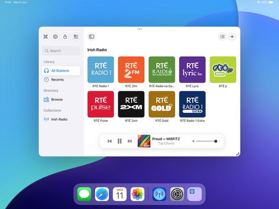
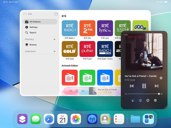
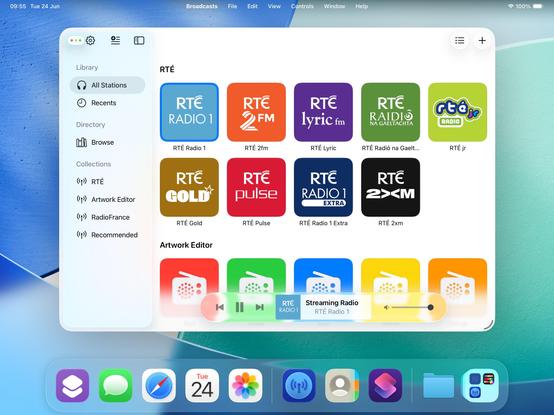
Came across these screenshots from August in my screenshots folder and realized I'd completely forgotten I had a big @broadcastsapp iPad redesign underway before I got distracted with iOS 17 🤦♂️
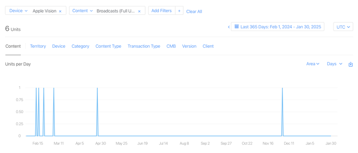
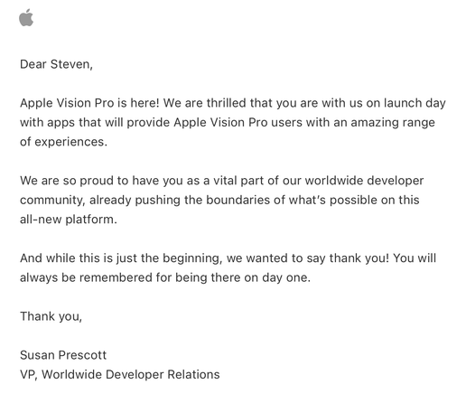
I have a whole year of sales data for @broadcastsapp on visionOS now!
In total, six full copies of the app were purchased on the platform in the past 12 months, and it has about 400 users total there.
This is my best-performing app on Apple Vision Pro, and it took about seven months of work to create 🤡
Apple offered a pat on the head in lieu of a devkit
Complete double-take while browsing Apple's Developer site.
"…hey, wait a second, I know that app…"
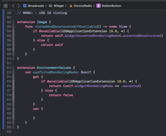
Threading the needle on targeted if statements that won’t also break the app across older OS designs on Mac, iOS, and visionOS 😂
This may not be the UI layout I ship, but I’m opting in all my custom views into the new stuff to see where that gets me before I start worrying about making decisions


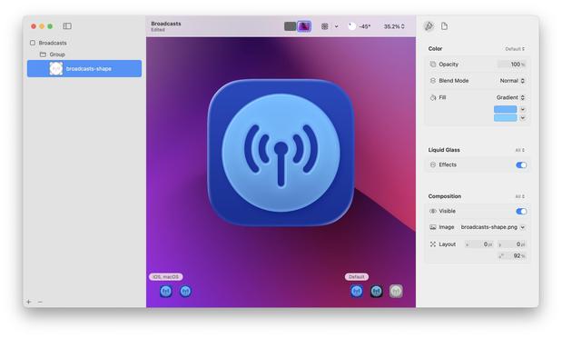
If I were making my living on designing app icons, I would be pretty upset with Icon Composer. Apple has gradually defined whole classes of designers out of existence throughout this era, but this is a K.O.
As a developer, though, this stuff is great!
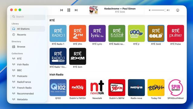
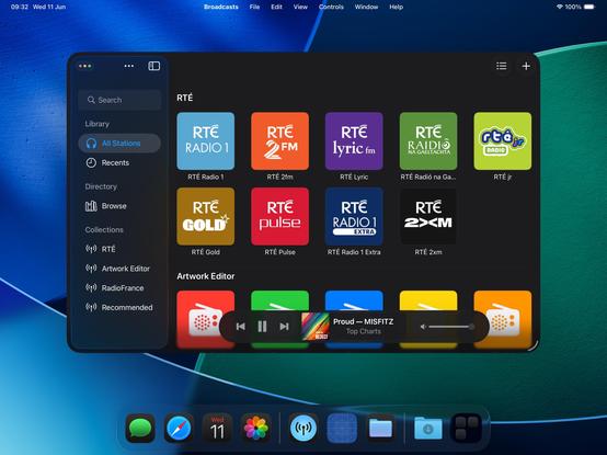
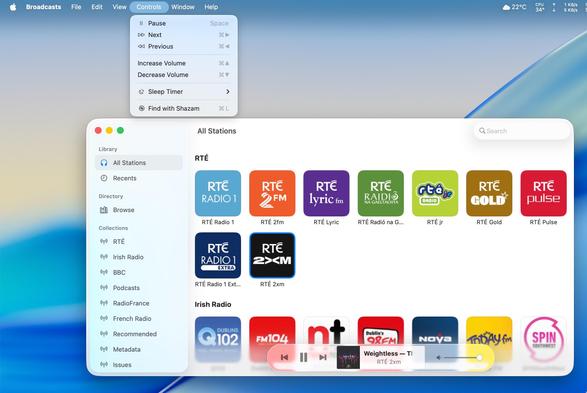
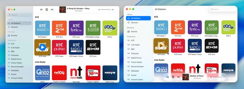
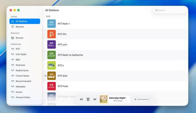
Alternate Broadcasts layout, should all the bottom toolbar stuff stick on macOS.
When you see it all laid out like this, I'm almost surprised Apple didn't make macOS more like visionOS, and move the sidebar and the bottom bars out of the window chrome like visionOS' ornaments
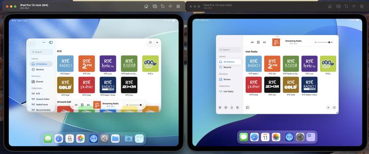
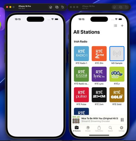
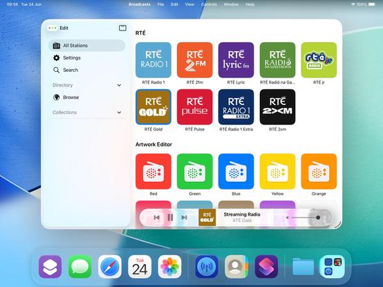
I have reduced Broadcasts to its platonic ideal on iOS 26 😜
Trying to shoehorn all the new stuff into my existing view controller hierarchy was just overcomplicating things; I'm going to start over from first principles, and I think that means using the modern iPad (/mighty morphin') tab bar structure that I so hated upon its introduction last year. But I think it makes a lot more sense now, now that there's a spectrum across device sizes
If you've never really considered the complexity in updating an app for a new iOS release over the summer, welcome to my hell:
I'm currently working on two completely different versions of the UI in Broadcasts. One, using the old layout, which needs a reasonable amount of fixup. And another, using a new layout using all the newer APIs, currently very broken and is going to need a mountain of work to finish, and from my initial experimentation looks like it's unable to do all the things I want
Will I ship the ambitious rewrite that won't be as pretty but will be way more flexible for folding phones? Or will I ship the battle-tested existing UI that doesn't handle transitioning from small to large mode very well, and won't have a good solution for the 'middle' posture the platform now demands? I really don't know right now. Many of the APIs are unfinished and/or broken, so it's really up in the air. I will have to progress *both* far enough to make a decision
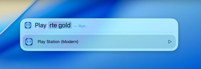
I’ve been wanting to spotlight “map [place]" for years...
@stroughtonsmith How does this differ from the way shortcut actions can present themselves in spotlight on iOS/iPadOS? I’m not using any betas at the moment, and I haven’t manually added any of these actions as explicit shortcuts
Are the APIs different for the new Spotlight actions?


@stroughtonsmith yeah I’m having the same debate with Delta. I’ve had a prototype that opens games in new windows by default on iPadOS for a while, and now it feels like it could at least be an option?
Not to mention the WWDC videos are recommending document-based apps open each document in a new window by default anyway…

@simsaens unfortunately not with public API (please file a radar!)
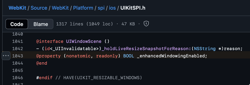
The WebKit source code points to a private API that it checks, instead


@stroughtonsmith I think that it makes more sense to have the controls at the top of the window, as you showed about 9h ago.
You lose the "liquid glass" shininess in the controls, but the space is more logically distributed. It is so weird to have the controls over some of the app's content when you have all that space at the top of the window.
Anyway, that's just my opinion; it does not matter.
Good job.
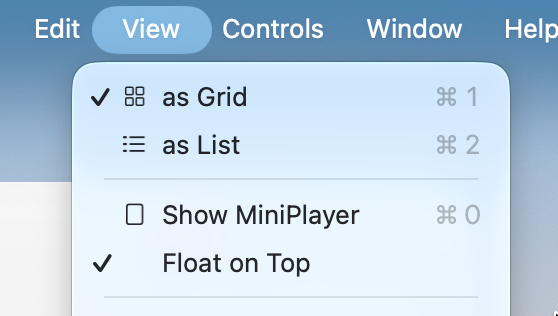
@stroughtonsmith What about items that could have a checkmark… indicating that they are selected? Is this not a thing anymore?
https://developer.apple.com/documentation/applicationservices/kaxmenuitemmarkcharattribute
@codemusings @stroughtonsmith Feels to me like title bar controls are depreciated in the new design; there shouldn't be anything under the sidebar because other UI controls and displays should also be floating in their own space, not part of the window framework.
I think when done well it could work really great, but for some apps it'll definitely require deeper work to not look awkward.
@buffaloseven @codemusings @stroughtonsmith Even if content could flow under it I am struggling to find the utility. There just isn’t enough peeking through to be of any utility, and it could easily be distracting.
This seems like an it-looks-neat change.