Bumped @broadcastsapp to v3.2 to account for the new watch app and SharePlay support, so I can bundle them together. Making sure to keep the scope of this update pretty small, as it's not intended to draw out into an iOS 17 update over the summer
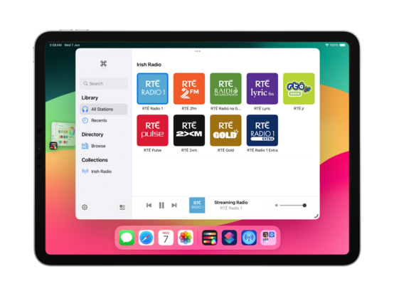
I am still figuring out how other apps implement SharePlay, but I'm reasonably happy with how it works in @broadcastsapp now in this initial version. You can start up a session over iMessage, then any participant can start playback of a station. Station name/address/artwork is shared directly through SharePlay, doesn't need to already be in your library. Could make for a fun 'watch party' mode for audio-only streams like podcasts or live events
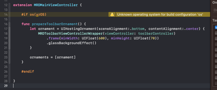
There's no visionOS SDK yet, but I can prepare for the ornaments API by making the @broadcastsapp layout more flexible. This may lead to bigger UI changes down the road to the iPad version, which I'll probably roll into a v4.0? For now, it's just decoupling some layout elements
On visionOS, I expect to place the @broadcastsapp playback toolbar in an ornament (simulated at the bottom of the window here instead), and the Now Playing screen to open as a new window — like the Mini Player on macOS. It took just a little bit of rewiring, and expanding code I had for Mac Catalyst, but getting these changes in now should hopefully mean when I build and run upon release of the visionOS SDK that everything ‘just works’
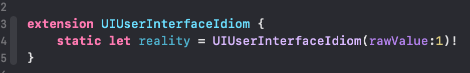
The redesign continues; I added a 'reality' device idiom (that corresponds to iPad) so I can test all my visionOS code paths at will. I'm trying to match what we saw of the visionOS Music app, and predict the navigational layout structure I'll need to light up properly when the SDK launches. I even have my ornaments prepped and ready, just ifdef'd out 😂
I added an AppKit target to the @broadcastsapp codebase just to experiment, and of 245 source files only 11 are portable 💀 All the pre-existing SwiftUI code is uncompilable, because even basic things like size classes don't have a macOS equivalent or translation. I continue to believe that the AppKit SwiftUI target is simply a dead end and needs to be rolled into the Universal app platform instead. I don't want to continue with this bringup experiment at all
If WWDC had got me thinking about SwiftUI again, even slightly, working on the @broadcastsapp watch app has definitively dissuaded me. I'm so unhappy with the development experience that I would discontinue the watch app in a heartbeat if it didn't have users. Every element is a battle, and I've wasted so much time trying to get it to work 'correctly’; if I had UIKit, I would have been done in a day and shipped months ago. Almost at the point where I git revert everything and go back to WatchKit
I think that's what I'm gonna do; shelve the updated watch app for the time being. There are other updates I want to ship and I don't want this holding me back, plus I don't have an actual Watch to do testing on anymore for such a significant revamp so it's probably for the best. Broadcasts v3.2 with SharePlay can continue on without it
Finally after 4 years I've renamed the Broadcasts Xcode project to 'Broadcasts’, and given the whole project structure a cleanup 😄
Tweaked my xrOS test scene to more closely simulate visionOS, so I can prototype my layouts and make sure the right code paths are firing
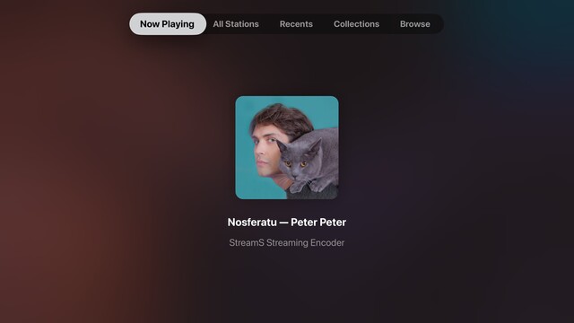
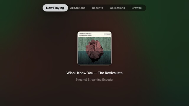
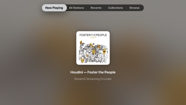
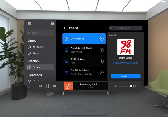
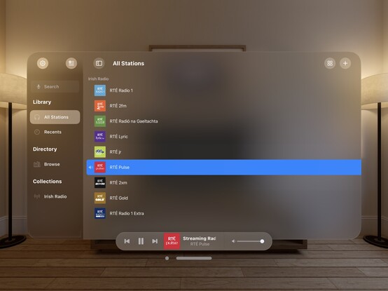
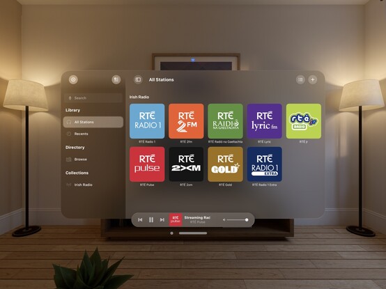
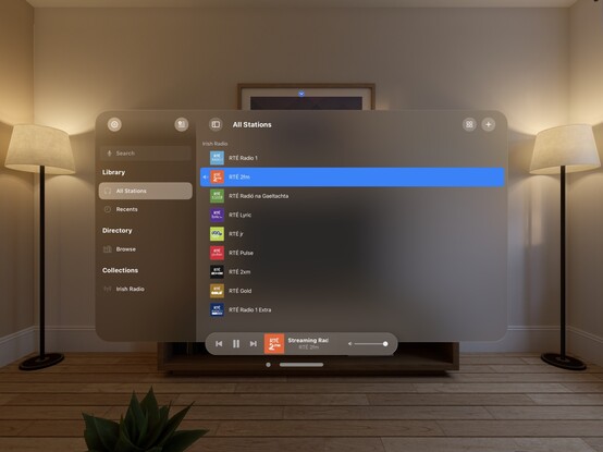
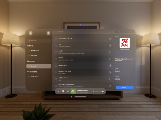
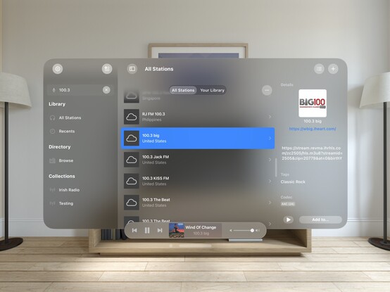
While I have a little downtime, I’m giving the tvOS app a look over to see what more of the Broadcasts experience I can expose. The Station Browser is a tough one, as it has a lot of non-tvOS-safe UI elements, but I'm doing the basics in getting things compiling at the very least. Now Playing though has been a frequent request
Though it's not actually visionOS, my little prototyping view controller is proving invaluable at reminding me which other parts of my UI need to be updated to not use static background colors. It's nice to have a core app structure that is flexible enough to cope with all these changes, for once. Having lived through the dark, painful years of rewriting iOS 6 designs for iOS 7+ and a dozen new device sizes, this is pretty refreshing
I put together this prototype over a year ago, and it's kinda neat that my floating toolbar wasn't too far off what they actually did in visionOS
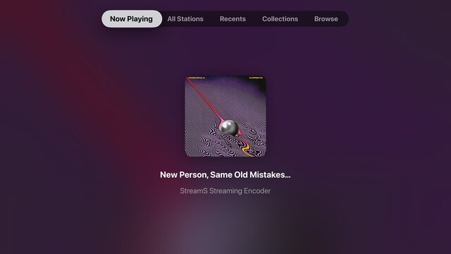
This is a special moment for me, so I'll share it with you too: this is the first launch of @broadcastsapp natively on visionOS. It's alive! 🧟
Lots of work to do, but this is promising
I'd be lying if I said I wasn't completely overwhelmed by how much effort I see before me to try and support visionOS properly across any one of my apps, nevermind all of them 😵💫
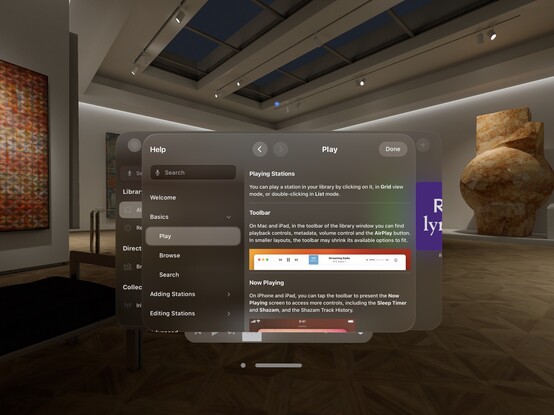
Kinda neat that my Help framework just works out of the box on visionOS 😄
My fun little experimental menu bar view kinda feels like it could work on visionOS. I should stick it into an ornament…
I’m pretty darn glad Vision Pro isn't shipping in September, that's for sure 😅
Even so, I'm pretty happy so far with the bringup process
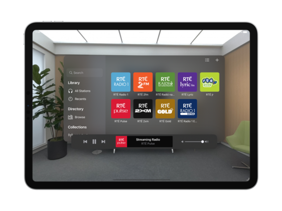
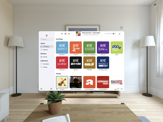
Now all my codepaths are in order, @broadcastsapp is pretty much fully-functional on visionOS. There's still plenty to learn re metrics, control sizes, and best practices, but what you see here is pretty close to what I would expect to ship at launch. It's going to take a while for me to build up a mental model of how visionOS apps work, so this design will evolve over the rest of the year
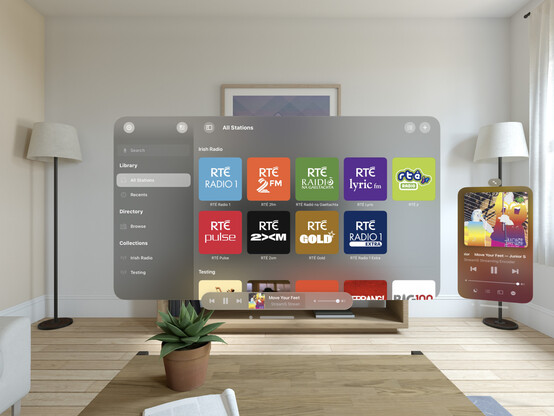
Just quick demonstration of what multi-windowing in @broadcastsapp might do on visionOS — main UI in one room, mini player in another. It would really be cool if music came from a physical source location, or if I could even have different stations playing in different rooms. In the sim, at least, all audio is piped through the main speakers and seems sourceless 🤔
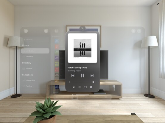
The miniest player
One neat thing you can do on visionOS is programmatically change the size of the window, so you can make a button that does this:
Here's what it looks like when you place a visionOS window flat on a desk. In this case, the mini player I've built for @broadcastsapp
I don't think I showed how I'm spawning the mini player window in @broadcastsapp, so here’s a quick one. Once you have the window, you can move it anywhere you like
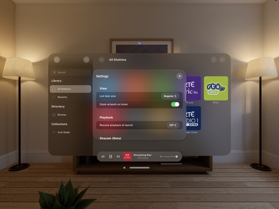
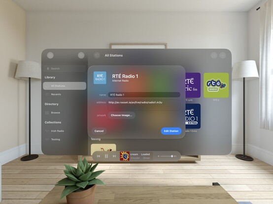
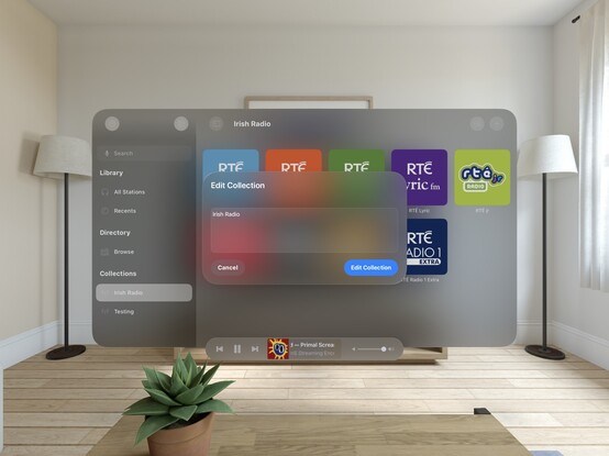
Working on all the auxiliary panels now; new UIKit toolbar is in, and I've given the two editors an initial pass for the new metrics and styles. What I'm finding with visionOS is any layout that doesn't work out of the box suggests more than anything that *I’m* doing it wrong, and I should probably rewrite it for other OSes too. It's good at highlighting focus areas in my apps that need work
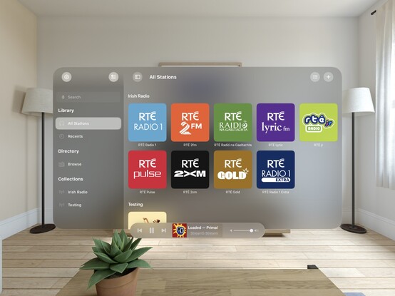
Another UI down; @broadcastsapp's search screen has been visionOSified
I haven't officially branched yet, but I think what I'm working on now will become Broadcasts v4.0. So that will be Broadcasts for visionOS, plus the revamp I want to perform on the iPad version's UI, and the payment model changes I've talked about before. Maybe the new watchOS app, if everything else goes well. I'm not sure yet if that will mean a minimum OS version bump, as I am loath to cut off hardware
Not sure if I'll go with this, but I did a little experimenting with 3D layering/z-depth in @broadcastsapp just to see how a real UIKit app might approach this. I think 'sparingly' is the right answer, but unlike many of Apple's platforms, there really are no physical bounds or rules to tell you not to. It’s a lot easier for a SwiftUI app to use 3D transforms and z-depth, so you'll probably see it used/abused much more in indie apps than e.g. Photoshop or Office
Screenshot roundup for @broadcastsapp at the end of the first week of the visionOS SDK. Honestly, I'm ready to start testing on actual hardware, which is a very expensive-sounding prospect 🫥
'You're my friend now’ /cc @jsnell
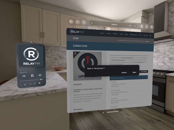
Also a fun excuse to see how URL handling works in visionOS — and it does!
Realized I never posted a picture of the iPad version of Broadcasts running on visionOS, as I went straight for a native app instead. Here's a side by side, just for fun!
Tempted to leave this alternate toolbar style in @broadcastsapp as an easter egg, to go along with the existing pinstripes setting 👀
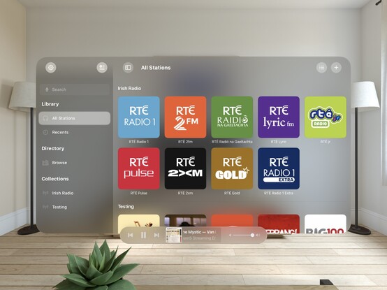
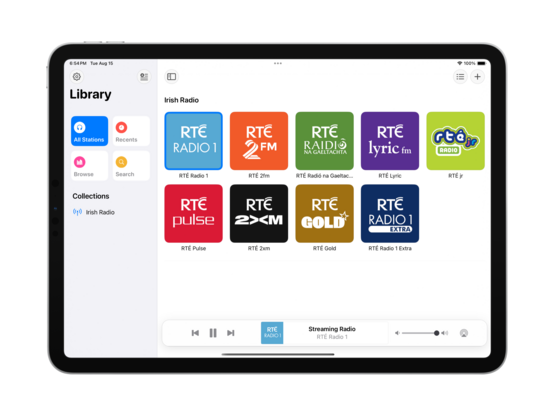
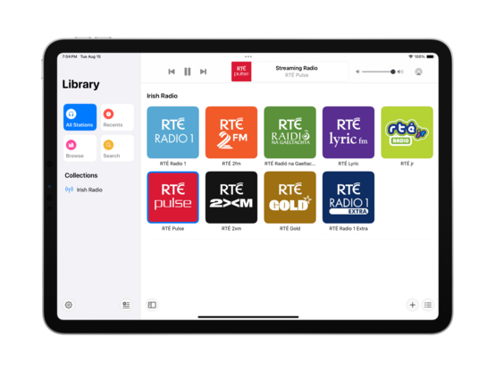
Starting some initial work on unifying @broadcastsapp's sidebar design language with @pastelapp and @takeoneapp by using the Reminders-style group cell. I think this calls for me to create a custom class I can use across all of them — I'll have to put some thought into that. Take One has the best variant so far, so I will probably use that as the template
I'm also experimenting with a new bottom-aligned floating toolbar style, but I haven't committed to it yet (I can toggle it while debugging)
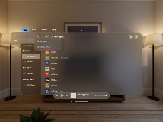
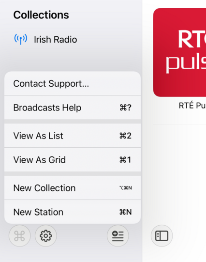
I do currently plan to remove Broadcasts’ command menu. It came about in an era where iPadOS did not have dropdown or context menus, or a system menu panel. It served its purpose, but there are better ways to go about this now
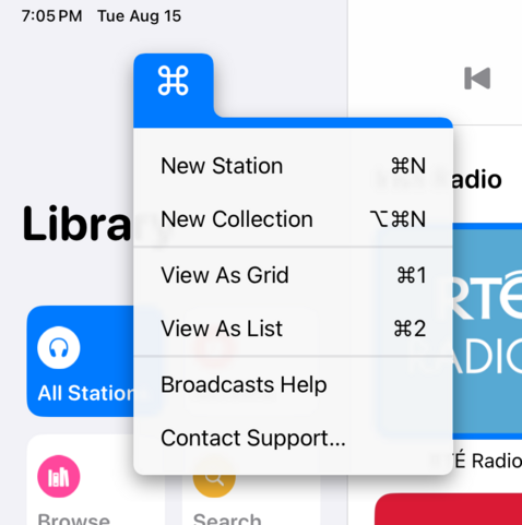
If UIMenu allowed for variable image widths, you could do something like this by rendering the shortcut symbols to an image. The 'New Collection' item is sadly how it works today. I am quite tempted to just not show multi-modifier commands in this menu though, since the effect works great otherwise…
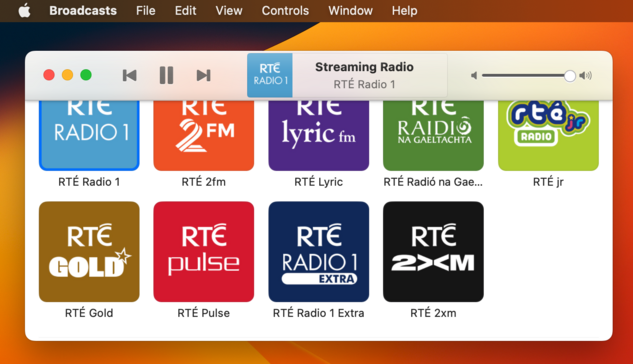
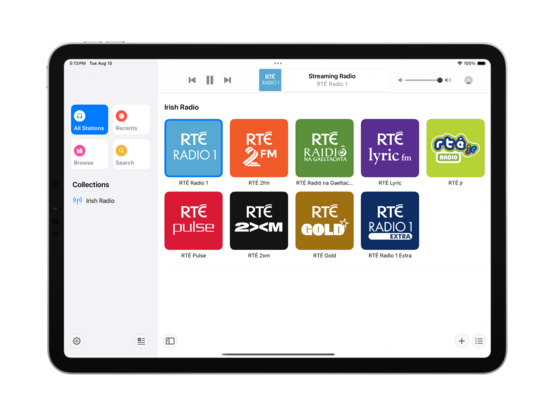
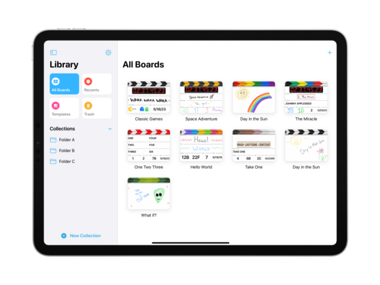
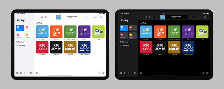
The layout and colors might change a bit, but this is the overall look I'll be going with for the next version of Broadcasts on iPad — a friendlier, more-modern sidebar design
Revisiting the Broadcasts watch app in terms of a watchOS 10 baseline so I can actually use some of the new stuff, like toolbar buttons. Using @_Davidsmith’s technique, on earlier versions of the OS it loads up the existing WatchKit code, and on watchOS 10 it's all SwiftUI. I think I'm much happier going this route than trying to build a SwiftUI interface that works across all the different OS designs. I might actually ship it this time round
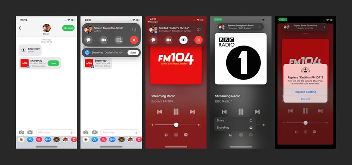
SharePlay over AirDrop is very cool, especially with the new ‘bump your phones together’ UI. I wired up @broadcastsapp so that it supports handing off playback between people just like that
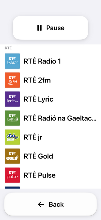
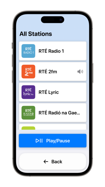
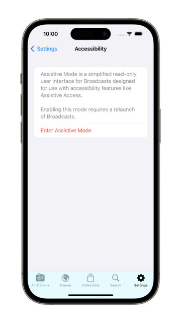
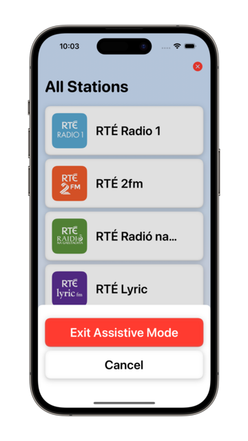
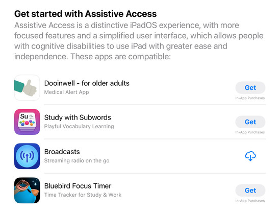
Though there’s no real system support for it, having lived through a similar situation this year I feel like my custom Assistive Access mode is too important to not ship in some form. So I'm going to do the next best thing: a temporary custom URL scheme that can toggle Broadcasts in and out of this mode, until real APIs are available. In Assistive Access mode, Broadcasts just shows a list of stations that can be played, and turns off all other features and UI. No accidental deletions, no nothing
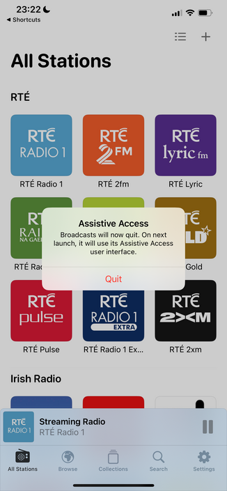
Having spent the day working with the actual Assistive Access SPI (https://mastodon.social/@stroughtonsmith/111072449541807169), I decided to replicate as much of it as I could in SwiftUI directly. In doing so, I ported my new watchOS app code to iOS and used it as the basis of my faux-Clarity UI. It's not perfect, but it kinda works! And this one I can ship
I didn't have a whole lot prepared for iOS 17, just a amorphous collection of features I'd been working on for @broadcastsapp in some form or other over the summer, while the core of the app was revamped quite a bit for visionOS. Nonetheless, they've kinda taken form over the past few days into something I can call v3.3.
I've got:
• Assistive Access mode
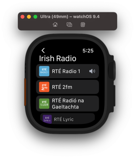
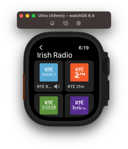
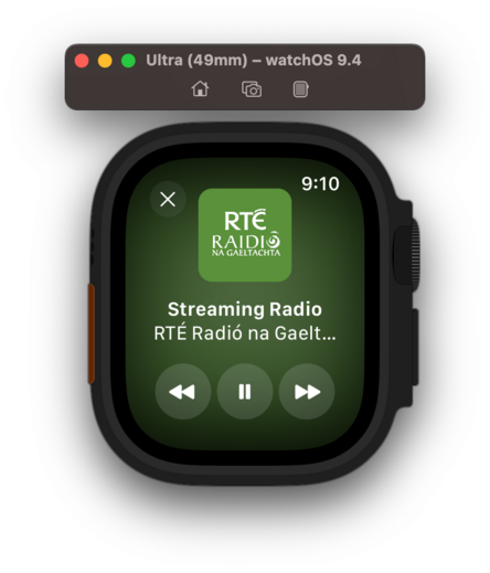
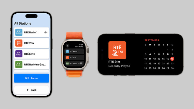
• A refreshed app for Apple Watch
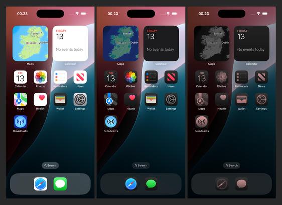
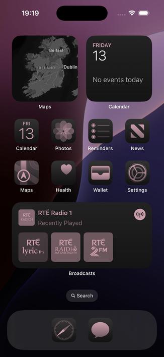
• Interactive widgets & Stand By support
• SharePlay via AirDrop
On top of that, Broadcasts has a whole visionOS app pretty much ready to go, but I have no intention of shipping this before I have a device to do final iteration & testing with. A lot has gone into the app over the past few months!

I decided to elevate Broadcasts' Assistive Mode from 'hidden feature' to just 'feature’. There's a new panel in the settings tab that allows you switch to Assistive Mode at will. And now there's a close button that lets you exit Assistive Mode, too. I think this is the right thing to do
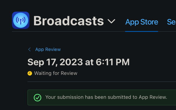
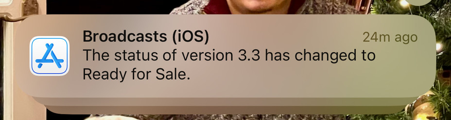
I’m calling it on Broadcasts v3.3, anything else is a ‘we'll fix it in post’. To App Review!
I would have to be real silly to be crunching to ship @broadcastsapp for the visionOS launch, huh?
…👀
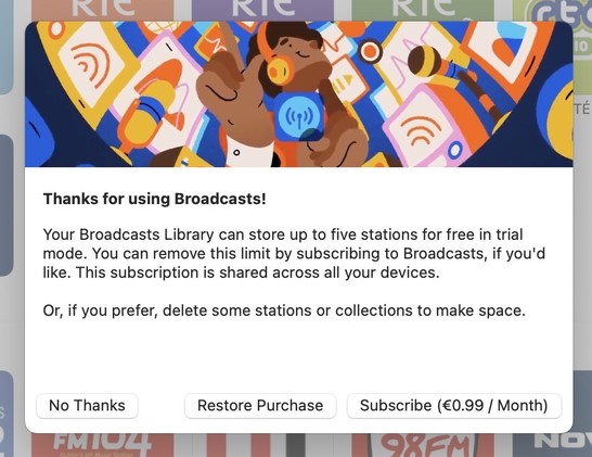
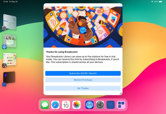
Finally going in and putting together the systems to enable Broadcasts’ switch to a subscription model. Still have a lot of UI to redesign and re-word, but successfully subscribed using my sandbox account so that's a win so far.
As a reminder, existing users won't need to switch to subscription — if you've bought the app, you've bought the app, and that purchase will last for several years to come. New users will be offered subscription pricing
Came across these screenshots from August in my screenshots folder and realized I'd completely forgotten I had a big @broadcastsapp iPad redesign underway before I got distracted with iOS 17 🤦♂️
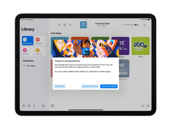
I'm going to be streamlining @broadcastsapp’s license flow a little in the next release, shifting where the library cap is exposed from the Add Station panel to the main UI instead — dimming any stations beyond the cap but letting them stay in your library. Tapping a dimmed station presents the IAP panel. It's a little more upfront, and a whole lot less confusing
Extracting Broadcasts' purchase panel out into its own project for a while, so I can iterate on it and easily resize it. The idea being to make it a flexible shared component I can use across different apps. Need to also bring it up to scratch for the switchover to a subscription model (for new users) and meet all of Apple's guidelines 😪
Fun fact: Broadcasts has received 110-ish updates across four platforms since it launched in 2020. If you add in Pastel, that brings it to 180 or so, or 45 shipping builds a year. Kinda highlights how silly it was to not move to subscriptions much earlier; the longer it gets from launch, the more I’m stretching that original $5 purchase price
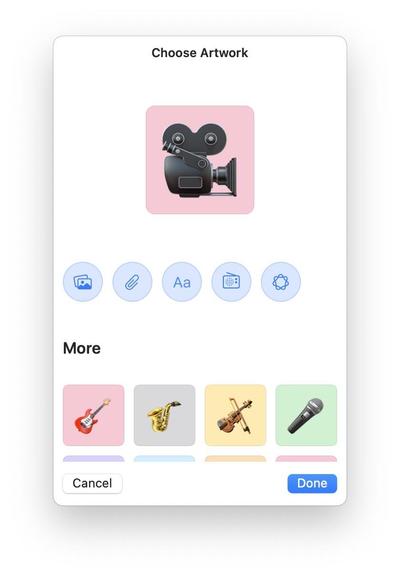
There's an obvious place for Image Playgrounds in @broadcastsapp, and that's in the station artwork picker. I’m not running the betas yet, so I'll see how appropriate the results actually are, but I've built in the support regardless and can turn it off if it doesn't work
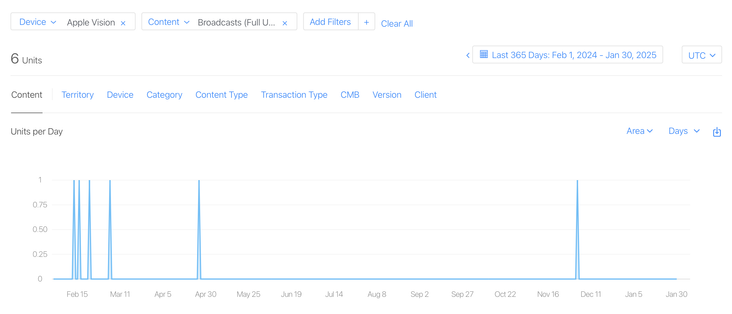
I have a whole year of sales data for @broadcastsapp on visionOS now!
In total, six full copies of the app were purchased on the platform in the past 12 months, and it has about 400 users total there.
This is my best-performing app on Apple Vision Pro, and it took about seven months of work to create 🤡
Apple offered a pat on the head in lieu of a devkit
@stroughtonsmith smart backwards compatibility extensions! Mine are not so nice 😬
@stroughtonsmith I’m tired and stressed and read that as “inflatable widgets”
UX designer, please make this a thing.
@stroughtonsmith how do you/ will you handle someone subscribing, adding many broadcasts, then unsubscribing?
@JediMax anything past the first x stations can no longer be played in the current version; I made this change some months ago
@stroughtonsmith Ooo, love the banner
@christianselig better in motion!
@christianselig @stroughtonsmith Steve who's the artist of that banner?
@stroughtonsmith May I inquire about the rationale behind that decision? Please understand, I rely on subscriptions for my livelihood. I'm genuinely curious about the abrupt choice, which we all acknowledge will restrict the user base.
@Albertkinng I've been talking about this for a year now, there's nothing abrupt about it 😂
Subscription pricing is the only sustainable way to build quality software on the App Store. Anything else, you're just kidding yourself
@stroughtonsmith @Albertkinng Sorry but I don’t buy it (pun intended 😂)
@stroughtonsmith Have you delved into the trends of subscription-based business models lately? The question for many nowadays isn't just about affordability; it's about which existing subscription to drop in favor of a new one. There’s this attachment to their current suite of apps, and that often means they'll skip even attractive new offerings if it requires an additional subscription. (1/2)
@stroughtonsmith Developers are essentially crafting apps for a niche of maybe 100 people — and if they don’t absolutely delight, that number dwindles. Having a dual approach with both one-time purchase and subscription options might just be the smarter move. (2/2)
@stroughtonsmith cheers for the heads up - just pulled the trigger before the move to subscriptions.
@stroughtonsmith I found a bug with this screen on iOS, if you try to swipe dismiss it(swiping down to close the sheet) it freezes the app and becomes unresponsive.
@stroughtonsmith Subscription?!!? You've become a rent-seeking helot like Cook.
@stroughtonsmith @broadcastsapp no, and I’m looking forward to it on the 2nd
@stroughtonsmith Not as silly as crunching to ship mine while still working on the base tvOS app, hoping I'll be able to jump onto porting to visionOS once that one is "done" 🤣
@stroughtonsmith Love to see it! Awesome work :)

@stroughtonsmith Really cool. I suppose as a user I’d also want to read that I can revert back to the default mode though.
@stroughtonsmith I suggest you put a white click wheel on that widget on the right to enhance the skeuomorphic look. 😜
@stroughtonsmith the mini player is so 👌. I love the idea of filling my workspace peripheral with little things like that.
@stroughtonsmith @broadcastsapp I can’t wait for the interactive widgets on the mac!
@stroughtonsmith Awesome work!
@broadcastsapp is there a TestFlight you’re looking for fans to join?
@unitof not currently! We traditionally do TestFlight before major releases, and there's no way to join in the interim
@stroughtonsmith @broadcastsapp this is super cool! (and man, iOS 17's animations are absolutely beautiful)
@stroughtonsmith did you have to do anything special to support this? We have SharePlay in our app but was acting up when i tried it last week before the public beta. But normal SharePlay was working as expected
@kais you need to add your group activity to the activity items config of the current view controller https://blog.thomasdurand.fr/story/2023-06-14-implement-new-airdrop-share/

Implement iOS 17’s new AirDrop experience
One of the most “off radar” feature from this year WWDC probably is the new Share experience introduced by Apple with iOS 17. From sharing your info with NameDrop, to starting a new SharePlay, we can now just approach the top of our phones together…
@stroughtonsmith awesome. Thank you! Will take a look!

@stroughtonsmith @broadcastsapp that effect 😍