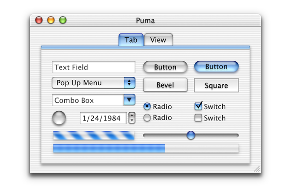
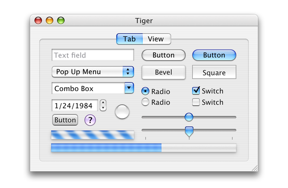
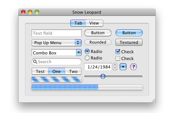
I hope I live long enough to see this style philosophy come back around. https://mastodon.social/@realmacdan/113792374380828124
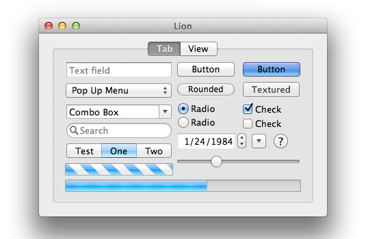
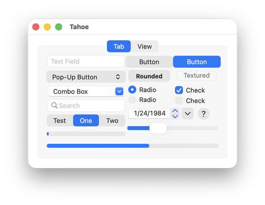
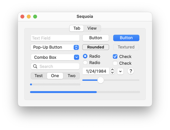
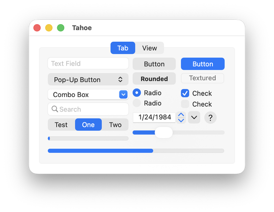
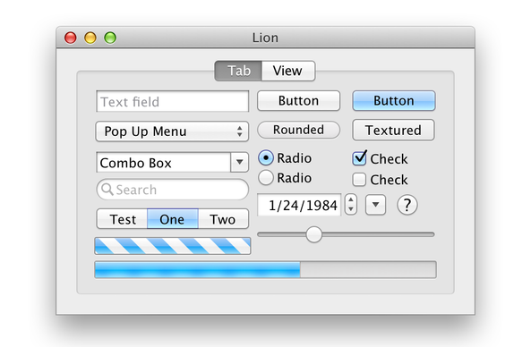
As requested by @rvr, here's a control sample from Lion, the reimagined Lion by @realmacdan, Sequoia, and Tahoe beta 2.
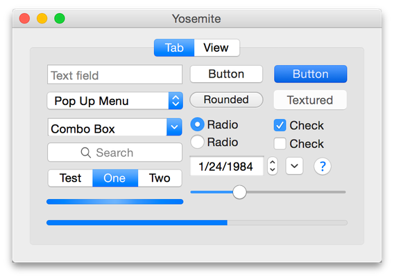
To be more fair to Tahoe, here's a version where I re-aligned the controls to accommodate the new metrics. I've also included Yosemite in this one. (I'd add more, but there's apparently a four-picture limit.)
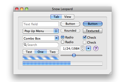
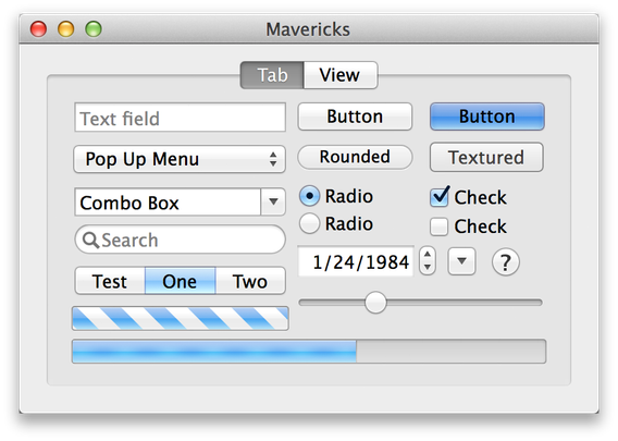
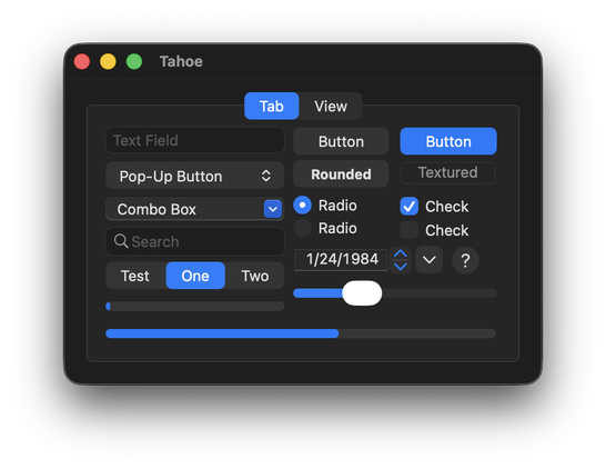
A few more older ones, plus Tahoe beta 2 dark mode.
Here are some great “reimagined” Retina-resolution images of some older versions of Mac OS X created by @kylehalevi
@siracusa @kylehalevi What’s really great about these early Aqua designs (the buttons in particular) – they looked translucent without actually being translucent. So they looked cool and glassy but also had perfect legibility at the same time.
