Running a little bit late to the party this year as I've been juggling some tough personal circumstances and a busy workload however I've decided to take part in the #30DayMapChallenge again this year, and this year I'll be sharing my maps both through Github and through a little website I built specifically for the project: https://vikkiwalls.github.io/30-Day-Map-Challenge-2023-Live/

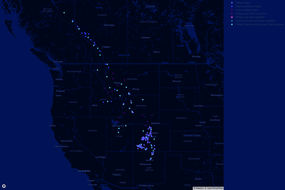
Day 1 had the theme of points, so having felt inspired by all the travel videos I've seen on Instagram lately, I thought I'd plot the highest peaks in the Rocky Mountains.

#Python #Plotly #HTML #CSS #MatPlotLib

30 Day Map Challenge

Day 2 of the #30DayMapChallenge was lines, so inspired by last year's network map I plotted the pavements in the City of London colour coded by length
Day 3 of the #30DayMapChallenge was polygons, so after much deliberation, I found a dataset which allowed me to plot the constituency regions in Scotland and Wales

Day 4 of the #30DayMapChallenge was A Bad Map. I decided to go a bit "off piste" with this one and chose to plot a bad thing, rather than produce a map that looks bad.

This map depicts all the mass shootings in the USA between January 1st and November 5th 2023.

All 518 of them...

Day 5 of the #30DayMapChallenge was Analog map, so I thought it would be fun to challenge myself to hand draw Asia since it has many interestingly shaped countries, and to recycle an unused Halloween pumpkin.

Day 6 of the #30DayMapChallenge ended up taking me a couple of days due to a lot of bugs, and producing a code file too big to be committed to GitHub without being zipped first...

The theme for day 6 was #Asia, and I decided to plot the provinces of Thailand according to how much tourist revenue they pull in.

As usual you can find all my code, data and the interactive version of the map on my challenge website at the link below.
https://vikkiwalls.github.io/30-Day-Map-Challenge-2023-Live/Day%206.html

(please note - this is quite a heavy duty map, so it will probably need a few seconds for the page to load)

#Python #Pandas #Plotly #Matplotlib #Geopandas #SQL #DataScience #DataVisualisation #GIS

Honestly this was really not my favourite #30DayMapChallenge experience. I tried so many different ways of making this map work that didn't go to plan that I ended up putting myself even further behind in the challenge than I already was. Then to top it all off what I thought would be a pretty cute idea or my map turned out to look really underwhelming and boring...

This map was for Day 7's Navigation theme and I thought it would be cool to do a play on the song "Is This the Way to Amarillo" by Tony Christie by plotting the route from New York where his writers were at the time to Amarillo Texas itself.

I did manage to add a wee easter egg to my webpage for the live version of the map though (link below). You can find out more about how I built the map and access my code there too.

https://vikkiwalls.github.io/30-Day-Map-Challenge-2023-Live/Day%207.html

Day 8 of the #30DayMapChallenge was Africa, so using the 2022 census, I plotted the usage of all the major languages of South Africa by Province

(This is part 1 of a few as there were 17 maps in total...)

#DataScience #Python #Geopandas

Day 9 of the #30DayMapChallenge was hexagons.

After an honestly pretty tiring day I opted to save some energy by recycling my day four data and plotting a hexbin map showing the worst affected areas for mass shootings in the US between January 1st and November 7th 2023. The worst area was the slot containing Chicago, with 42 incidents.

#DataScience #DataVisualization #Plotly #Python

Day 10 of the #30DayMapChallenge was North America.

I've already done quite a lot of maps focusing on the USA so I decided to venture further north and plot the extent and ground ice content of #permafrost in #canada

Unfortunately the only data I could find is pretty out of date (pre 2000) but I'm quite proud of how this map turned out nonetheless.

#Python #Matplotlib #Paint #GIS #DataScience #DataViz

Day 11 of the #30DayMapChallenge was #retro so after a few false starts with finding data for my ideas I thought about how much of a focus the #Ozone hole was in the late 90's and early 00's.

Based off of that I was able to find a dataset that gave me most countries #CFC consumption - although as you may notice there are a few countries including the UK missing. I had a lot of bugs with joining the CFC data to my geospatial data which I couldn't solve within the 1 day time constraint and I really didn't want to go another day without finishing a map.

I used paint for most of the visual effects as well as diving into my sub 5 year old memory of trendy fonts and colours!

As per data, code, access to my challenge #Github repo, and my 28 other maps can be found on my website:

https://vikkiwalls.github.io/30-Day-Map-Challenge-2023-Live/Day%2011.html

#DataScience #DataVisualization #DataViz #GIS #OzoneLayer #Python #Matplotlib #90s #90sKid

Day 11

Day 12 of the #30DayMapChallenge was South America.

I've done quite a lot of #python maps lately with this challenge so I thought it was time to crack out the 3D rendered maps.

This rendering is of the Chilean Andes and was built using Aerialod

https://vikkiwalls.github.io/30-Day-Map-Challenge-2023-Live/Day%2012.html

#DataScience #DataVisualization #DataViz #Rendering

Day 12

Day 13 of the #30DayMapChallenge was #Chloropleth, so in honour of last year's Red - Taylors Version map, I decided to plot global total album sales for #TaylorSwift by country. Unsurprisingly the United States had far more sales than anywhere else - more than double the total of all the other countries combined in fact!

It would be interesting to come back to this and re plot it once she has finished the #ErasTour. She is already going to all of these countries I believe, but the proximity might change some of the numbers.

https://vikkiwalls.github.io/30-Day-Map-Challenge-2023-Live/Day%2013.html

#DataScience #DataAnalysis #DataVisualisation #GIS #GeospatialData

Day 14 of the #30DayMapChallenge was #Europe

Whilst technically an interactive map (link below) this was very much more about spending a little time playing with design. To keep things simple I pulled the top 15 places to view the Northern Lights in Norway from a travel website, and then calculated the Lat and Long co-ordinates to create a dataset. I then plotted 12 trace layers of continuously increasing size and coloured them based off of some hex codes I extracted from an image of the northern lights.

I had another play with #MapboxStudio with this one, building a custom dark base map to try and let the 'Northern Light Points' really shine through.

If I get some time I'd love to explore this with a much more substantial dataset and see what effects I can play with.

https://vikkiwalls.github.io/30-Day-Map-Challenge-2023-Live/Day%2014.html

#DataViz #DataScience

Day 15 of the #30DayMapChallenge was themed around using #OpenStreetMap #Data

Inspired by my entry for the same theme last year, I decided to follow the same technique, and make use of the #Prettymapp app.

#DataViz #DataScience #ArtyMap

Day 16 of the #30DayMapChallenge was #Oceania

Initially I had planned to clip the original #Tif to the boundary of #NewZealand, and started doing that using #QGIS.

However, when I did a test render I thought the sea bed looked really cool, so I decided to keep the unclipped version.

These renderings make me feel inspired to explore animated renderings, but whether or not I can do that as part of the challenge will depend on time... and whether my laptop can handle heavy #blender usage 😅

#RenderedMap #Aerialod #GIS #DataScience #DataViz

Day 17 of the #30DayMapChallenge was flow. To be honest, I really struggled with todays theme, I had several really cool ideas but there was either no data, no information on how to achieve the idea, or no time.

Eventually, I decided to re use a technique I used from last year's lines map - although had my poor laptop working very hard on a file that took 15 minutes to import and required my fans to be on full pelt 😅

This is a watercourse map of #Ontario #Canada. It is not designed to be particularly functional, however if it wasn't already 1am on a work night I would have loved to play with the colours a bit more.

I really wanted to do a 3d animated map of a single watercourse for this theme, so if anyone knows any good tutorials for such things I'd love to hear about them - happy to use any tech as long as I can download it for free.

https://vikkiwalls.github.io/30-Day-Map-Challenge-2023-Live/Day%2017.html

#DataScience #DataViz #Mapping #GIS #Python #HTML #CSS #Geopandas

Day 17

Day 18 of the #30DayMapChallenge was #Atmosphere

After a quite few failed attempts at building a 3D atmospheric pressure map, (largely due to degraded python modules in all the example code I could find), I decided to change tack, so instead, here is a map comparing countries which produced the most CO2 in 2016 in total, compared to the countries who produced the most CO2 per capita.

https://vikkiwalls.github.io/30-Day-Map-Challenge-2023-Live/Day%2018.html

#DataScience #DataAnalysis #DataViz

Day 19 of the #30DayMapChallenge was 5 Minute Map, so I set myself a five minute timer and built this map of Paris centred on the Arc de Triomphe using the #Python #Osmnx package

https://vikkiwalls.github.io/30-Day-Map-Challenge-2023-Live/Day%2019.html

Day 19

Day 20 of the #30DayMapChallenge was Outdoors, so after carefully planning my route on Strava, I ventured out in my crocs in -3°C to walk the word for this day's map.

#StarvaArt

Day 21 of the #30DayMapChallenge was #Raster.

It occurred to me recently that I haven't done a lot of playing with #QGIS for this year's challenge, so I decided to combine that with this data of the #MarianaTrench and create a #contour map.

It took me a few tries as the trench is so vast that I had to play around a lot with the intervals at which contours were shown in order to have a map that produced anything readable.

Most maps have contour lines for every ten metres, with the 50 and 100m intervals slightly thicker. The pink image below has lines only at every 100m, and had to be zoomed in quite far before you can distinguish any features. The other image has purple contours at every 500m, and white contours at every 1km, which just highlights how deep the trench actually is.

What a fascinating area of the planet.

#DataViz #DataScience #GIS #Geography

https://vikkiwalls.github.io/30-Day-Map-Challenge-2023-Live/Day%2021.html

Day 21

Day 22 of the #30DayMapChallenge was "North is not always up" so I took this as an opportunity to play with #MapboxStudio, #html #iframes and positional locking

Spinny interactive version can be accessed here:
https://vikkiwalls.github.io/30-Day-Map-Challenge-2023-Live/Day%2022.html

Day 22

Day 23 of the #30DayMapChallenge was #3D

Admittedly I'm trying to catch up a little bit (hence the spam of posts this weekend) so I used the same technique from day 16.

This is a 3D rendering of the seabed around the Falkland Isles and was produced using #Aerialod

#30DayMapChallenge day 24 - Black and White

Exploring Lidar data and REM models to build this version of the North River in the US

#QGIS #REM #GIS
Thank you to Dan Coe for the fab tutorial
https://dancoecarto.com/creating-rems-in-qgis-the-idw-method

Dan Coe Carto - Creating REMs in QGIS with the IDW Method

Daniel Coe's cartographic portfolio. This site encompasses mapping and geo-centric design projects both big and small, personal and professional. My cartographic interests include geologic and geomorphic processes, natural hazards, biogeography, and lidar-based landform visualization. Beyond maps, I am intrigued and inspired by all forms of visual communication.

Day 25 of the #30DayMapChallenge was #Antarctica

I really enjoyed my little play with REMs yesterday so I wanted to see what they could do with glaciers.

I'm particularly interested by the visible striation like lines that show up.

Unfortunately this dataset only had a resolution of 8m, so I'm sure it would be much better if I had a bit more detail.

#QGIS #DEM #REM #GIS #DataScience

Day 26 of the #30DayMapChallenge was minimal.

Inspired a little by the person speaking Italian near me whist I made this, I decided to plot all the roads within the boundary lines of #Verona in #Italy

#Python #Osmnx #MinimalMap #GIS

https://vikkiwalls.github.io/30-Day-Map-Challenge-2023-Live/Day%2026.html

Day 26

Day 27 of the #30DayMapChallenge was "Dot"

I'll be honest I'm not really sure I understand the difference between this theme and day 1's "points", so my aim was basically to make a map that followed the theme but was as different as I could possibly think of.

This map plots the provinces of Denmark proportional to their furthest edges, as well as the 'capital cities' of each province (little yellow dots), and Copenhagen (big yellow dot). I actually quite like this effect but I think it would have been better on a country that had more regions.