Grazie a #PyConIT 2026 per avermi coinvolta nell'#OpenLearningDay 🙏
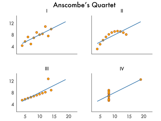
Ho portato un workshop sull'#EDA 📊: non abbiamo coperto tutto, ma così hanno materiale per casa 🙃
Tra encoding diversi e portatili in difficoltà col rendering, anche su Google Colab è emerso quanto l'#EDA chieda risorse 😅
Buona parte del percorso era pensato per rispondere a domande sui dati e c'è stata grande partecipazione 🎉