Minimalist Poster Design That Actually Works: A Music Event Template Worth Using

Honestly, I think that most event posters fail before anyone even reads them. They pile on too much color, too many fonts, too many competing ideas. Then they wonder why nobody stops scrolling. This minimalist poster design template by Jozef Micic does the opposite—and the result is striking. After working with it hands-on in Adobe Illustrator, I can tell you: this is one of those rare poster templates that respects the designer using it. It gives you a strong visual foundation without making every decision for you. That balance is harder to achieve than it sounds.

The timing for this kind of template couldn’t be better. Gradient-based minimalism is currently one of the dominant visual languages in music, tech, and cultural event promotion. You see it on festival lineups, club nights, gallery openings, and product launches. But most gradient templates look derivative. This one has genuine compositional intelligence behind it. Let me explain exactly what I mean.

Download the template from Adobe Stock

Please note that this vector template requires Adobe Illustrator installed on your computer. You can get the latest version from the Adobe Creative Cloud website. Just have a look here.

Download a minimalist poster design template by Jozef Micic as an editable vector graphic. Download the template from Adobe Stock

What Makes This Minimalist Poster Template Stand Out From the Crowd?

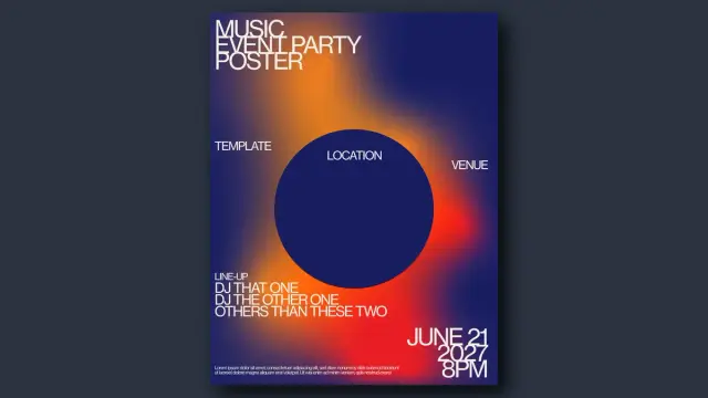
The first thing that hits you is the gradient. It’s not just decorative—it’s structural. Micic uses a deep navy blue as the dominant field, then pushes a molten amber-to-red glow from the lower-right quadrant. The result is something I’d describe as thermal tension: the poster feels warm and cold simultaneously. That’s not an accident. It creates immediate visual interest without relying on photography or illustration.

Then there’s the circle. A large, solid dark-blue circle sits centered in the composition, slightly above the midpoint. It functions as a focal anchor—what I call a Geometric Gravity Point in poster design. Everything else orbits it. The “LOCATION” label floats inside it. “VENUE” sits to its right. The lineup text anchors below it. The circle controls the entire visual hierarchy without being aggressive about it.

The Typography System: Restrained and Intentional

Micic’s type choices are equally deliberate. The headline stack—”MUSIC / EVENT PARTY / POSTER”—uses a bold, condensed sans-serif in all caps. It sits flush to the upper-left corner, creating a typographic block that feels architectural. Furthermore, the weight contrast between the large headline text and the smaller event details creates a natural reading order. Your eye moves from the top-left headline to the center circle to the bottom-right date. That’s a well-engineered visual path.

The date block in the lower right—”JUNE 21 / 2027 / 8 PM”—is set in oversized numerals. This is a classic Swiss-style typographic device, and it works beautifully here. Additionally, the small body-text placeholder at the very bottom grounds the composition without demanding attention. Every typographic element has a defined role. Nothing is there for decoration.

Color Palette Analysis: Why This Gradient Works

The palette operates in three zones. First, the cool deep-blue field (approximately #1a1a4e in tone). Second, the warm amber-orange glow radiating from the lower center-right. Third, the hot red-orange accent is bleeding toward the right edge. Together, they create what I’d call a Spectral Arc Gradient—a gradient that shifts through a convincing portion of the visible spectrum within a tight, controlled range.

This is not a random color combination. The warmth of the gradient against the cool field produces strong visual temperature contrast. Moreover, the dark circle is tonally close to the background, making it read as a void rather than a shape. That negative-space quality adds depth and sophistication. It’s exactly the kind of detail that separates professionally designed templates from generic ones.

How I Used This Poster Template in Adobe Illustrator

The template downloads as an AI file—a native Adobe Illustrator vector file. Opening it is seamless. Everything is clean, organized, and logically layered. The gradient background is a fully editable vector gradient mesh, not a rasterized image. That means you can adjust colors without any loss of quality at any output resolution.

Because it’s a vector graphic, the template scales infinitely. Therefore, you can use it for a standard A3 event flyer, a large-format print at 120×160 cm, or a digital social media square—all from the same file. That kind of format flexibility is exactly what working designers need.

Editing the Gradient: More Flexible Than Expected

I spent time reworking the gradient to test its editability. Shifting the amber-orange to a cooler violet-purple took under two minutes. The gradient structure held perfectly. Consequently, you could recolor this template to match any brand palette—a corporate blue, a fashion-week blush, a techno-night acid green—without rebuilding the composition from scratch.

The circle is also fully editable. I experimented with replacing the dark fill with a semi-transparent overlay. The effect was excellent—the gradient bleeds through subtly, creating a lens-like quality. This is a design move I’d recommend for anyone promoting a high-end or art-forward event.

Swapping the Typography for a Real Event

Replacing the placeholder text is straightforward. All text is editable as live type, not outlined paths. So you can change the font family entirely if the current choice doesn’t match your event’s identity. However, I’d caution against going too decorative here. The template’s strength comes from its typographic restraint. A serif or script headline would fight the composition, not complement it.

For music event use specifically, I replaced the lineup placeholder with three real DJ names, adjusted the column spacing, and the layout held without any manual rebalancing. That’s a sign of a well-constructed editorial grid underneath the design. Moreover, the “LOCATION” and “VENUE” text fields position logically around the circle anchor and update cleanly as you edit them.

The Minimalist Poster Design Principles This Template Embodies

Good minimalist poster design is not about removing things. It’s about understanding which things belong. Micic’s template demonstrates three principles I think are fundamental to this discipline:

1. The Dominant Field Principle

One visual element should control the majority of the poster’s surface. Here, the gradient field does exactly that. It covers the entire background and sets the emotional temperature of the whole piece. Everything else responds to it. This creates coherence without monotony.

2. The Focal Anchor Principle

Every strong poster has one unambiguous focal point. The large circle serves this function here. It’s not the largest element, but it’s the most geometrically defined. As a result, the eye naturally seeks it out first. This is the Geometric Gravity Point at work.

3. The Hierarchical Text Ladder

Text in a minimalist poster should read in a clear sequence: title → key details → supporting info. This template nails that hierarchy. The event type at the top, the lineup in the middle, and the date at the bottom—each at a different scale and weight. Consequently, even a quick glance communicates the essential information.

Who Should Download This Minimalist Poster Template?

This template is a strong fit for several use cases. It’s ideal for music event promoters, club nights, festival side events, DJ showcases, and gallery openings. Beyond music, it also works for tech product launches, creative conferences, and contemporary art exhibitions. The visual language is genre-flexible enough to carry different contexts.

Furthermore, this is an excellent starting point for graphic design students learning event poster composition. The underlying structure teaches real principles: dominant field, focal anchoring, typographic hierarchy, and thermal color contrast. Working through a template like this analytically is genuinely instructive.

Additionally, freelance designers working on tight deadlines will appreciate how much production time this saves. The composition is already resolved. You’re customizing, not constructing from scratch. That’s a significant efficiency advantage on commercial projects.

What Editable Vector Format Means for Your Workflow

The AI file format means every element stays resolution-independent. Gradients, shapes, text—all of it prints crisply at any size. This matters enormously in print production. A rasterized template at 300 dpi looks fine at A4 but falls apart at large-format print sizes. With this vector-based poster template, that problem simply doesn’t exist.

Furthermore, working in Adobe Illustrator with a well-structured AI file is a genuinely different experience from wrestling with a poorly organized template. The layers here are logical. Objects are grouped sensibly. You don’t waste time hunting for the element you want to edit. That kind of template hygiene is a professional courtesy that not all designers extend to their buyers.

Practical Output Formats From a Single AI File

From this one template, you can export a print-ready PDF with bleed and crop marks, a high-resolution JPEG or PNG for digital promotion, an SVG for web use, and even repurpose elements for motion graphics by importing the AI file into After Effects. The vector foundation makes all of this possible without quality compromise.

My Honest Assessment: Strengths and Limitations

This template is genuinely impressive. The compositional intelligence, the color temperature work, the typographic restraint—it’s all there. Moreover, the editability is excellent. The gradient is not locked down, the type is live, and the structure is clean. I’d confidently recommend it for professional use.

That said, there are some considerations worth naming. The template is portrait-oriented and optimized for standard print ratios. If you need a landscape or square version for Instagram feeds or event banners, you’ll need to adapt the composition yourself. The circle-centered layout doesn’t reformat automatically for horizontal crops.

Also, the current color palette reads strongly as nightlife and music culture. That’s a strength for those contexts, but it requires more significant recoloring if you’re applying it to, say, a corporate conference or a daytime outdoor festival. The bones are excellent; the skin needs changing for very different brand contexts.

Predictions: Where Gradient Minimalism in Poster Design Is Heading

I want to be direct about a forward-looking prediction here. Gradient-based minimalist poster design is not a trend that’s fading. It’s evolving. The next wave will push Spectral Arc Gradients into more unexpected territory—cold-to-cold palettes (indigo to slate), monochromatic thermal fields (crimson to burnt sienna), and interference gradients that mimic iridescent printing.

Templates like Micic’s are effectively documentation of where contemporary poster aesthetics currently sit. Therefore, designers who understand this grammar now will be better positioned to evolve it—or intelligently subvert it—as the language develops. Minimalism in event poster design is not standing still. It’s getting more sophisticated, not simpler.

How This Compares to Other Minimalist Event Poster Templates

Most competitor templates in this space make one of two mistakes. Either they’re too sparse—a single color block and a font—with no real visual tension. Or they’re overcrowded with gradients, textures, and elements fighting each other. This template occupies a genuinely productive middle zone. Specifically, it uses visual complexity (the gradient) in service of simplicity (the clean composition).

That’s the tension that great minimalist graphic design resolves. Complexity and clarity are not opposites. They’re in conversation. When that conversation is handled well, you get a poster that’s immediately readable and aesthetically rich at the same time. This template gets there.

Download the template from Adobe Stock

Frequently Asked Questions

What software do I need to edit this minimalist poster template?

You need Adobe Illustrator to fully edit the AI file. Because the template is a native Adobe Illustrator vector file, it opens and edits cleanly in any current version of Illustrator. Other vector editors like Affinity Designer may open the file, but full compatibility is not guaranteed.

Can I use this poster template for commercial projects?

License terms vary by marketplace. Always check the specific license attached to the file at the point of download. Most Creative Market and similar marketplace licenses allow for commercial use in event promotion, client work, and print production. Personal use licenses typically cover non-commercial applications only.

Is this template suitable for large-format print?

Yes. Because it’s a fully editable vector graphic, it scales to any print size without quality loss. You can confidently output this at A3, A2, A1, or even large-format billboard dimensions directly from Adobe Illustrator as a print-ready PDF.

How do I change the gradient colors in Adobe Illustrator?

Select the background gradient object, open the Gradient panel (Window > Gradient), and click individual color stops to reassign them using the Color panel or Swatches. The gradient mesh structure is straightforward and responds cleanly to color edits without requiring you to rebuild the gradient from scratch.

Can I use this poster template for social media graphics?

Absolutely. While the template is portrait-oriented for standard print sizes, you can adapt the artboard to square (1:1) or story format (9:16) in Adobe Illustrator by adjusting the artboard dimensions and repositioning the design elements. The vector format makes resizing non-destructive.

Who is Jozef Micic?

Jozef Micic is a graphic designer who creates professional, editable design templates, including poster layouts, branding assets, and event graphics. His work is available through major design marketplaces and is characterized by clean compositional structure, contemporary color work, and strong typographic sensibility.

What file format does this minimalist poster template come in?

The template is available as an AI file—the native Adobe Illustrator format. This ensures full editability of all vector elements, including gradients, shapes, and live text. It’s the ideal format for professional print and digital design workflows.

What makes a poster design truly minimalist?

True minimalist poster design is not about emptiness—it’s about intentionality. Every element earns its place by contributing to the visual hierarchy, emotional tone, or informational clarity of the composition. A strong minimalist poster uses restraint as a design decision, not a default. This template demonstrates that principle effectively through its use of a dominant gradient field, a single geometric focal anchor, and a clear typographic ladder.

Feel free to find other trending graphic design templates here at WE AND THE COLOR.

#1a1a4e #adobeIllustrator #AdobeStock #minimal #poster #posterDesign #posterTemplate #vectorGraphic
Inspired by the time I snorkeled in a local lake and had tons of newts swimming up to check me out! I love newts.

I've also got the newt itself as a sticker on my shop! https://www.etsy.com/ca/listing/4520782842/rough-skinned-newt-sticker

#VectorGraphic #art #newt #salamander #amphibian #stickers #inkscape #VectorArt

This Minimalist Summer Party Poster Template Nails Retro Design Without Trying Too Hard

Nostalgia sells. But lazy nostalgia bores everyone within seconds. The design world knows this, and yet the internet remains flooded with retro-styled event graphics that mistake sun-faded filters for actual craft. That’s exactly what makes this minimalist summer party poster template by Jozef Micic stand out so sharply. It doesn’t borrow from the past — it translates it. And there’s a real difference between those two things.

Right now, retro-inspired graphic design is having a serious cultural moment. Brands, DJs, independent event organizers, and creative studios are all turning toward the visual language of the 1970s. The warm gradients, the bold sans-serif typography, the stripped-back geometry — these are not just aesthetic choices. They carry emotional weight. They signal authenticity in an era where audiences are increasingly skeptical of digital polish.

This particular retro summer party poster taps into all of that energy while staying functionally tight. It’s available as a fully editable Adobe Illustrator vector file, sized for both A4 and US Letter formats, built in CMYK for professional print output, and designed to be customized in seconds. Whether you’re promoting a beach event, a rooftop party, or a summer music series, this template gives you a strong visual foundation that already does most of the heavy lifting.

Download the template from Adobe Stock

Please note that to edit this template, you need professional graphic design software like Adobe Illustrator installed on your computer. You can get the latest version from the Adobe Creative Cloud website. Just have a look here.

This minimalist summer party poster template in retro style by Jozef Micic is available for download as a vector graphic for Adobe Illustrator. Download the template from Adobe Stock

What Makes a Retro Summer Poster Actually Work in 2025?

Most retro poster designs fail at the same point: they overexplain themselves. Too many textures, as well as too many competing type styles, and too much visual noise dressed up as a vintage character. Good retro design is, paradoxically, extremely disciplined.

This template works because it commits to a concept and sees it through. A concentric sun descends into a horizon of horizontal color bands. That’s the whole image. No decorative flourishes. No secondary illustrations. Just one idea executed with precision. The design language here is rooted in what I’d call Solar Minimalism — a retro-forward framework where a single celestial motif anchors the entire composition, with color doing all the emotional work.

The color palette runs from deep brick-red through burnt orange, warm amber, and into golden yellow. These are not pastel suggestions. They’re committed. They evoke late-evening summer heat without describing it literally. That’s sophisticated visual storytelling compressed into a gradient scale.

The typography reinforces this restraint. The headline “Summer Party” is set in a heavy, grotesque, bold, unapologetic font, planted at the top left with clear typographic hierarchy. Event details appear at the top right in a lighter weight, creating a natural reading path across the page. Nothing competes. Everything has its place.

The Geometry Behind the Design: Concentric Arcs as a Visual System

Look closely at the central motif. The concentric arcs aren’t just decorative. They create depth through repetition. Each arc shifts slightly in hue as it moves outward from the yellow core, building a sense of radiant heat expanding from a single source. This technique has roots in mid-century American graphic design, particularly in the travel poster work of the late 1950s and 1960s. But here it’s applied with a contemporary economy of line that feels fresh rather than referential.

The arcs also transition seamlessly into horizontal stripes at the base of the poster. This is a deliberate structural choice. The sun “sets” into the horizon, and the horizontal bands become the reflected light on water or land. The composition tells a story of a specific moment in time — late afternoon, early evening — without using a single representational image. That’s a strong design thesis.

I’d define this structural approach as Motif Continuity Architecture: a compositional strategy where a single repeating visual element transitions between two states — curved and linear — to create both movement and spatial grounding within a flat design. It’s the kind of framework that makes a poster feel cinematically complete.

Why Vector Format Matters for Event Graphics

This template is built entirely in Adobe Illustrator as a vector file. For event promoters and designers, that distinction matters enormously. Vector graphics scale to any dimension without quality loss. You can print this poster at A4 for a café noticeboard or blow it up to a 3-meter event banner — the result looks identical in terms of sharpness and color fidelity.

The CMYK color mode means professional print shops will receive exactly the colors you see on screen, without the conversion errors that can distort warm tones when exporting from RGB. Burnt orange should look like burnt orange on paper. That reliability is built into the file from the start.

Placeholder text throughout the template is fully editable in Illustrator. Swap in your event name, date, location, performer lineup, and any other details in seconds. The layout is structured to accommodate standard event information without requiring any redesign. It’s genuinely ready to use immediately after downloading.

The Retro Revival Cycle: Why This Visual Language Resonates Right Now

Design trends operate in roughly 25-to-30-year cycles. We revisit aesthetics once enough time has passed for them to feel both nostalgic and newly discovered. The 1970s are firmly in their peak revival window, which partly explains the current saturation of warm-toned, geometrically abstract event graphics across social media and print.

But there’s more than cyclical timing at work. The 1970s design vocabulary — flat color, bold shape, minimal ornamentation — translates exceptionally well to digital contexts. It reads clearly on small screens. Furthermore, it prints well, and it avoids the visual complexity that makes many contemporary designs feel exhausting. That functional compatibility with modern media is a major reason the style has sustained its cultural relevance rather than fading quickly.

This summer party poster template understands that. It’s not nostalgic in a wistful, backward-looking sense. It’s using a proven visual grammar to communicate something immediate and exciting: a summer event you’d actually want to attend.

How This Template Fits the Modern Event Promotion Workflow

Independent event organizers often face a real tension between wanting high-quality visuals and lacking the budget or time for a full custom design commission. Editable vector templates solve that problem cleanly. The design work is done. The customization is fast. The output is professional.

For a freelance designer working with event clients, this template also functions as a strong starting point that clients can understand and respond to immediately. The visual concept is legible at a glance. There’s no need to explain the aesthetic direction at length. The client either connects with it or they don’t — and if they do, the project moves forward at speed.

Social media adaptation is also straightforward. The core motif — the concentric sun above the horizon bands — crops cleanly into square formats for Instagram or resizes for Stories without losing its visual logic. That adaptability is not accidental. It’s the reward for designing from a strong central concept rather than from decorative accumulation.

Minimalist Summer Party Poster Design: A Framework for Evaluating Quality

When evaluating any event poster template, I apply what I think of as the Three-Second Thesis Test: can a viewer extract the core message, tone, and event type within three seconds of exposure? Strong poster design passes immediately. Weak design fails because it forces the viewer to work too hard.

This template passes without hesitation. “Summer Party” registers first, anchored by the scale and weight of the typography. The visual mood — warm, celebratory, slightly nostalgic — lands simultaneously through color and form. The event details are available for those who look longer. The hierarchy is perfect.

A second framework worth applying is Color Emotional Coherence: the degree to which the color palette reinforces the intended emotional register of the event. This poster’s amber-to-crimson spectrum signals warmth, energy, and a specific time of day (sunset) that’s inherently associated with social gatherings and leisure. The color choices don’t just look good. They do communicative work.

Who Actually Needs This Template?

The obvious users are event organizers, nightlife promoters, and DJs. But the design’s visual authority extends beyond that. Music festival organizers working on sub-stage flyers will find it useful. Small businesses promoting summer sales events can adapt it. Creative directors looking for mood-board material or client presentation visuals can use it as a reference. Design students studying retro vector aesthetics have a clean, well-executed example to learn from.

The template is also a practical resource for anyone learning Adobe Illustrator. Examining how a professional handles concentric path construction, color gradient layering within vector shapes, and typographic spacing at this scale is genuinely instructive. Good templates teach while they serve.

Adobe Illustrator Vector Templates and the Democratization of Design Quality

There’s a broader story worth telling here. The availability of high-quality, professionally designed vector templates through platforms like Adobe Stock has genuinely shifted what’s possible for non-designers and small teams. A concept like this poster — which required real design skill and aesthetic judgment to produce — is now accessible to anyone with an Illustrator license and ten minutes to spare.

This isn’t a threat to professional design. It’s a reallocation of creative labor. Designers who create strong templates are doing valuable work. Users who customize those templates thoughtfully are making real design decisions. The line between “designer” and “design user” continues to shift, and honestly, that’s interesting rather than alarming.

What this template represents, at its best, is the transfer of a specific design intelligence — Jozef Micic’s eye for proportion, color, and compositional restraint — into a reusable, transferable format. That’s not diminishment. That’s craft finding its widest possible audience.

Predictions: Where Retro Vector Design Is Heading

The current retro design wave will not plateau. Instead, it will fragment. Expect increasing specificity — not just “1970s” but particular subsets of that decade’s visual culture: Soviet-era constructivist geometry, Japanese city-pop illustration, American Southwest tourism posters. The broader “warm retro” aesthetic will give way to more precisely referenced design languages.

Templates that anchor themselves in a specific, coherent visual thesis — like this solar minimalism approach — will hold their relevance longer than generic retro styles. The more precisely a design speaks, the more durably it communicates. That’s as true for event posters as it is for any design work.

AI-assisted design tools will also change how templates are used. Designers will increasingly combine template structures with AI-generated custom elements, producing hybrid outputs that sit between templates and fully custom work. The vector format’s editability becomes even more valuable in that context — it’s the stable foundation that AI variations can build around.

Practical Guide: Customizing This Summer Party Poster Template

Opening the file in Adobe Illustrator, you’ll find the text elements are immediately selectable. Replace the “Summer Party” headline with your event name using the same typeface for consistency. Update the date, time, and location details in the upper right. Swap the performer names on the left for your actual lineup.

If you want to adjust the color palette — perhaps shifting toward cooler sunset tones or pushing into deeper reds for a late-night aesthetic — use the Recolor Artwork function in Illustrator. The vector construction means you can shift the entire palette cohesively without manual adjustments to individual elements.

For print output, export as a high-resolution PDF in CMYK color mode. The template is already configured for this, so the export settings are minimal. For digital use — social media, email newsletters, event listings — export as PNG at 150 DPI minimum for screen clarity, or 300 DPI if you anticipate any print-on-demand use.

Download the template from Adobe Stock

The A4 and US Letter sizes cover the majority of standard print applications. For non-standard dimensions, scale the artboard proportionally and adjust text positioning as needed. Vector graphics handle this scaling without degradation.

Frequently Asked Questions

What file format does this summer party poster template come in?

The template is available as an Adobe Illustrator vector file (.ai). This format supports full editability of all design elements, including text, shapes, and colors. It scales to any size without quality loss.

What size is the retro summer party poster template?

The template is designed in both A4 and US Letter formats. Both sizes are included in the download. You can also rescale the artboard to any custom dimension within Adobe Illustrator since all elements are vector-based.

Is this template suitable for professional printing?

Yes. The template uses CMYK color mode, which is the standard for professional offset and digital print production. This ensures color accuracy when working with commercial print services. Export as a press-ready PDF for best results.

Can I edit the text in this summer party poster template?

All text in the template is fully editable in Adobe Illustrator. Placeholder text can be replaced with your event name, date, time, location, and performer details in seconds. No advanced Illustrator knowledge is required for basic text editing.

Who designed this retro summer party poster?

The template was designed by Jozef Micic, a graphic designer whose work is available through Adobe Stock. The design reflects a minimalist approach to retro visual aesthetics, drawing on 1970s design language with a contemporary economy of form.

Can I use this template for commercial events?

Usage rights depend on the specific Adobe Stock license applied to the template at the time of download. Standard Adobe Stock licenses cover most commercial applications, including event promotion materials. Review the license terms during purchase for full details.

What makes this poster design style “retro”?

The design draws on visual conventions from 1970s American and European graphic design: warm amber-to-crimson color palettes, concentric geometric forms representing a sun, horizontal banding suggesting a horizon, and bold sans-serif headline typography. These elements combine to produce a visual language immediately associated with that era.

Can I adapt this poster for social media use?

Yes. The core visual motif scales and crops cleanly for square Instagram posts, Stories, and other social formats. Export as PNG or JPEG from Illustrator at the appropriate dimensions. The bold, high-contrast design reads well at small screen sizes.

Do I need advanced Adobe Illustrator skills to customize this template?

Basic Illustrator skills are sufficient for text replacement and color adjustments. The file is professionally structured, so intermediate users can also explore the layer organization to make more extensive modifications. The Recolor Artwork function makes palette changes particularly accessible.

Where can I download this minimalist summer party poster template?

The template is available for download through Adobe Stock. Search for the template by designer name Jozef Micic or by searching for retro minimalist summer party poster templates within the Adobe Stock library.

Check out other amazing graphic design templates here on WE AND THE COLOR.

#70s #AdobeStock #minimal #poster #posterDesign #posterTemplate #retro #vectorGraphic #vintage
I hope you all have a great weekend

#fotoart
#gimp
#vectorgraphic
People really liked my ungovernable gull! So you can now get it as a sticker, or on a T-shirt. If there's some other item you'd like it on, I can probably make that happen too.

https://www.etsy.com/ca/listing/4485249514/ungovernable-gull-t-shirt-funny-animal

#seagull #gull #ungovernable #vectorart #vectorgraphic #graphicdesign #art #etsy #merch #canada
WC nur für Anfänger - image: Drucksachen!

Guidelines and instructions for small and large businesses. Inform others with postcards from ohoh.store. The ohoh.store has divided its collection of postcards into various categories. The postcard designs are categorised by technique, material and various thematic themes. One category features postcards with illustrations, 12 of which are currently on offer.

Drucksachen! is a brand that uses photography, illustration and collage to create postcard designs for various occasions, such as birthdays, Easter, births, get-well wishes, and so on.

#postkarte #postcard #cartespostales #postkaart #cartepostale #postcardsfromtheworld #postcrossing #webshop #postcardexchange #happymail #postkartenliebe #giftshop #schreibmalwieder #snailmail #schneckenpost #illustration #illustrationart #drawing #zeichnung #vector #vectorart #vectorgraphic #toilet #pictogramm #pictogram #piktogramm #toiletsign #icon
Der kleine Moogh. Wow! Ich hab's! - image: Christine Oehrlein

A philosophical reflection by Little Moogh, a vector art creation by Christine Oehrlein. The ohoh.store has divided its collection of postcards into various categories. The postcard designs are categorised by technique, material and various thematic themes. One category features postcards with illustrations, 12 of which are currently on offer.

Christine Oehrlein works as a graphic designer and has her own agency, KunstKatalyse, in Berlin. She conceives and designs printed media, corporate identities and exhibition graphics. To ensure optimal results, she supervises and monitors the entire production process. With her strong entrepreneurial spirit, she has made her company a success.

#postkarte #postcard #cartespostales #postkaart #cartepostale #postcardsfromtheworld #postcrossing #webshop #postcardexchange #happymail #postkartenliebe #giftshop #schreibmalwieder #snailmail #schneckenpost #illustration #illustrationart #drawing #zeichnung #vector #vectorart #vectorgraphic #philosophy #philosophie #philosophical #philosophicalthought #philosophisch
I continue to be silly with my vector art doodling.

This my illustration of a kelp pipefish, Syngnathus californiensis.

#vectorgraphic #vectorart #art #funny #joke #cecinestpasunepipe #pipefish #syngnathus #fish

Abstract Geometric Vector Shapes That Make Everything Around Them Look Timid https://weandthecolor.com/abstract-geometric-vector-shapes-that-make-everything-around-them-look-timid/208472

Graphic designer and contributor to Adobe Stock, Oleg R. has created a striking collection of abstract geometric vector shapes that stand out for their bold color, mathematical precision, and high contrast against black backgrounds.

#graphicdesign #vectorgraphic