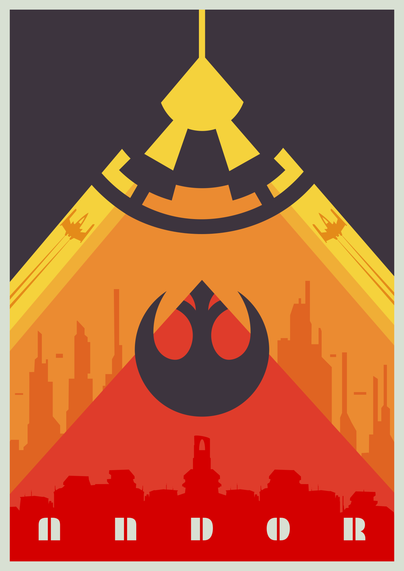
DESIGN ☆ PRINT ☆ BRAND ☆ MARKET
Posters • Flyers • Banner • Brochures
📞 0112216151
#posterdesign #viral #Flyers #banner #trendingnow
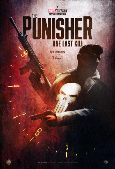
Posters • Flyers • Banner • Brochures
📞 0112216151
#posterdesign #viral #Flyers #banner #trendingnow
I am a huge Punisher since I can remember. I own tons of comics, watched all the movies and I love Bernthal's iteration of the character. Here is a tribute poster I made for the Marvel Television Special Presentation, now streaming on Disney+.
#thepunisher #posterdesign #keyart #frankcastle #digitalart #filmposter #streaming #keyart #illustration #marvel #onelastkill #disneyplus #nunosarnadas

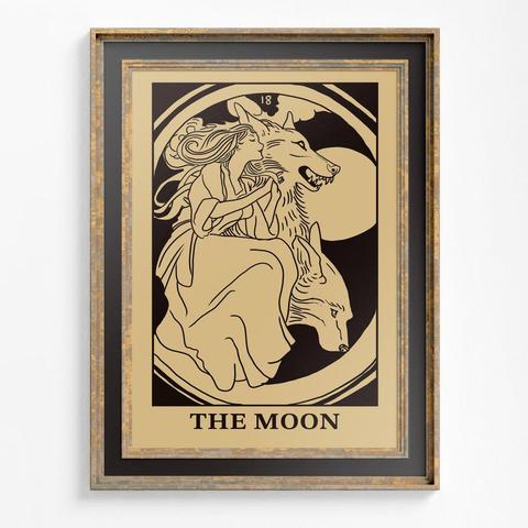
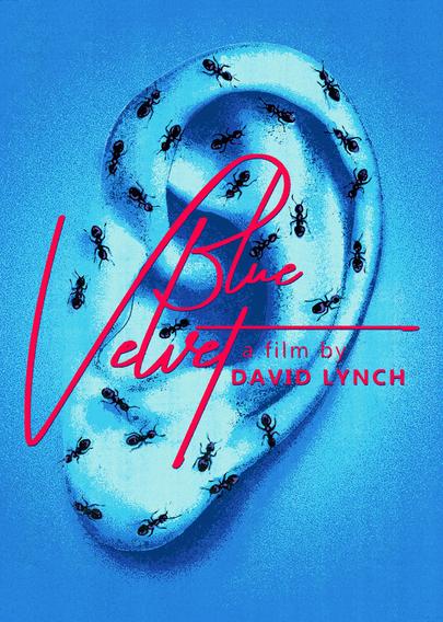
Desenhando filmes que gosto, até alguém me chamar pra desenhar um cartaz.
Cartaz de hoje é do meu filme favorito do David Lynch ❤️