Beautiful palettes based on art for R and python: https://github.com/BlakeRMills/MetBrewer #rstats #ggplot #dataviz
Examples of creative data visualizations, mostly ggplot: https://github.com/tashapiro/tanya-data-viz #ggplot #dataviz #rstats
If you set limits for a scale (e.g. x-axis) in ggplot, how would you like data outside of that range be handled? There is the oob parameter for that and a set of functions to use with it: https://scales.r-lib.org/reference/oob.html #rstats #ggplot #dataviz
Out of bounds handling — oob
This set of functions modify data values outside a given range. The oob_*() functions are designed to be passed as the oob argument of ggplot2 continuous and binned scales, with oob_discard being an exception. These functions affect out of bounds values in the following ways: oob_censor() replaces out of bounds values with NAs. This is the default oob argument for continuous scales. oob_censor_any() acts like oob_censor(), but also replaces infinite values with NAs. oob_squish() replaces out of bounds values with the nearest limit. This is the default oob argument for binned scales. oob_squish_any() acts like oob_squish(), but also replaces infinite values with the nearest limit. oob_squish_infinite() only replaces infinite values by the nearest limit. oob_keep() does not adjust out of bounds values. In position scales, behaves as zooming limits without data removal. oob_discard() removes out of bounds values from the input. Not suitable for ggplot2 scales.
ggplot2 theme in Associated Press style:
https://github.com/associatedpress/aptheme
Add some swag to your ggplots, with fontawesome symbols and colors: https://nrennie.rbind.io/blog/adding-social-media-icons-ggplot2/ #rstats #ggplot #fontawesome #ggtext

Adding social media icons to charts with {ggplot2} – Nicola Rennie
Adding social media icons to your data visualisation is a great, concise way to put your name on your work, and make it easy for people to find your profile from your work. This blog post explains how to add social media icons to {ggplot2} charts.
You dont like the default color palett of #ggplot? You can change it: https://stackoverflow.com/questions/10504724/change-the-default-colour-palette-in-ggplot #rstats #dataviz

{ggchicklet}: library for rounded Segmented Column Charts: https://github.com/hrbrmstr/ggchicklet #ggplot #rstats #dataviz @hrbrmstr
r-graph-gallery.com provides example code for a variety of chart types, both in base R and ggplot: https://r-graph-gallery.com/ #rstats #ggplot #design
Add richer tooltips to ggiraph with kableExtra and friends: https://uncharteddata.netlify.app/posts/2022-09-30-interactive-tooltip-tables/ #dataviz #ggplot #ggiraph #UI
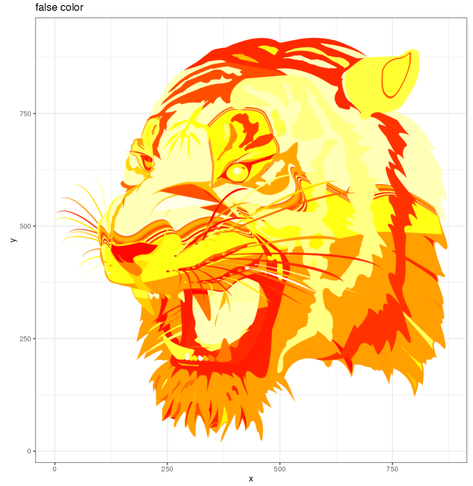
Convert from beziers to line segments in pure #RStats.
Here's the tiger, once with false colour, once with real colours. Plotted with #ggplot geom_polygon()
Feeling pretty good for a bit of lazy #WeekendCoding