Rina Stardust 💻
"Traduzindo arte em algoritmos e otimizando a estética do design. O futuro é um código bem estruturado, rosa e perfeitamente liso. 🤖💖 #RinaStardust #TechArt #DataDesign #Futuro"


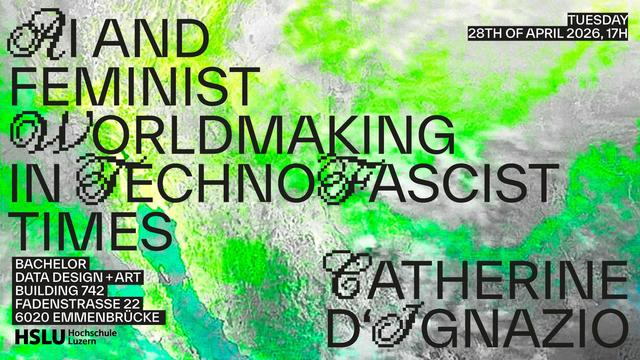
I am very pleased to share that Data Design + Art first public lecture will host none other than Catherine D'Ignazio.
Like for many others, Catherine D'Ignazios work, for example the seminal book «Data Feminism» (MIT Press 2020), co-authered with Lauren Klein, has been an invaluable inspiration to combine data work with questioning dominant power structures. It is a book that I, but also our students, keep coming back to time again and again.
«AI and Feminist Worldmaking in Technofascist Times»
by Catherine D'Ignazion
Author of «Data Feminism» / Associate Professor of Urban Science & Planning / Director, Data + Feminism Lab Department of Urban Studies & Planning
Massachusetts Institute of Technology MIT
Tuesday 28th of April 2026, 17H
The lecture will be held in person & in english. / Attendance is free but place is limited. / Please reserve a spot at [email protected]
Data Design + Art
Building 742
Fadenstrasse 22
6020 Luzern-Emmenbrücke
Как мы улучшаем наши «Нейросторис»: новый фильтр и исправление ошибок
Всем привет! Недавно я рассказывал о том, как мы создали для риелторов сервис автоматической генерации stories в нашем мобильном приложении. Сегодня я поделюсь тем, как мы продолжаем улучшать эту фичу и к каким результатам это привело.
https://habr.com/ru/articles/1017270/
#marketing #marketing_automation #marketing_research #productdevelopment #datadesign #ux #ux_design #ux_дизайн #uxисследования #mobileapp
Как мы сделали автогенерацию контента для риелторов в мобильном приложении
Всем привет! Мы добавили новый функционал в мобильном приложении цифровой платформы для риелторов, который позволил создавать продающий контент для социальных сетей и генерировать новые лиды. В статье расскажу, как мы пришли к созданию такого инструмента и как он повлиял на увеличение количества сделок наших пользователей.
https://habr.com/ru/articles/1010674/
#productdevelopment #marketing #ux #datadesign #mobileapp #digitalmarketing #продуктология #content #content_management_system

#Data is more than an asset: it is a designed experience, a product. Jed Sundwall’s article “Great #DataProducts” reminds us that #OpenData matters only when paired with intent, usability, and care in creation. A shout out for #DataDesign and #ProductThinking for #geospatial data.
the top symbol of the hallmark explained
#art #1bit #blackandwhite #solodev #pixelart #ドット絵 #oc #gamedev #lowres #metadata #doodle #datadesign #60Grid #javascript #webdev #webapp #mobiledev #digitalart #illustration #artist #graph #info
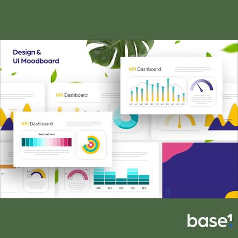

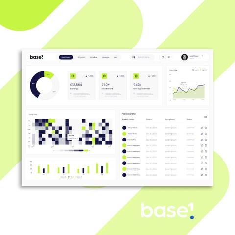
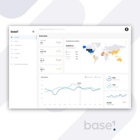
10 𝐓𝐢𝐩𝐬: 𝐇𝐨𝐰 𝐭𝐨 𝐂𝐡𝐨𝐨𝐬𝐞 𝐏𝐞𝐫𝐟𝐞𝐜𝐭 𝐂𝐨𝐥𝐨𝐮𝐫𝐬 𝐟𝐨𝐫 𝐏𝐨𝐰𝐞𝐫 𝐁𝐈 🎨 First impressions count when it comes to how your dashboards are perceived - some feel right, while others seem messy. When presenting your work to teammates and decision-makers it's important to feel confident that you've nailed the look and feel. 𝐓𝐡𝐞 𝐬𝐞𝐜𝐫𝐞𝐭 𝐨𝐟𝐭𝐞𝐧 𝐥𝐢𝐞𝐬 𝐢𝐧 𝐜𝐨𝐥𝐨𝐮𝐫—not just picking the pretty ones, but the right ones for your data and audience. I recommend these 10 steps to nailing your colour choices every time: 1. 𝐒𝐭𝐚𝐫𝐭 𝐖𝐢𝐭𝐡 𝐘𝐨𝐮𝐫 𝐁𝐫𝐚𝐧𝐝 𝐏𝐚𝐥𝐞𝐭𝐭𝐞 🎯 Business colours are more than just for logo's! They bring consistency and professionalism to your dashboards. Use them for headers, key visuals or accents. 2. 𝐔𝐬𝐞 𝐂𝐨𝐥𝐨𝐮𝐫 𝐭𝐨 𝐓𝐞𝐥𝐥 𝐚 𝐒𝐭𝐨𝐫𝐲 📖 Every colour should have a job. Green for positive trends, red for warnings and neutral tones for context. Let your audience feel the data at a glance. 3. 𝐋𝐢𝐦𝐢𝐭 𝐘𝐨𝐮𝐫 𝐏𝐚𝐥𝐞𝐭𝐭𝐞 🎨 Less is more. Stick to 2-3 main colours and 1-2 accent shades. Overloading colours can confuse your audience and dilute your message. 4. 𝐏𝐫𝐢𝐨𝐫𝐢𝐭𝐢𝐬𝐞 𝐀𝐜𝐜𝐞𝐬𝐬𝐢𝐛𝐢𝐥𝐢𝐭𝐲 ♿ Ensure your colour choices work for everyone. Use high contrast and avoid combinations like red and green, which can be difficult for colourblind users. 5. 𝐋𝐞𝐚𝐧 𝐨𝐧 𝐂𝐨𝐥𝐨𝐮𝐫 𝐓𝐡𝐞𝐨𝐫𝐲 🌀 Analogous colours (next to each other on the wheel) feel harmonious, while complementary colours (opposites) create contrast. Use these principles to guide your choices. 6. 𝐊𝐞𝐞𝐩 𝐁𝐚𝐜𝐤𝐠𝐫𝐨𝐮𝐧𝐝𝐬 𝐍𝐞𝐮𝐭𝐫𝐚𝐥 🤍 Bright or busy backgrounds can distract from your visuals. Stick to light greys or whites to make your data pop. 7. 𝐓𝐞𝐬𝐭 𝐨𝐧 𝐃𝐢𝐟𝐟𝐞𝐫𝐞𝐧𝐭 𝐃𝐞𝐯𝐢𝐜𝐞𝐬 📱 Colours can look different on various screens. Always preview your dashboards on a laptop, tablet, and phone to ensure consistency. 8. 𝐀𝐝𝐝 𝐕𝐢𝐬𝐮𝐚𝐥 𝐂𝐮𝐞𝐬 𝐁𝐞𝐲𝐨𝐧𝐝 𝐂𝐨𝐥𝐨𝐮𝐫 🧩 Don’t rely on colour alone to convey meaning. Use shapes, text, or icons to reinforce your message for a more inclusive experience. 9. 𝐄𝐱𝐩𝐥𝐨𝐫𝐞 𝐏𝐨𝐰𝐞𝐫 𝐁𝐈 𝐓𝐡𝐞𝐦𝐞𝐬 🖌️ Use built-in or custom JSON themes to apply a polished, consistent colour palette across your entire report in seconds. 10. 𝐈𝐭𝐞𝐫𝐚𝐭𝐞 𝐖𝐢𝐭𝐡 𝐅𝐞𝐞𝐝𝐛𝐚𝐜𝐤 🔄 Share your colour choices early and refine them based on user feedback. Sometimes the colours you love might not resonate with your audience! 𝘎𝘳𝘦𝘢𝘵 𝘤𝘰𝘭𝘰𝘶𝘳𝘴 = 𝘤𝘭𝘦𝘢𝘳 𝘴𝘵𝘰𝘳𝘪𝘦𝘴 + 𝘮𝘦𝘮𝘰𝘳𝘢𝘣𝘭𝘦 𝘥𝘢𝘴𝘩𝘣𝘰𝘢𝘳𝘥𝘴. 𝐒𝐮𝐛𝐬𝐜𝐫𝐢𝐛𝐞 𝐭𝐨 𝐦𝐲 𝐧𝐞𝐰𝐬𝐥𝐞𝐭𝐭𝐞𝐫 (link in comments) for more Power BI design tips and freebies! 🎉 #matthewspuffard #powerbi #powerbitips #designtips #data #dataanalytics #colourtheory #branding #baseone
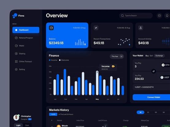
Rounded bars on Power BI bar charts—who’s with me? 🙋
Clean, modern #UIUX matters! This design rocks and could make dashboards look so much better. Let’s push for these little improvements that make a big difference!
For more design ideas, visit my LinkedIn: Matthew Spuffard https://www.linkedin.com/in/matthewspuffard/🚀
#PowerBI #DataDesign #DashboardTips