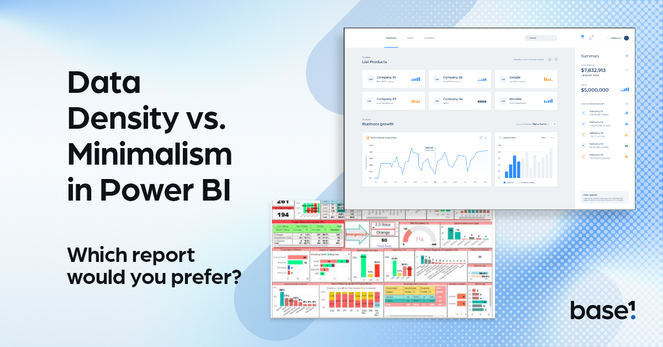
Balancing Data Density & Minimalism in Power BI ⚖️
1️⃣ Highlight key metrics 🎯
2️⃣ Use drill-throughs for depth 🧩
3️⃣ Structure layouts for clarity 🖼️
4️⃣ Test dashboards for cognitive load 🧠
Well-designed dashboards answer questions, not raise them. Full guide: Matthew Spuffard 🚀
https://www.linkedin.com/in/matthewspuffard/
#PowerBI #DataAnalytics #DashboardTips
Power BI Dashboard Design: 10 Key Principles 🚀
✔️ White space improves focus 🌌
✔️ Visual hierarchy guides attention 🔝
✔️ Colours emphasize insights 🎨
✔️ Accessibility ensures usability ♿
Great dashboards = great decisions. Learn more on LinkedIn: Matthew Spuffard 🚀
https://www.linkedin.com/in/matthewspuffard/
#PowerBI #UIUX #DashboardTips

Rounded bars on Power BI bar charts—who’s with me? 🙋

Clean, modern #UIUX matters! This design rocks and could make dashboards look so much better. Let’s push for these little improvements that make a big difference!

For more design ideas, visit my LinkedIn: Matthew Spuffard https://www.linkedin.com/in/matthewspuffard/🚀
#PowerBI #DataDesign #DashboardTips

⚡ 3 Easy Ways to Speed Up Power BI Report Design 📊
Save time without compromising quality:
1️⃣ Use templates for instant layouts & themes.
2️⃣ Apply a JSON theme to style your report in one go.
3️⃣ Use a grid for perfect visual alignment every time.
Which hack will you try first? Get the full post on my LinkedIn: Matthew Spuffard https://www.linkedin.com/in/matthewspuffard/🚀
#PowerBI #DataDesign #DashboardTips
Onboarding a new team member? Show them how to customize the WordPress dashboard! 🖥️ From managing posts to optimizing settings, our guide has all the essentials they need. Check it out! https://wbcomdesigns.com/customize-your-wordpress-dashboard/
#WordPress #DashboardTips #TeamOnboarding #wbcomdesigns
How to Customize WordPress dashboard and login page?

Are you looking to customize your WordPress Dashboard? The WP Adminify Plugin lets you customize your Dashboard to your liking.

Wbcom Designs