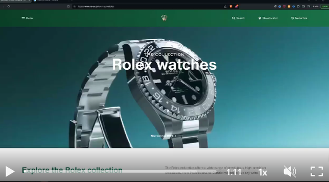
I crafted a #Rolex-inspired cover using their colours, typography, and whitespace for a clean, luxurious layout.
🎥 Watch the full video on LinkedIn: Matthew Spuffard 🚀 https://www.linkedin.com/feed/update/urn:li:activity:7222209150829637633/
#DesignProcess #GraphicDesign #PowerBI #BaseOne #MatthewSpuffard

Matthew Spuffard on LinkedIn: #powerbi #rolex #graphicdesign #coverdesign #brandconsistency…
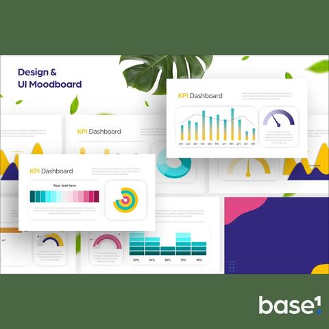
🎨 Creating the Perfect #PowerBI Cover: A Behind-the-Scenes Look! 🕰️ Check out this sped-up video of my design process for the cover of our latest #Rolex report. In this video, you'll get an exclusive look at how I crafted the layout. I started by delving into the brand's color palettes and typography, examining how buttons are presented, their website menus, and the overall photography style. I also paid attention to how they use whitespace. I used a well-thought-out 12x6 grid system, ensuring precise margins, gutters, and header/footer spaces. The goal was to align with Rolex's brand colors and typography, reflecting their iconic style. Throughout the video, you'll see how I focused on maintaining brand consistency, choosing the perfect shades from Rolex's color palette and incorporating the fonts they use to convey luxury and elegance. This cover design is all about capturing the essence of Rolex and presenting it in a clean, professional layout. Whether you're into graphic design or just love seeing creative processes in action, this video offers a glimpse into the meticulous work that goes into aligning design elements with a prestigious brand's identity. 📺 Watch the video now to see the cover come together, step by step! 📺 #GraphicDesign #CoverDesign #BrandConsistency #DesignProcess #LuxuryBrand #Photoshop #GridSystem #BaseOne #DataAnalytics