Is it just me or does this progress dial look like it wants to start a world war?

Python matplotlib library, with my own custom library, Annoplot, to provide dataviz features matplotlib cannot.
The process is slow enough that have also created a bespoke logging library that provides auditory output: to allow me to monitor progress while doing dishes in the next room.
Is it just me or does this progress dial look like it wants to start a world war?
The amazing folks @ garminconnect (python package) have fixed the login issues and now I can get my golf data easily!! ⛳️⛳️
https://github.com/cyberjunky/python-garminconnect
I cant wait to start visualizing the data once I download it all, been wanting to do it for a long time! 🥳
#TidyTuesday last week explored European parental leave policies. Accepting a reduced % on paid leave for more time off with a growing family has its benefits.
#Dataviz #Datavis #DataVisualization #RStats #Quarto #Echarts4r
🔗https://github.com/afrikaniz3d-za/Tidy-Tuesday-Participation/tree/main/tt_2026_22
Open to freelance data viz/reporting work
Who controls a visualization? @framoriniii presents our paper »Critical Interactivity: Exploration and Narration in Data Visualization« at #EuroVis2026 in Nottingham!
📆 Today 4pm in Room F4: Design Frameworks & Critical Perspectives
We see critical interactivity as the negotiation of authority and agency between authors and viewers. Across four case studies, we show how it links exploration and narration.
📄 Open access in IEEE CG&A: https://doi.org/10.1109/MCG.2025.3544684
Most recent #CDC dataset, updated today, again omits Nowcast for the most recent four-week period, "[d]ue to low numbers of sequences being reported to CDC".
Stratus-Eleventy XFG.1.1 appears to gain share in April-May reporting, though under pressure from XFG.23.1.3 / RV and last Spring's LF.7 lineage. Cicada BA.3.2, Nimbus NB.1.8.1 / PQ, and XFZ recombinant, identified as challengers a month ago, now appear to be in retreat.
Note that, in absence of robust data from states, CDC has given up modeling historical estimates, instead giving only shares of reported sequences.
Raj's dashboard, updated end of March, showed XFG.1.1 at a quarter share, for the last half of the most recent reporting period, while Cicada grandkid RE.2 made a significant appearance.
That said, said GISAID data was dominated by paltry submissions from New York (171), Minnesota (85), Maryland (84), Nebraska (53), and Arizona (17).
❖ #ThisIsOurPolio #variants #CovidIsNotOver #dataviz #datavis

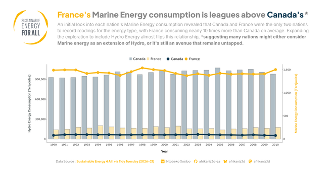
#TidyTuesday this week explored sustainable energy, and I chose to look into the infrequently-discussed Marine Energy.
#DataViz #Datavis #DataVisualization #RStats #Quarto #GGplot2
🔗 https://github.com/afrikaniz3d-za/Tidy-Tuesday-Participation/tree/main/tt_2026_21
Open to freelance data viz/reporting work
#TidyTuesday last week ORCID and ROR metadata from Crossref. I chose to modify an evaluation tool (OSMI) to look at Sub-Saharan Africa members.
#Dataviz #Datavis #sf #DataVisualization #RStats #Quarto #ggplot2 #Inkscape #Kdenlive
🔗 https://github.com/afrikaniz3d-za/Tidy-Tuesday-Participation/tree/main/tt_2026_20
Hey vis.social!
There are some great hashtags to follow. You might already know about #datavis or #RStats and #SciArt.
But there are some lovely ones like #Bloomscrolling, #LichenSubscribe, and the wonderful #TinyBalancingSheep