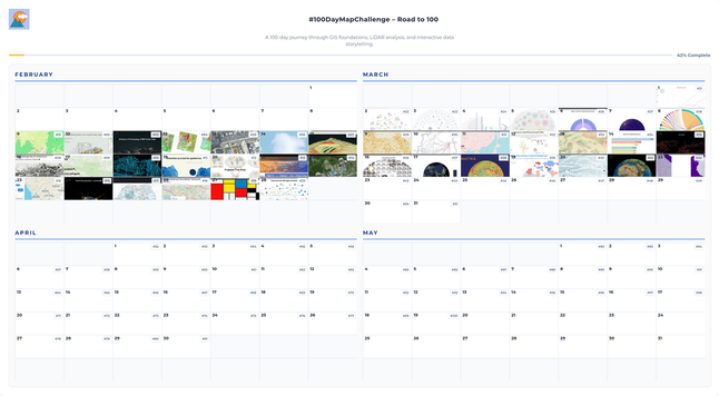
Day 45. Chlorophyll ocean data 🌊

I used NASA Aqua/MODIS chlorophyll concentration data to build an interactive globe that shows monthly phytoplankton distribution across 2021.

The challenge was creating smooth transitions across 12 month textures while preserving scientific meaning. I used Three.js + WebGL for the rendering stack, then added GLSL shaders.

Selected for IIB Awards 2023.

🔗 https://maptheclouds.com/playground/threejs/chlorophyll/

#100DayMapChallenge Day 45/100
#ThreeJS #WebGL #GLSL #DataVisualization

You can still get access to all Statistics Globe Hub March modules by registering before the end of the month.

More info: https://statisticsglobe.com/hub

#Statistics #DataScience #RStats #Python #DataVisualization #AI

Statistics Globe Hub

The Ultimate Program to Master Statistics, Data Science, AI, and Programming with R and Python - Instructor: Joachim Schork - Statistics Globe

Statistics Globe

Excited to share that I’ll be presenting at the upcoming Impresso Seminar, on April 2! Really looking forward to presenting the results of the Mini-Muse project.

Save the date and sign up to receive the Teams meeting link!

👉 https://impresso-project.ch/events/history/2026/03/19/Impresso-seminar-spring-2026.html

#DigitalHumanities #DigitalHistory #DataVisualization #CulturalHeritage #DigitalArchive #ETHBibliothek #SSH #SUPSI

A book in Polish titled "Creating Graphs in LabPlot 2" by Paweł Knast and Ryszard Maciejewski has been published. Kalisz, 2025.

Na rynku wydawniczym pojawiła się książka w języku polskim pt. "Tworzenie wykresów w LabPlot 2" Pawła Knasta i Ryszarda Maciejewskiego. Kalisz 2025.

👉 https://w.bibliotece.pl/7469025/Tworzenie%20wykres%C3%B3w%20w%20LabPlot2

#LabPlot #OpenSource #FOSS #FLOSS #DataVisualization #DataAnalysis #Statistics #Plots

„Tworzenie wykresów w LabPlot2” Uniwersytet Kaliski im. Prezydenta Stanisława Wojciechowskiego

Portal e-usług bibliotecznych to serwis zainspirowany miłością do książek i ich czytania.

Week 6 reflection. Different registers each day.

From experimental data viz to scientific depth and client work, ending on a more playful note.

Day 36 explored Voronoi logic, Day 37 mapped 50k+ cities, Day 38 visualized Antarctica’s gravity in 3D, and Day 39 marked a high point with UNESCO work.

The final days shifted tone: Corgi Routes, an Africa-centered globe, and river hierarchies shaped by Strahler order.

#100DayMapChallenge #DataVisualization #ThreeJS #D3js #Geospatial

Good example of how a 3D pie chart misrepresents data.

The red wedge is the smallest one, but the view seems to suggest the opposite.

#dataVisualization #pieCharts

"Continuing our exploration of the open-source software Labplot, we’ll look at another example. The data comes from https://www.itl.nist.gov."

https://josegon.wordpress.com/2026/03/20/labplot-2-12-iii/

#OpenSource #FOSS #FLOSS #DataVisualization

"Continuando con el estudio del software libre #Labplot veremos otro ejemplo, una importación de datos y visualización de los mismos, siguiendo la clara explicación del video en su canal."

https://josegon.wordpress.com/2026/03/18/labplot-2-12-ii/

#LabPlot #OpenSource #FOSS #FLOSS #DataVisualization

Ruby-LibGD with 2D/3D Plots in Jupyter

Learn how to use ruby-libgd to create stunning 2D and 3D plots directly in Jupyter Notebooks! In this comprehensive tutorial, we'll explore the powerful graphics capabilities of ruby-libgd, from basic functions to advanced 3D visualization.

https://youtu.be/-yMG0GzatNw

#Ruby #DataVisualization #Jupyter #LibGD #Programming #GraphicsProgramming #3DPlots #Coding #Tutorial #DataScience

Ruby-LibGD with 2D/3D Plots in Jupyter

YouTube

sankeys, instant progress dashboards based on disparate data sources that update themselves -- the visual display of information I've always designed, spent days fighting excel or another analytics package to create, and ultimately failing at ... now they're a 15 minute job in Claude Code (plus a 30 minute audit to make sure the analysis is done accurately).

#DataVisualization #InformationDesign