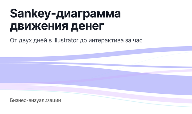
Sankey‑диаграмма движения денег: от двух дней в Illustrator до интерактива за час
Как понять, куда на самом деле уходят деньги, если смотреть на них как на поток, а не как на набор категорий. На реальном примере показываю, как из банковской выписки собрать Sankey-диаграмму, где помогает AI, где ошибается и какие решения приходится принимать. В итоге получается не статичная картинка, а интерактивная модель, с которой можно работать: разбирать структуру расходов, видеть взаимосвязи и находить узкие места. Подход применим не только к личным финансам, но и к бизнесу — для анализа движения денег, затрат и сложных процессов. Будет полезно дизайнерам, аналитикам и всем, кто работает со сложными системами
https://habr.com/ru/articles/1016620/
#Sankey #визуализация_данных #финансы #анализ_данных #UX_дизайн #интерфейсы #бизнесаналитика #D3js #React #AI