MapTheClouds

271 Followers
339 Following
88 Posts

Hi all! Here’s Cristina, founder @maptheclouds.

I’m an independent cartographer from România, based in Cluj-Napoca.

I ❤️ all 3D and maps.

Feel free to check out my projects at maptheclouds.com

Websitehttps://maptheclouds.com
Instagramhttps://www.instagram.com/maptheclouds
Twitterhttps://twitter.com/maptheclouds
GitHubhttps://github.com/alexaac

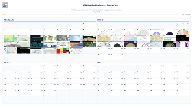
Day 44. Earth gone wild! 🌍

This project uses NOAA ETOPO1 global relief data to render an exaggerated 3D Earth where mountains and trenches become immediately legible.

I built the globe in Three.js + WebGL, converted height data to grayscale displacement textures, and used GLSL controls for exaggeration and lighting balance.

🔗 https://maptheclouds.com/playground/30-day-map-challenge-2022/gl-remix-extra1/

#100DayMapChallenge Day 44/100

#ThreeJS #WebGL #GLSL #Topography #Geospatial

Day 43. OpenFlights World Airports ✈️

Built an interactive 3D globe from the OpenFlights Airports Database, mapping 8,000+ airports as queryable points.

The challenge was performance at scale. Plotting is easy, but keeping interaction fluid is not. InstancedMesh optimises rendering, while Raycaster and CSS2DObject keep selection and labels responsive.

https://maptheclouds.com/playground/30-day-map-challenge-2022/globe-airports/

#100DayMapChallenge Day 43/100

#ThreeJS #WebGL #Geospatial #OpenFlights #OpenSource

Week 6 reflection. Different registers each day.

From experimental data viz to scientific depth and client work, ending on a more playful note.

Day 36 explored Voronoi logic, Day 37 mapped 50k+ cities, Day 38 visualized Antarctica’s gravity in 3D, and Day 39 marked a high point with UNESCO work.

The final days shifted tone: Corgi Routes, an Africa-centered globe, and river hierarchies shaped by Strahler order.

#100DayMapChallenge #DataVisualization #ThreeJS #D3js #Geospatial

Day 42. Rivers as flow networks 🌊

South America's river systems as interconnected flow networks.

Using HydroSHEDS data, the focus is on hierarchy: streams → tributaries → major rivers → ocean. Multiple scales reveal both continental structure and local complexity.

The visualization moves through zoom levels in a rotating Three.js carousel.

https://maptheclouds.com/playground/30-day-map-challenge-2023/sa-rivers/

#100DayMapChallenge Day 42/100

#ThreeJS #QGIS #HydroSHEDS #OpenData

Day 41. Africa on a 3D globe 🐘

A small visual experiment: what happens when you center a 3D Earth globe on Africa?

Built with Three.js and WebGL using NOAA ETOPO1 elevation data. The globe combines textured surface with real geometric relief, so mountains and valleys emerge as it rotates.

Sometimes a small shift in perspective reveals something new in familiar geography.

#100DayMapChallenge Day 41/100
#ThreeJS #WebGL #Africa #3D #OpenData

https://maptheclouds.com/playground/30-day-map-challenge-2023/africa/

Day 40. Corgi routes 🐶

What if GPS routes could be visualized with animation and terrain like Relive?

Interactive route visualizer built with MapLibre GL and D3.js. Drag-and-drop GPX → animated playback over terrain, with an elevation chart synced to the map.

Click the chart to jump anywhere along the route. Both views stay aligned.

Still experimental, but shows what’s possible when flexible route data meets modern mapping tools.

#100DayMapChallenge Day 40/100

#MapLibreGL #D3js #GPX #OSM

Day 39. Education inequality at global scale 🌍

How do you compare gender disparities across education worldwide?

Interactive animated choropleth showing the Gender Parity Index across five levels (primary to tertiary), built with Leaflet.js and D3.js. Client project.

Key challenge: consistent color scale across all levels, solved with Jenks Natural Breaks on the combined dataset.

Insight: as girls progress through education, the gender gap often widens.

#100DayMapChallenge #Leaflet #D3js

Day 38. Visualizing gravity beneath Antarctica 🧊

What does gravity look like at Earth’s most remote continent?

3D map of gravity disturbances using the EIGEN-6C4 model (0.1°). Data from Quantarctica reveals how ice thickness, bedrock density, and subglacial topography shape the field.

Processed in QGIS. Warmer elevations = positive anomalies, cooler depressions = negative ones.

Not the surface, but the forces beneath it.

https://maptheclouds.com/playground/30-day-map-challenge-2023/antarctica-gravity/

#100DayMapChallenge #QGIS #Antarctica

Day 37. Populated places by size and rank 🌐

How visualize global settlement patterns without political boundaries dictating story?

Circle size = population, brightness = rank. Removes borders. Settlement structure visible on own terms.

D3.js canvas rendering handles thousands of points. City selection uses quadtree spatial index.

Data: Natural Earth. Quadtree inspired by Alain Roan (Observable).

https://maptheclouds.com/playground/30-day-map-challenge/points/

#100DayMapChallenge #D3js

Day 36. When data visualization meets music history 🎶

This project maps 50 of the most valuable vinyl records using a Voronoi-style visualization where each region represents a record.

The Beatles dominate the list, including Yesterday and Today ($234k) and the famous White Album ($790k).

Built with D3.js, the visualization turns record prices and cultural impact into a spatial landscape of music history.

https://maptheclouds.com/playground/30-day-chart-challenge/comparisons/experimental/

#100DayMapChallenge #D3js #DataViz