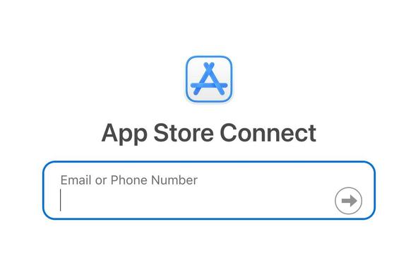
Repeat after me: Separating username and password fields on separate (fucking responsive) page WILL NOT INCREASE A FUCKING SECURITY IN ANY WAY! IT WILL JUST MAKE THE PASSWORD MANAGERS TO WORK WORSE AND THUS IT WILL FUCKING DECREASE THE SECURITY!!!


@ondrej Love it <3
@ondrej apparently it is not because of security but SSO. https://www.smashingmagazine.com/2024/06/2-page-login-pattern-how-fix-it/ Off course you'll find people saying it's more secure, even some saying in increases usability ¯\_(ツ)_/¯

@ondrej also, don't fucking continue with the login process as soon as 6 digits are entered in the 2FA stage (looking at you, Atlassian). I got locked out twice because I had a wrong paste in my clipboard from the password manager and the login window disappeared so fast I couldn't notice that the numbers stayed the same.
I hate that UX is run by fucking morons nowaday almost unanimously across the board 🤬
I hate that UX is run by fucking morons nowaday almost unanimously across the board 🤬
@DJGummikuh @ondrej would you like some 1px-and-autohide scrollbars as seasoning for your notion? /S
@ondrej Really good to know. As a user, I have always hated the two-page log-in.
@ondrej Also, it's an accessibility nightmare (and as such, decrease security even more).

@ondrej there’s a special place in hell for the developers who do this. And they’ll be joined by their friends who disable paste on password inputs.
@ondrej corollary: Enter your email *twice*. Because we can't trust users to do it right on the first attempt or something.
@phl @jspath55 @ondrej TBH, as someone who suggested this feature in something I support, watched it get implemented, and saw a whole category of support tickets just cease to be raised anymore - when dealing with the general public, yes, forcing them to enter their email address twice when creating an account does in fact make a difference.
@ondrej people who approve this, who design it, who code it and who boast about it on production software are employed while me who things about ethical UX patterns sit here with no job contemplating life haha
@ondrej Yes, this is almost as bad as preventing me from seeing what I am typing into the password field. I mean I'm at home and all alone in the room... give me an eyeball icon to click on so I can see if I typed my password right.
@ondrej Yep... it's just enshittification.
I agree @ondrej. I have problems with the behavior of these sites specially after misspelling my password. One of my homebanking sites go back to username field, one not. So I write my password in the username field! My fault I suppose...
O.M.G! I FUCKING HATE THIS SO MUCH!
@ondrej time to change the bank?
@ondrej @mailbox_org Pls take this to heart! 🙏🙏🙏 Worst feature of the new interface
@ondrej Also, even when PM works, some website needs you to **actually type something in the box**, otherwise the "NEXT" button won't enable.
So, I have to append manually a space and remove it to proceed 🤦
So, I have to append manually a space and remove it to proceed 🤦
@ondrej I've heard the (security) reason this is done, is to avoid phishing. A legitimate website, knowing your username, can serve a personalized—familiar to the user—password input, with their avatar, name, or a secret third thing like my bank does. A mismatch should alert the user.
On the other hand, it's foolish to assume a malicious party can't easily scrap this from the original webpage.
@ondrej @mistercharlie Isn’t this done to support identity federation? Enter my work email and it redirects to my work identity tool (Entra, Okta, Google, etc) which logs me straight in with SSO. Enter my personal email and it asks for a passkey that I set up. Enter another email address and it asks for a password and authenticator code. Without knowing the identity first, how should it present the appropriate fields for authentication which that federated identity uses (if any)?
@kagan That’s the reason in a tiny minority of cases. For the rest, the reason is superstition: some dickhead at company B saw such a login form by company A, didn’t know why it was done that way, concluded it must be for security reasons, made the team do the same, and told customer service to tell people who complain that it’s for their own safety.
@tuckerjj @ondrej @mistercharlie
@tuckerjj @ondrej @mistercharlie
@oscherler @tuckerjj @ondrej @mistercharlie I don't know how we could possibly survey all the sites out there and find out how true this is, but... I find this all too depressingly believable.


@oscherler @kagan @tuckerjj @ondrej @mistercharlie and also SSO can be done with an SSO button. Much clearer
@wyri @oscherler @kagan @ondrej @mistercharlie A lot of users won’t have a clue what this is. Enter their email address and it’ll pick automatically.
@tuckerjj @oscherler @kagan @ondrej @mistercharlie yeah that's fair, also have to say my password manager is getting pretty good at it.
@ondrej I would love to know where this stupid idea came from.
@ondrej The point here isn't security, the point is that some users aren't using a password at all. If such a username is detected, instead of being redirected to the password page, you're taken straight to Okta / whatever your chosen SSO system is.

@ondrej It also causes me to type my password in the wrong field, readable for all around me, when the username or password is not accepted for some reason.
@ondrej One reasonable possibility for the pattern is systems that implement SSO login flows for *some* users, and they don't want an SSO-bound user to spend time worrying about inputting a password that may indeed not exist.
They need to evaluate the username to decide whether to prompt for a password at all.
Which password managers are causing you problems?
They need to evaluate the username to decide whether to prompt for a password at all.
Which password managers are causing you problems?
@mr64bit @ondrej I think it's pretty much an established fact that the way to prevent injection attacks is to correctly parse and handle/quote user input to ensure it doesn't get mixed in with the logic/control flow, not to split a form over multiple pages :-)
Perhaps they're also "helping" the AI/LLM people with their injection "problems" :-)
Perhaps they're also "helping" the AI/LLM people with their injection "problems" :-)
@oscherler @ondrej I'm using Bitwarden and 1Password, and although I've encountered many sites that split the username and password onto separate screens, most of them work just fine. Some of them do cause failures to follow the flow, and I have to select the password from a dropdown, like I do for the password. I see this as a UX fail and agree that's annoying, but I do not directly as a decrease in security. I may have misunderstood something, and I'm happy to be corrected.
@ondrej @looopTools *Unless the password is removed completely