the cartouches both show today’s date. translating data and input into visual systems ❤️
#art #1bit #solodev #pixelart #ドット絵 #oc #픽셀아트 #monochrome #60Grid #javascript #webdev #font #1bitart #digitalart #infodesign
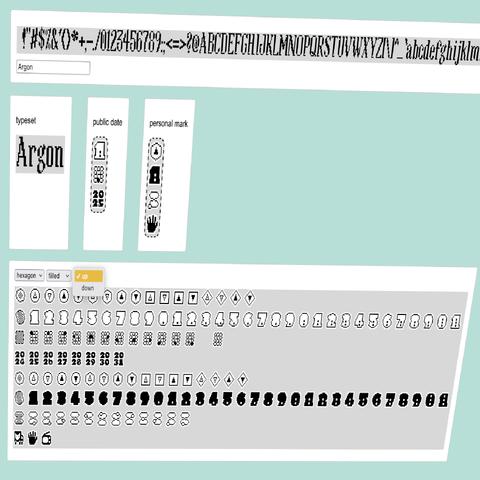
the cartouches both show today’s date. translating data and input into visual systems ❤️
#art #1bit #solodev #pixelart #ドット絵 #oc #픽셀아트 #monochrome #60Grid #javascript #webdev #font #1bitart #digitalart #infodesign
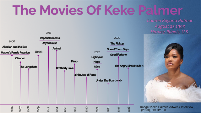
🎬 From spelling bees to sci-fi blockbusters — the movies of Keke Palmer, mapped from 2006 to 2026.
Which one’s your favorite?
#KekePalmer #Movies #FilmTimeline #Bamlytics #DataViz #InfoDesign
🎉 it's the end of the work week
🌈 a good time to follow a few folks for visualization inspiration – in case you do not know them yet:
#followfriday #DataViz #DataVis #InfoDesign #InfoGraphics #DigitalHumanities #TGIF
The Aalto infodesign showcases are pretty neat (Full disclosure: I advised some of the creators) #infodesign
Last week @jona Pomerance presented the interactive and narrated #BetterCatastrophe flowchart at #infoplus2023 in Edinburgh. For this occasion we also released Interactive Flowchart as a free reusable template with detailed explanations of its structure, a visual step-by-step tutorial, and 12 student examples covering a range of well-known personal dilemmas.
Find everything compiled here:
https://uclab.fh-potsdam.de/interactive-flowchart/
#Flowchart #Datavis #Infodesign #Storytelling #FHPotsdam
what i also really liked about #infoplus2023 was that many presenters shared various materials making it easy to reuse these for teaching, research and practice.
here are some freely available tutorials, toolkits and templates:
https://www.marieneurath.org
https://www.lizbravob.com/data-distortion-exercises
https://chartbites.webflow.io
http://easydataviz.co
https://sonification.design
https://mitvis.github.io/olli/
https://uclab.fh-potsdam.de/interactive-flowchart/
Hey! 👋 We're Fathom. We build platforms and products for understanding data.
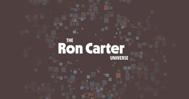
Some of our projects have included a Ron Carter discography explorer (https://www.roncarteruniverse.com/), Mayo Clinic healthcare information tools, an archive of Krista Tippett's On Being Project (https://discover.fathom.info/), a data platform for the Gates Foundation, and a research-driven educational platform for understanding the Chinese political system (http://china.fathom.info/).
We also love nerding out about typography, fiber and textile arts, paper, language, and the history of computation, to name a few interests shared between ourselves.
In the past three years, we've been hard at work developing dozens of tools for pandemic prevention, in collaboration with the Sabeti Lab at the Broad Institute. Stay tuned for more project details; we can't wait to share everything we're working on with you.
@troos
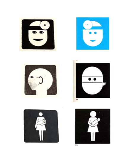
I’m increasingly convinced that the graphic I photographed is an older set of the same symbols by E. Christopher Klumb Associates. Perhaps they tried selling them separately before developing them for NYC Health?
Here’s some fairly clear cases, in addition to the babies. The surgeon with mask and the one with head lamp were made more uniform, the mother and child is visually better balanced.
#icons #infodesign #history
Self-promotion:
If you happen to know of projects suitable for our information design agency, then we would actually have time to take on something new.
We do stuff from one-off charts and maps to interactive online dataviz. We can also create high-quality print publications, including design, illustration and layout.