Hope to be able to publish this project one day soon. For now waiting for probable data changes and green light for completion. Meanwhile here are some screenshots with placeholder texts.
#dataviz #informationdesign
Designing Data-Intensive Applications—Advice for Interaction Designers, by @uxdesigncc:
🔴 Marco Ferrari on the politics of information design
Host:
@jarrettfuller
The co-founder of Studio Folder and head of Design Academy Eindhoven's ID Program about how his work is an interrogation of
#datavisualization and #informationdesign
Do Graphs and Charts Need to Be Accessible?, by @tempertemper:
https://www.tempertemper.net/blog/do-graphs-and-charts-need-to-be-accessible
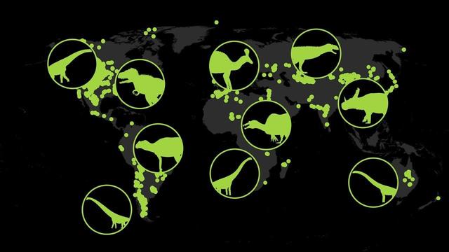
💁🏻♀️ ICYMI: 🦖🦴 Watch over 150 million years of #fossil evidence from around the world in this #data viz from the American Museum of Natural #History. You can see when and where #dinosaurs appeared on #Earth as the continents shifted from the Late Triassic onward.
#animals #birds #cretaceous #dataviz #fossils #informationdesign #jurassic #maps #nature #paleontology #pangea #science #spinosaurus #titanosaur #triassic #trex #tksst #video
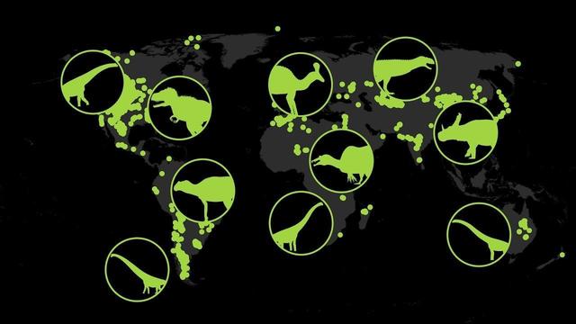
🦖🦴 Watch over 150 million years of #fossil evidence from around the world in this #data viz from the American Museum of Natural #History. You can see when and where #dinosaurs appeared on #Earth as the continents shifted from the Late Triassic onward.
#animals #birds #cretaceous #dataviz #fossils #informationdesign #jurassic #maps #nature #paleontology #pangea #science #spinosaurus #titanosaur #triassic #trex #tksst #video
sankeys, instant progress dashboards based on disparate data sources that update themselves -- the visual display of information I've always designed, spent days fighting excel or another analytics package to create, and ultimately failing at ... now they're a 15 minute job in Claude Code (plus a 30 minute audit to make sure the analysis is done accurately).
Liveuamap: #Guerre e #informationdesign il monitoraggio dei conflitti moderni
@diggita @tecnologia @opensource
https://webappsmagazine.blogspot.com/2026/03/liveuamap-guerre-e-information-design.html
The purpose of information design is to assist thinking.
-- Edward Tufte (Presenting Data and Information Short Course)
⬆ #Wisdom #Quotes #EdwardTufte #Communication #InformationDesign
Emerald Black Latency, the technological latency of the green screen by Mario Santamaría
#emeraldblacklatency #newmediaart #internet #data #artandtechnology #arttech #artandtech #datavisualization #informationdesign #newmediaartist #mediaart #mediaarts #mediaartist #informationart #onlineart #netart #netartist #internetart #internetculture #analoganddigital #analoguedigital #digitalcultures #technoculture #technosphere #dataethics #postphotography #artsciencetechnology #mariosantamaria #anthropoceneart #digitalaesthetics