typographische

@typographische@typo.social
762 Followers
595 Following
530 Posts

@typographische Gesellschaft München e.V. (tgm) – Typografie in guter Gesellschaft.

Impressum: http://tgm-online.de/verein/impressum

Die Typographische Gesellschaft München e.V. (kurz tgm) zählt zu den europaweit führenden Organisationen in der Kreativbranche. Sie versteht sich als interdisziplinäre Expertenplattform für das Spielfeld zwischen Inhalt und Form, Text und Bild, Gestaltung und Technik.

gegründet14. Mai 1890
unsere Eventshttps://tgm-online.de/angebot/
mitmachenhttps://tgm-online.de/mitmachen/
Instagramhttps://www.instagram.com/typographische/

Komplexe Texte sind nicht elitär – sie sind manchmal notwendig.

Ohne sie verlieren wir die Fähigkeit, Ambiguität auszuhalten, Quellen kritisch zu prüfen, Demokratie zu denken.

👉 https://tgm-online.de/blog/lesekrise

#Demokratie #Lesekompetenz #Politik #Kulturkritik #Zukunft #Typografie

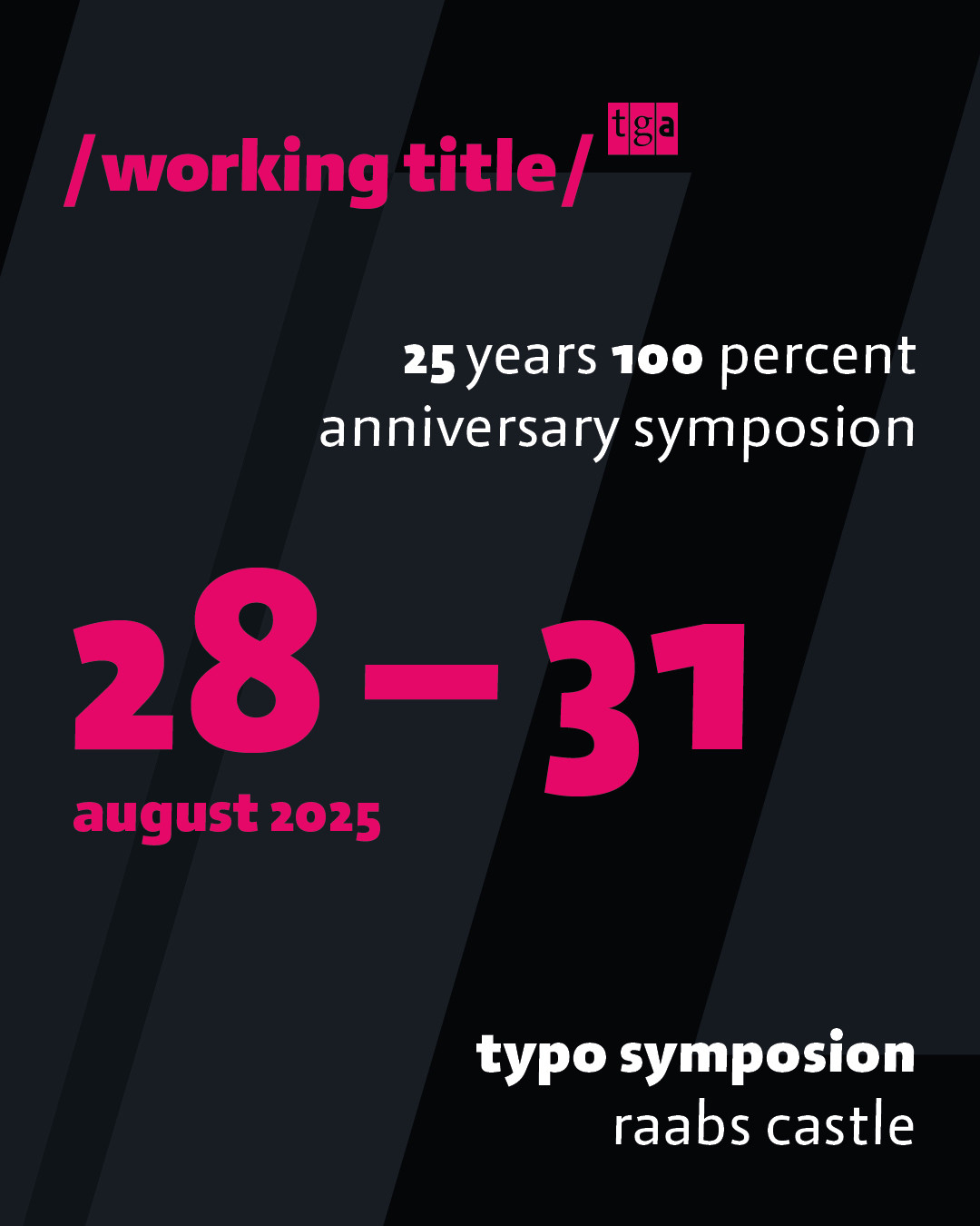
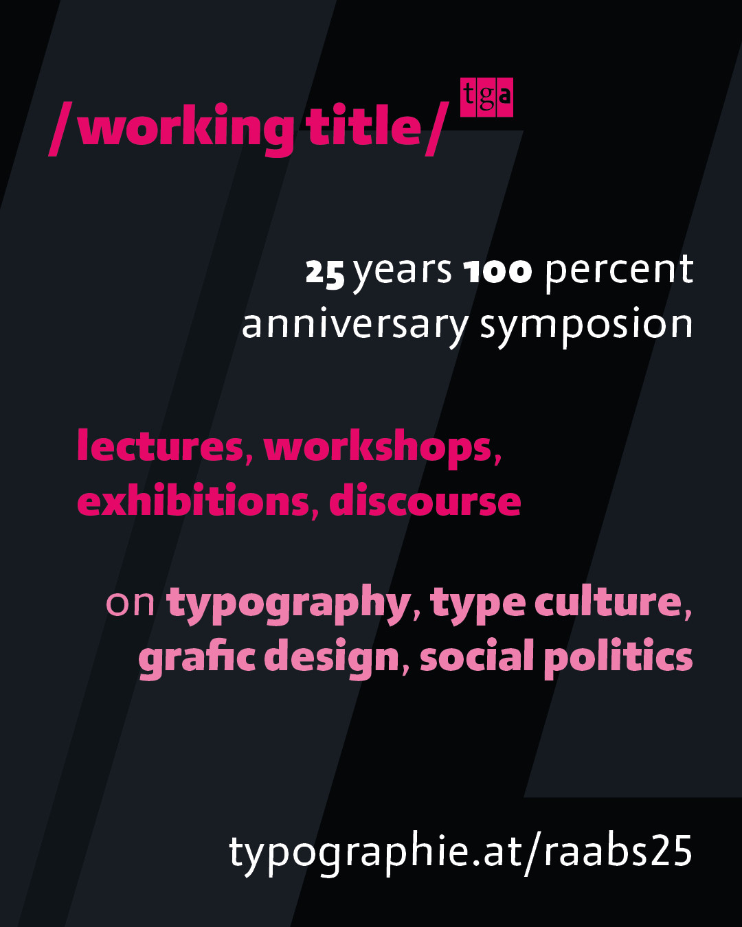
tgm – Wir stecken in einer Lesekrise

Lange Sätze galten einst als sprachliche Krönung. Heute verstehen 20 Prozent der Deutschen keine komplexen Texte und angehende Lehrkräfte kennen teilweise Brecht nicht mehr. Das Smartphone und Social Media verschärfen die Krise zusätzlich dramatisch. Was bedeutet das für uns? Zeit, dass Gesellschaft, Wissenschaft, Medien und die Typografie Verantwortung übernehmen!

Hier kommt ein neuer Workshop
21. November 2025 / 14 bis 18 Uhr: Pixelprint Workshop bei der tgm
https://pxlprnt.de/workshops#21-November-2025-14-bis-18-Uhr
Pixelprint / Workshops

Workshops. Hochdruck – Pixelprint. Wir drucken mit Klemmbausteinfliesen aka Lego Dots™. Je nach Druckmachine ist die Druckbettgröß 8×8, 16×16 …

Une autre date au Portemine à Clermont-Ferrand en août puisqu'il n y a rien à faire...

Une matinée par mois, notre atelier se transformera désormais en bibliothèque ! Venez vous inspirer et consulter des dizaines de livres, magazines, fanzines sur l'art, design, archi, typographie...
Et vous pouvez aussi participer en ramenant vos publications préférées !

Ouvert à tout·e·s, gratuit, on s'occupe du thé et du café.
Samedi 9 août de 10h à 14h

#design #clermont_ferrand #clermont #LePortemine

Typen im Fluss mit Typogram Studio

Mehr Typo, weniger Klicks: Ein neues Design-Tool verspricht, die Arbeit mit Schrift so direkt und intuitiv zu machen, wie es sonst nur das Skiz­zieren mit dem Bleistift ist. Ligaturen, Glyphen, variable Fonts: alles da, wo man’s braucht. Typogram Studio heißt das Tool von Wenting Zhang und Hua Shu, das komplett im Browser läuft und derzeit für Neugier sorgt.

https://tgm-online.de/blog/typogram-studio

#TypogramStudio #App #Typografie #typography #typodesign #OpenType #Features

tgm – Typen im Fluss mit Typogram Studio

Mehr Typo, weniger Klicks: Ein neues Design-Tool verspricht, die Arbeit mit Schrift so direkt und intuitiv zu machen, wie es sonst nur das Skizzieren mit dem Bleistift ist. Ligaturen, Glyphen, variable Fonts: alles da, wo man's braucht. Typogram Studio heißt das Tool, das im Browser läuft und derzeit für Neugier sorgt.

SURROUND is the second concept font I developed during my Bachelor's thesis at HKB (Bern Academy of the Arts).

Using three variable font axes (Animation, Wave Amplitude and Wave Direction) to control the motion, 208 masters were created to cover all steps. A Python script took around 20 hours to complete the pixel displacement for all 26 letters. But once rendered and saved as a font file, it runs butter-smooth — at least in the browser.

Bachelor thesis mentored by Edgar Walthert @eWalthert

The new #PlainText 2 magazine by @plain_form just arrived.

I think I have not been as excited about receiving a periodical since my beloved music magazines have been discontinued.

@chockenberry @pieteromvlee Path compatibility is very important in type design, for example, to interpolate a Semibold font between a Regular and a Bold font. Therefore, font editors tend to offer compatibility-preserving path offsetting.

This is what offsetting looks like in Glyphs, the font editor I work on: https://handbook.glyphsapp.com/filters/offset-curve/

Offset Curve — Glyphs Handbook

Offsetting the outlines of paths and converting paths to stroked outlines.

Bye forever, WeTransfer.

Bei einer neuen Jubiläums-Ausgabe der Werke von Thomas Mann setzt der S. Fischer Verlag auf fehlerhafte Billo-KI-Cover. Die zuständige Agentur will das als "qualitative Eigenleistung" verstanden wissen.

https://lichtblau.substack.com/p/ki-slop-auf-dem-buchcover-hauptsache?utm_source=share&utm_medium=android&r=dfrhu&triedRedirect=true

KI-Slop auf dem Buchcover: Hauptsache was Buntes

Immer häufiger sparen sich Verlage bei der Covergestaltung die Illustratoren. Im Fall einer neuen Thomas-Mann-Reihe will man das nun sogar als "qualitative Eigenleistung" verstanden wissen.

Quentin Lichtblau

Staff pick: Railtrack and Network Rail identity and signs

In the latest installment of his series concerned with #railway #typography in the UK, James Millner takes a look at the signs used since 1998. They feature a custom #typeface named Brunel, developed by Freda Sack and David Quay.
https://fontsinuse.com/uses/68927/railtrack-and-network-rail-identity-and-signs

#FontsInUse #PublicTransport #fonts #TrainStations #signs #UnitedKingdom #Britain

×

symposion

/ working title /

25 years 100 percent
anniversary symposion of the typographic society austria

thursday, august 28 to sunday, august 31 2025
raabs an der thaya castle

four days with 16 lectures, 3 workshops plus exhibits on typography, type culture, graphic design and social politics

info and registration:
https://typographie.at/raabs25