typographische

@typographische@typo.social
753 Followers
587 Following
517 Posts

@typographische Gesellschaft München e.V. (tgm) – Typografie in guter Gesellschaft.

Impressum: http://tgm-online.de/verein/impressum

Die Typographische Gesellschaft München e.V. (kurz tgm) zählt zu den europaweit führenden Organisationen in der Kreativbranche. Sie versteht sich als interdisziplinäre Expertenplattform für das Spielfeld zwischen Inhalt und Form, Text und Bild, Gestaltung und Technik.

gegründet14. Mai 1890
unsere Eventshttps://tgm-online.de/angebot/
mitmachenhttps://tgm-online.de/mitmachen/
Instagramhttps://www.instagram.com/typographische/

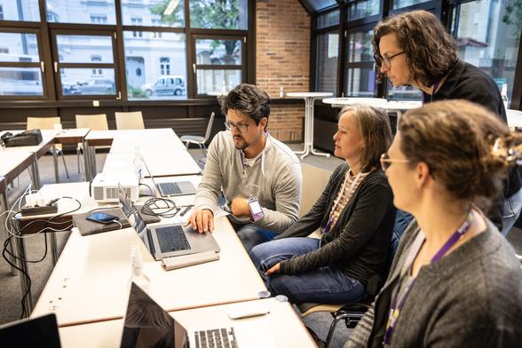
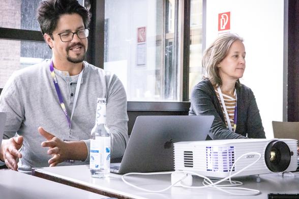
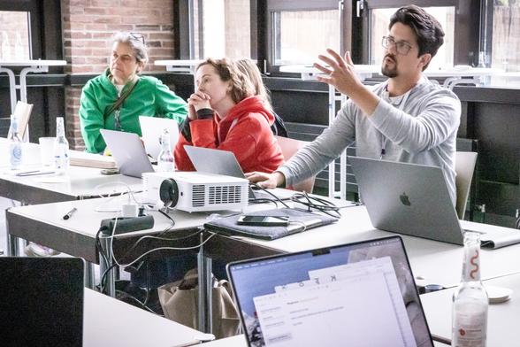
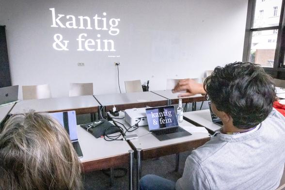
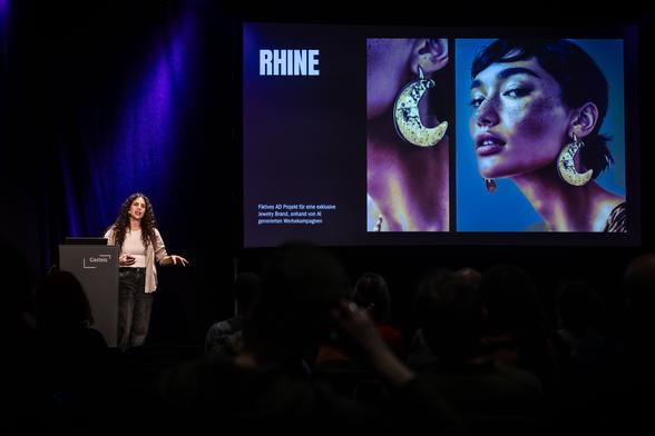
Jakob Runge (@jakob_runge) auf der DIVE’25 in #München, #Glyphs Workshop: Make Your Logo Responsive – dynamische Wortmarken erstellen (sponsored by Glyphs) by @typematesfonts

Design trifft Politik, Wirtschaft und Gesellschaft – erster Bundeskongress Design #deutscher_designtag #dive25 #mcbw (Fotos: @typolis)

Nur 28% der Befragen wählt die korrekte Form. 56% hingegen eine Form, bei der die Schleife gespiegelt ist.

(Quelle Sofie Beier, https://www.linkedin.com/feed/update/urn:li:activity:7307383301713911808/)

Look at these four versions of the letter "g". | Sofie Beier | 30 comments

Can you spot the correct double-storey "g"? Research shows most people can't. In fact, when participants were asked to select the correct double-storey "g" among distractors, their performance was no better than chance. Why does this matter? We often assume that reading familiarises us with letter shapes, but this study reveals that we primarily recognise words and content, not individual letters. Our brains focus more on meaning and context than on the precise forms of letters. This knowledge is crucial when designing for readability. Letter shapes need to be so familiar and effortlessly processed that they disappear into the background, allowing readers to absorb meaning without conscious effort. If a typeface introduces unfamiliar letterforms or disrupts recognition, it can slow reading and increase cognitive load. How aware are you of letter shapes as you read? Close your eyes and try to recall the shape of the lowercase "G" from this text that you just read. Could you? The research in question is this: Wong, K., Wadee, F., Ellenblum, G., & McCloskey, M. (2018). The devil’s in the g-tails: Deficient letter-shape knowledge and awareness despite massive visual experience. Journal of Experimental Psychology: Human Perception and Performance, 44(9), 1324 | 30 comments on LinkedIn

Wie sieht das zweigeschossige „g“ aus?Laut einer Studie können die meisten die Form nicht korrekt erkennen – die Antworten lagen im Zufallsbereich.

Das zeigt: Lesen trainiert eher das Erkennen von Wortbildern als von Buchstabenformen.

Für eine gute Lesbarkeit müssen Schriftformen also so vertraut sein, dass sie nicht auffallen.

Hinweis & Bildquelle: Sofie Beier (https://www.linkedin.com/feed/update/urn:li:activity:7307383301713911808).
Studie: Wong, Wadee, Ellenblum, McCloskey. The devil’s in the g-tails (https://gwern.net/doc/psychology/cognitive-bias/illusion-of-depth/2018-wong.pdf)

Look at these four versions of the letter "g". | Sofie Beier | 30 comments

Can you spot the correct double-storey "g"? Research shows most people can't. In fact, when participants were asked to select the correct double-storey "g" among distractors, their performance was no better than chance. Why does this matter? We often assume that reading familiarises us with letter shapes, but this study reveals that we primarily recognise words and content, not individual letters. Our brains focus more on meaning and context than on the precise forms of letters. This knowledge is crucial when designing for readability. Letter shapes need to be so familiar and effortlessly processed that they disappear into the background, allowing readers to absorb meaning without conscious effort. If a typeface introduces unfamiliar letterforms or disrupts recognition, it can slow reading and increase cognitive load. How aware are you of letter shapes as you read? Close your eyes and try to recall the shape of the lowercase "G" from this text that you just read. Could you? The research in question is this: Wong, K., Wadee, F., Ellenblum, G., & McCloskey, M. (2018). The devil’s in the g-tails: Deficient letter-shape knowledge and awareness despite massive visual experience. Journal of Experimental Psychology: Human Perception and Performance, 44(9), 1324 | 30 comments on LinkedIn

Hybrid-Vortrag:
TGM × Mona Franz × Johannes Breyer

Die @typographische Gesellschaft München lädt ein:
Johannes Breyer, DINAMO TYPEFACES, Berlin
https://www.abcdinamo.com

📅 4. Februar 2025
🕢 ab: 19.30 Uhr

🎟 Tickets nur noch für den Livestream verfügbar. Danke für Ihr Verständnis.
Studierende nehmen dieses Mal kostenfrei teil!

Infos und Anmeldung zum Livestream:
https://tgm-online.de/programm/veranstaltungen/johannes-breyer-abc-dinamo

🎤 Moderation & Kuration:
Xuyen Dam und Mona Franz

#typedesign #fontdesign #typelove #inspiration #typetools

Home

Dinamo is a Berlin-based type design studio offering retail and bespoke typefaces, design software, research, and consultancy. We operate via a network of…

Dinamo Typefaces

Online-Abendkurs: »Barrierefrei publizieren mit InDesign-PDFs« mit Wolf Kamm

Förderung der Inklusion hat eine gesell­schafts­po­li­tische Bedeutung. Für Gestalter bedeutet dies auch ein neues Geschäftsfeld, dass von der Politik und Wirt­schaft gefördert wird.

Mittwoch 12.3.2025, 17–20 Uhr
Mittwoch 19.3.2025, 17–20 Uhr

Infos und Anmeldung:
https://tgm-online.de/programm/veranstaltungen/barrierefrei-publizieren-mit-indesign-pdfs-2025-03

#inklusion #inklusivesdesign #barrierefrei #barrierefreiesdesign #indesign #pdf #inclusion #leichtesprache #euaccessibilityact

tgm – Barrierefrei publizieren mit InDesign-PDFs

Die Fotos vom letzten Vortrag mit Florian Weichselbaumer (Lagebericht aus dem Rabbit Hole) und Sara Rami alias Marina Embrace sind online: https://www.flickr.com/groups/t-g-m/pool/with/53677232194/

Weitere Infos: https://tgm-online.de/programm/veranstaltungen/lagebericht-aus-dem-rabbit-hole

#Eventfoto #kunstlicheintelligenz #generativeAI #AI #KI #kreativitat #Design #Lecture

typographic society of munich

Events, people, publications of the “Typographischen Gesellschaft München e.V.” (typographic society of munich) – for further information on “tgm” please visit www.tgm-online.de. The Typographische Gesellschaft Muenchen e.V. (tgm; Typographic Society Munich) was founded in 1890 by type setters and printers. Today the Typographic Society Munich is the largest organisation for typographers or in typography interested people in Europe. tgm establishes a basis for sophisticated and interdisciplinary thinking and dialogues among content and form, text and photo, tradition and innovation, among design and technology. The tgm represents quality and education for the branch of communication with an ambitious and wide offering of skill enhancement, symposia, evening receptions and seminars. tgm also educates designers in a one year lasting course. The program of tgm also comprises lectures, conferences, educational journeys, excursions, typewalks and exhibitions like the TDC-show. Every offer under the roof of tgm is a result of solidarity. It is a result of people and companies who are united by the common interest in typographic quality.

Flickr

Zeigen, wie Design unseren Planeten beeinflussen kann.

Internationaler #Plakatwettbewerb zum Klimawandel.

Motto: „Green For Good“. Teilnehmer*innen gestalten in den Druckfarben Schwarz und Grün. 🖨️ Druck: umweltfreundliche Risographie. Einreichung als PDF. Die 50 besten Poster werden deutschlandweit ausgestellt.

👥 Jury aus Design und Umweltaktivismus. Teilnahme ab 16 Jahren bis 31.5.2024.
🔗 Infos: postersforfuture.de

#GreenForGood #PostersForFuture

Sophie Scholl engagierte sich mit Flugblättern gegen den Nationalsozialismus. Wegen ihres Engagements in der Widerstandsgruppe #WeißeRose wurde sie zusammen mit ihrem Bruder Hans Scholl von nationalsozialistischen Richtern in #München zum Tode verurteilt und noch am selben Tag hingerichtet – heute vor 81 Jahren.

Für die Briefmarke zum Gedenken an #SophieScholl verwendete Detlef Behr die Schrift T-Star Mono Round: https://fontsinuse.com/uses/45475/sophie-scholl-stamp
(Abbildung @FontsInUse) #otd #otd1943

Sophie Scholl stamp

In May 2021, Deutsche Post issued a stamp commemorating the 100th birthday of anti-Nazi political activist Sophie Scholl. In 1942, during World War II, the student joined the resistance group Weiße Rose, or White Rose. Together with her brother Hans and others, she conducted an

Fonts in Use

Im heute versendeten tgm-Newsletter geht es um den ersten Vortrag in diesem Jahr, den eine Pionierin halten wird.

Darüber hinaus gibt es neue Seminare, Workshops einen artDate und eine tgm-Ausstellung (!), Rückblicke sowie Ausblicke zu 4 Partner-Veranstaltungen (teilweise mit Ermäßigung für tgm-Mitglieder).

https://153508.seu2.cleverreach.com/m/15120135/

#typografie #Munich #typography #typographische #München #design #AI #KI #artificialintelligence #prompting #JumpingCreativity

tgm-News 119 – 🤸 Jumping Ahead mit Franzi Sessler, barrierefrei publizieren mit InDesign-PDFs, Design-Basics für Social Media, vom Sprachleitfaden zur Corporate Language, barrierefreie PDFs aus Word – 19.2.2024

tgm Jahresthema 2024:
»Jumping Creativity«

Dieses Jahr erkunden wir #KI als kreativen Partner und Herausforderung. Sieben Hauptvorträge von führenden Gestaltern beleuchten neue kreative Horizonte und tiefgehende ethische, künstlerische Fragen.
Ein Jahr voll Innovation und Inspiration erwartet Sie, mit Fokus auf KI in #Typografie und Gestaltung. https://tgm-online.de

#typography #grafikdesign #kommunikationsdesign #artificialintelligence #machinelearning #designintelligence #futuredesign

Typographische Gesellschaft München (tgm)

Die tgm fördert Bildung in der Kreativbranche und der grafischen Industrie. Entdecke das Angebot an Workshops, Seminaren, Vorträgen und profitiere von unserem Netzwerk.