Fonts In Use

@FontsInUse@typo.social
4.3K Followers
8 Following
726 Posts

Type at work in the real world. Fonts In Use is an independent archive of typography.

#fonts #typefaces #typography #GraphicDesign

Collectionhttps://fontsinuse.com/
Colophonhttp://fontsinuse.com/colophon/
Searchhttps://fontsinuse.com/search/advanced
Newsletterhttps://newsletter.fontsinuse.com/?tag=mastodon

Staff pick:
Issue no. 11 of Mosaïque magazine investigates how the music industry protects perpetrators of sexist and sexual violence. For the title, “La fabrique du silence”, art director Alexandre Créquer used the Thin weight of his own Mosa. 🔒 More:
https://fontsinuse.com/uses/72283/mosaique-magazine-no-11-la-fabrique-du-silenc

#FontsInUse #fonts #typefaces

A new beautiful @FontsInUse just dropped. 🎉
Thanks @fhardwig and @MatthijsSluiter for improving the post.

https://fontsinuse.com/uses/73893/new-visions-2023

New Visions 2023
by https://anti.as and Håkon Stensholt

New Visions 2023

In 2023, Henie Onstad presented the second edition of  New Visions, the Henie Onstad Triennial for Photography and New Media. The triennial takes the pulse of experimental practices within contemporary photography and new media. The second edition of the triennial presented w

Fonts In Use
Farmàcia Bonmatí labels

An advert from the early 1940s places the Bonmatí pharmacy at the upperside of the Rambla in Figueres, in the Catalonian region of Girona. Although the pharmacy moved to a new address few years ago, the old signage is still preserved at its original location. At the new address,

Fonts In Use

Staff pick:
“Readings of the Archive” is a book about Argentinian architect Amancio Williams (1913–1989) published by the Canadian Centre for #Architecture in partnership with Spector Books. Design studio Our Polite Society used two of their own typefaces: the monospaced OPS Favorite and the newly released OPS And Ever, a proportional update and continuation of the latter. Its Ultra weight that’s used on the cover is still unreleased.
https://fontsinuse.com/uses/73378/amancio-williams-readings-of-the-archive

#FontsInUse #typography #BookDesign

Up on @FontsInUse : the perfect use of Rillus by Marc Armand for Petits Mondes (Small Worlds), an exhibition about design for children in Toulon (France).

https://fontsinuse.com/uses/73541/petits-mondes

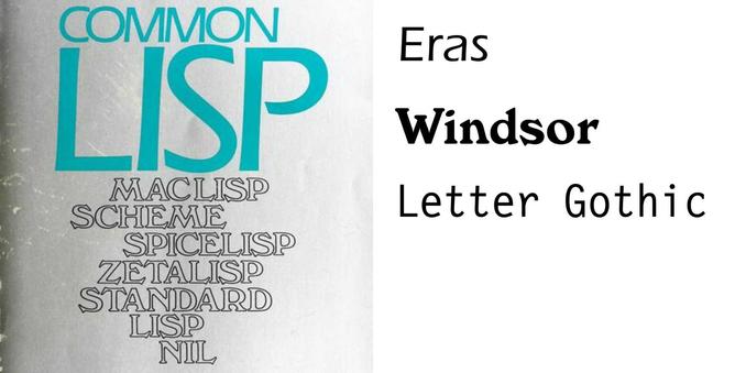
As we approach the anniversary of this comment https://fontsinuse.com/uses/58894/common-lisp-the-language-by-guy-l-steele-jr#comment-906218 declaring that Eras and Windsor Outline to be "one of the weirdest font pairing[s]", i propose that our @marksimonson make the "weirdest font pairing" an annual prize (and celebration).
Common Lisp: the Language by Guy L. Steele Jr.

I was prompted into finishing this post which has been long-sitting in my drafts by Paolo Amoroso’s reminder that Common Lisp: the Language was published 40 years ago. Common Lisp is a programming language and was an attempt to synthesize out of the many similar-but-not-compati

Fonts In Use
We love it when people use our fonts. We love it even more, when they post them themselves on @FontsInUse.
#PurpleHaze
https://fontsinuse.com/uses/73226/winter-drones-hearing-things-album-art
Winter Drones – Hearing Things album art

Album artwork for the Sydney-based ambient/experimental musician Winter Drones. We wanted to contrast an album that was quite reflective and topically heavy with typography and design that was a little more playful. I enjoyed using this typeface, playing around with it a little

Fonts In Use

New week, new project using one of my fonts on @FontsInUse
This time it's Le Murmure for a gorgeous double book dedicated to Lewis Caroll’s Alice. Don't click if you're allergic to distorted type.

Le Murmure is free and opensource at @velvetyne

https://fontsinuse.com/uses/73318/alice-s-adventures-under-ground-and-in-wonder

Jimmy Cliff

Jimmy Cliff

Fonts In Use