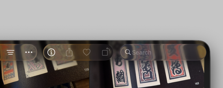
You know, I could write a whole blog post about this—and I might—but I think we need to start addressing the very likely possibility that the *entire thesis* that “UI should get out of the way” and “apps should focus on content” is wrong.
Apps aren’t just for looking at photos or videos. They’re for navigating through these things, organizing them, editing them. The tools to do those things should not get out of the way. They should be clearly defined and separate from the content.