You know, I could write a whole blog post about this—and I might—but I think we need to start addressing the very likely possibility that the *entire thesis* that “UI should get out of the way” and “apps should focus on content” is wrong.

Apps aren’t just for looking at photos or videos. They’re for navigating through these things, organizing them, editing them. The tools to do those things should not get out of the way. They should be clearly defined and separate from the content.
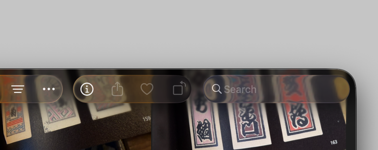
The problem is not the introduction of glass as an element of the visual design language. If used as the Dock background alone, it would be totally fine! But because someone said “UI should get out of the way” and no one challenged it—instead of content literally being the focus, Apple has to intentionally put content *out of focus* (blurring) to make the glass elements visible. They have to put a gradient behind the glass so you can see it. That should’ve been the “oh, it doesn’t work” moment.

But here we are with a new visual design language that somehow manages to compromise on both the content area *and* the UI.

I’m *living* on macOS Tahoe and I’m here to tell you that the apps that are a pleasure to use are the ones that haven’t adopted Liquid Glass (in essence... all the third-party apps.)

This should be a blog post. But I need to collect my thoughts and write it all better. So consider this a beta version. lol

@louie I have never once gotten the impression that anyone on Alan Dye’s UI team uses serious pro tool apps. They love making beautiful looking things, not solving difficult UI problems with clever solutions. And I suspect when confronted with difficult UI problems, they say “Shut up with that nerd stuff.”
@gruber @louie I’m not even sure they’ve used a Mac for a full day’s work.
@chockenberry @gruber this. I’ve said it so many times now but I’m not convinced the people making decisions even like computers.
@louie @chockenberry opinions on this being a knock-on effect of mock-up tools like Figma? I frequently run into issues where designers spend far more time in these tools than using the actual app. I get more feedback if implementations don’t pixel-perfect match “comps” rather than actual usage
@codecaffeine @louie @chockenberry And Apple’s internal mockup tools. They let designers obsess over the look of an application when they should be drawing from a standard set of units in order to implement a way of working. If someone wants a button to look completely unique rather than the standard UI style, they’re wrong, and they should feel bad.

@eschaton @codecaffeine @louie @chockenberry Decades of pro and consumer apps from Apple alone beg to differ. It’s perfectly reasonable to deviate and to create custom controls.

ProKit had a bespoke pipeline including animations for decades pre-Figma, pre-Sketch. It’s not a tooling problem, it’s about the design culture and approval chain.

@bgannin @codecaffeine @louie @chockenberry Apple is not exactly the gold standard here. ProKit’s design was function-first; it wasn’t dark to Look Cool, it was dark to avoid imparting tint to edited content, and often its controls had extra features that didn’t just make them aesthetically different buttons. And it should have been available to third parties from the start, as part of AppKit or as its own framework.

@eschaton @codecaffeine @louie @chockenberry You contradict yourself while proving my point.

“If someone wants a button to look completely unique rather than the standard UI style, they’re wrong, and they should feel bad.” <- that reads as ProKit shouldn’t have been made unless in the OS, but you assert the value of doing so

For the record, ProKit was very aesthetically driven with per major release variants of gray (I worked on Aperture and contributed to PK a bit.)