Louie Mantia, Jr.

@louie@pdx.social
3.1K Followers
42 Following
10K Posts
Louie Mantia writes LMNT, designs icons for Parakeet, makes playing cards for Junior, and creates fonts for Crown.
LMNThttps://lmnt.me
Parakeethttps://www.parakeet.co
Juniorhttps://www.junior.cards
Crownhttps://crowntype.com

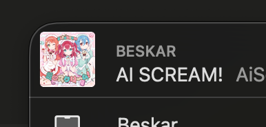
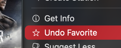
If you want to unmark an album as a favorite, it is labeled as “undo” despite not functioning at all as an undoable state.

I can go on, but I have some of my own things to do.

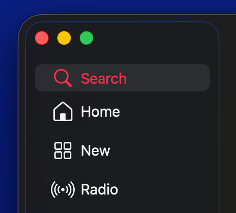
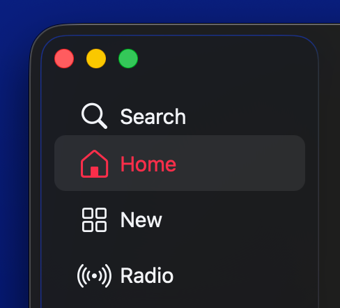
The interior padding on the Search sidebar element is shorter than the rest.

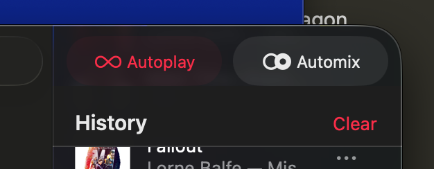
Despite being in button-like elements, Autoplay and Automix are toggles. They also behave differently from each other.

Clicking Autoplay when active will stop playback immediately. It cannot be re-enabled by clicking it again. You must start playing music first.

Clicking Automix when active will have no noticeable effect (but it will change the transition style between songs), and *can* be re-enabled by clicking it again.

(When you play an album, Automix is *not* automatically disabled.)

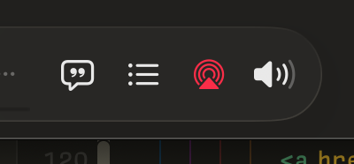
The first two icons open a right-sidebar pane, but only one can be selected at a time (like tabs). Both can be deselected, however (unlike tabs). If either version of the pane is open, its respective icon is red, the active accent color.

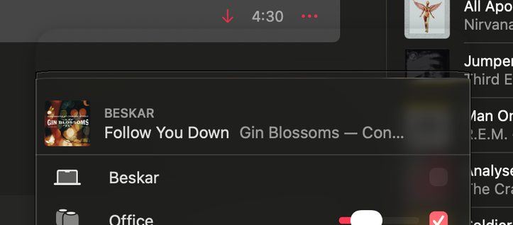
The third icon opens a popover, and its icon is red not when the popover is open, but when an AirPlay speaker is selected.

The fourth icon reveals a horizontal volume control which covers the first three icons. The icon is never red.
Concentricity can’t work everywhere and I think they know that.
I see the corner rounding logic is implemented logically. (Sorry, I think we all might need a little space to vent about this stuff for a while. It’s breaking my normal social media habits.)

Here’s another one: A transparent menubar implies there isn’t a boundary. But of course there is! You can’t drag a window past that boundary. Which is odd when it looks like there’s nothing preventing it.

Feels like invisible walls in 3D “open world” video games that chose not to figure out another way to section off an area. Oh that? It may look like a big, expansive field, but it’s just lying to you!

One problem with designing apps with edge-to-edge content is that it becomes unclear where the safe area to grab the window is. It’s been tougher for years, but where horizontal titlebars used to be a clear differentiator, we now have sidebars that extend into the titlebar area, even containing the window controls themselves. The horizontal “title bar” safe area is so ambiguous now.
If I see an obvious AI-generated avatar, I assume the account is also AI-generated. I imagine I’m not alone in thinking this, so it may not be a good idea if you’re a real person to use one.
I think blurring and dimming are not sufficient substitutes for real-world eye focus. Maybe that’s why the whole concept consistently struggles in 2D.