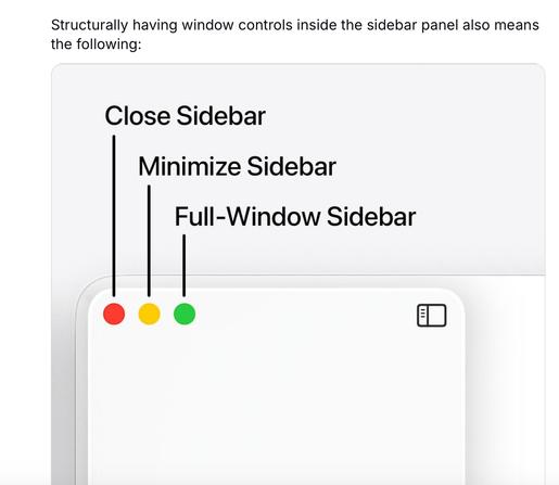
Menu item icons in macOS 26 reduce usability – should be optional
Please copy-paste the report as a new report in Feedback Assistant if you agree.

FB18692873: Menu item icons in macOS 26 reduce usability – should be optional · Issue #685 · feedback-assistant/reports
Submission Date 2025-07-08 Status Open Area Menu Bar Operating System Version macOS 26 Type Incorrect/Unexpected Behavior Description macOS 26 introduces icons for all menu items. This change adds ...