| Work (Current) | Prototyping @Airbnb |
| Work (Past) | Yahoo! Snapchat. Spotify. Instagram. Major League Baseball |
| Threads | https://www.threads.net/@cdoncarroll |
Chase Carroll
- 74 Followers
- 178 Following
- 424 Posts
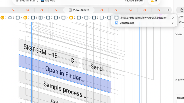
If you're like me and are trying to study and inspect the new Liquid Glass effect, I've built a small utility app for you!
Test Liquid Glass with all the different options, tinting, sizes, and backgrounds — only for macOS Tahoe for obvious reasons.
tired: swiftui is just a wrapper for kit controls
wired: kit controls are a wrapper around swiftui https://federated.saagarjha.com/objects/eacb0362-b48b-412f-8abf-ae52f07704f3
Yet another take about Liquid Glass:
Liquid Glass feels like one of the purest embodiments of the "design with behaviors not states" idea that Design put forth in their Designing Fluid Interfaces talk (way back in 2018!) since the fluid multitasking system itself.
Liquid Glass cannot be described as a linear series of states. It feels like a living object that behaves in very specific ways in relation to surrounding environment and interaction. I find this aspect incredibly inspiring.
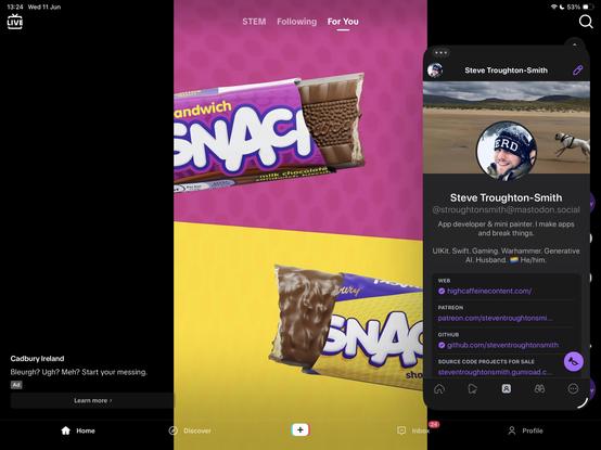
Something valuable was definitely lost on iPadOS 26 with the removal of Slide Over, now that I've tested it for a while. Easy example: try using TikTok fullscreen while keeping Ivory floating on the side. Every tap on the TikTok window brings it to front, and hides all other windows.
I think the way I would bring that functionality back, though, is to add the ability to *pin* apps to the front of the z-order. I don't think it requires bringing back the old mode, specifically
I‘ve put it on a device now and that fully confirmed it to me. I’ve been a „Reduce transparency“ user most of the time before, and with Liquid Glass that’s not even needed anymore for myself. The way the entire thing is animated and how items are separated from each other visually makes this a whole lot more comfortable and easy to follow along for me.
What a surprise, huh? So many people howling about the accessibility here who usually don’t care.
We promised a beta with progressive blurs today — and it’s available right now!
Download it from https://skt.ch/beta or open your current build and follow the update prompts.
But, that’s not the whole story with this release… 🧵
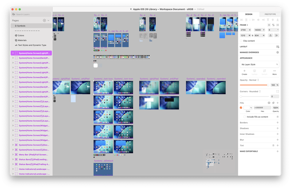
Beyond excited to share our new iOS 26 UI Kit for @Sketch Completely rebuilt for the new Apple design system.
This is a beta, but we went hard to make it as complete and accurate as we could.


