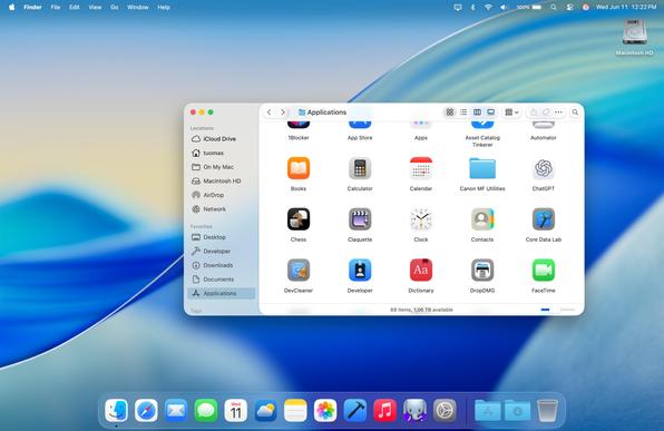
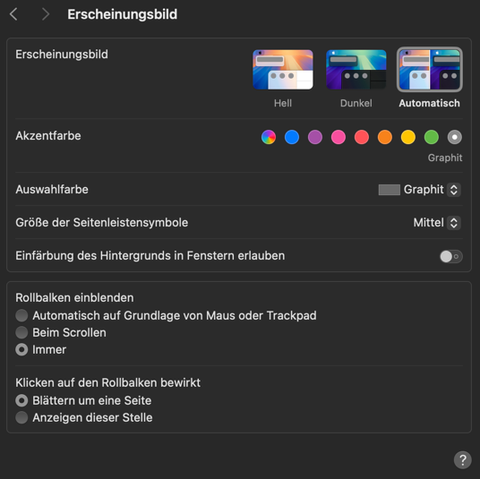
Mockup time! What could be a reasonable "middle ground" between the Mac OS design that we have today and the radical Liquid Glass design we saw this week from #WWDC25?
Disclaimer: this does not attempt to solve all the issues of modern Mac OS design, such as cramped toolbars caused by full-height sidebars and combining the toolbar with the title bar. I feel like the Apple of today is too far gone to do anything about those.
Read on to see what I actually tried to address.

