CodingPanic

@codingpanic
84 Followers
245 Following
40 Posts
Geek. Hobby Computer Enthusiast. Information Security Professional.

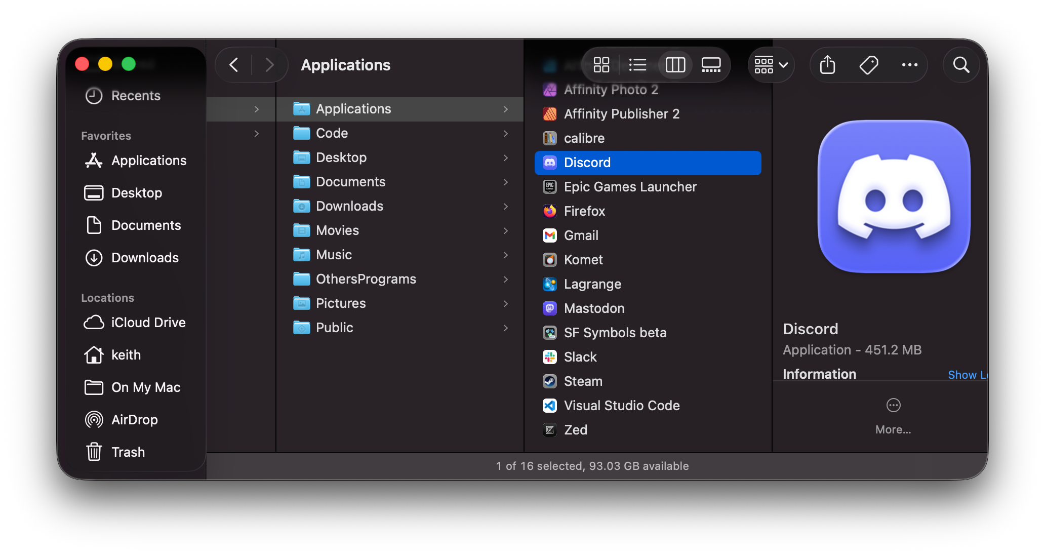
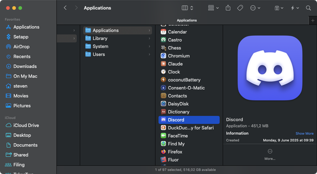
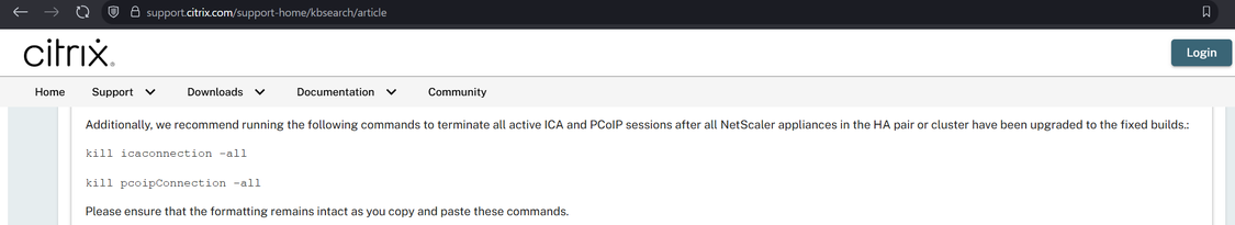
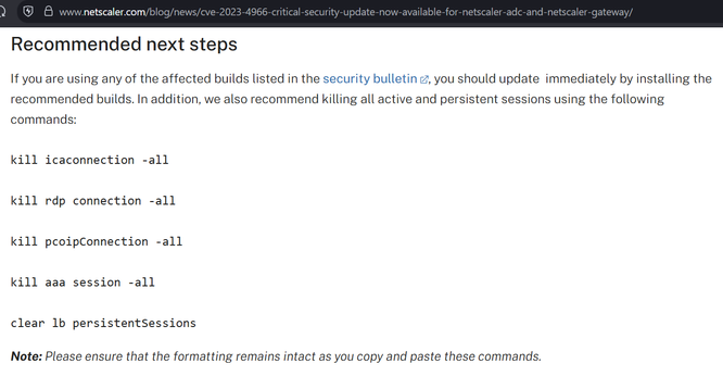
I believe Citrix may have made a mistake in the patching instructions for CitrixBleed2 aka CVE-2025-5777.

They say to do the instructions on the left, but they appear to have missed other session types (e.g. AAA) which have session cookies that can be stolen and replayed with CitrixBleed2. On the right is the CitrixBleed1 instructions.

The net impact is, if you patched but a threat actor already took system memory, they can still reuse prior sessions.

Tell anybody you know at Citrix.

@siracusa fired up my G4 mini running 10.3 yesterday and I was instantly reminded of how far Apple has fallen in design. Tahoe’s lack of interface density looks like a Tonka toy in comparison. Interface inflation and bloat is very real.

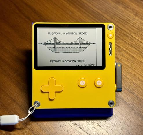
A free Playdate app to sideload: xkpd, Paul Straw's xkcd reader—check out the latest comic, go to a specific one, or jump around randomly. Cool use of the new networking APIs!

https://paulstraw.itch.io/xkpd

Sorry, MacOS Tahoe Beta 2 Still Does the Finder Icon Dirty
https://daringfireball.net/linked/2025/06/24/sorry-macos-tahoe-b2-finder-icon
Sorry, MacOS Tahoe Beta 2 Still Does the Finder Icon Dirty

Link to: https://512pixels.net/2025/06/finder-icon-fixed/

Daring Fireball
@geerlingguy crazy question… I’m looking at switching some of my systems to Wayland… but graphical remote access seems to mostly be limited to RDP on Ubuntu. I’m currently using vnc extensively… do you know of a vnc server that works with Wayland, that isn’t wayvnc? (It needs wlroots compositors)
@thomholwerda So, I get that the world is finally moving to Wayland. It will be great to finally leave X11/Xorg behind. I do have one use case though that I've yet to find a proper solution to. Does a VNC server exist that has Hardware Accelerated encoding, that supports a wayland backend? I know wayvnc exists, but it doesn't support kde/gnome since they don't use wlroots.
Sunsonic 986-II. A Thai Famicom clone with keyboard and mini CRT built-in.

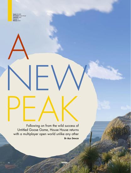
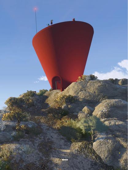
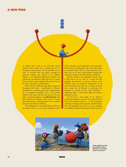
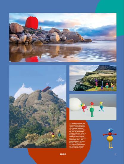
📚 A truly incredible 16-page cover feature on Big Walk is now ready for you to read! Get your copy of Edge #412…

• In Apple News+ if you have that: https://apple.news/I5yzL0QgZTMWoTXO7dOt2qw
• As a print or digital issue: https://www.magazinesdirect.com/az-magazines/6936949/edge-magazine-single-issue.thtml
• As a digital issue: https://pocketmags.com/us/edge-magazine
• On British (and EU?) newsstands now!
• At USA Barnes & Noble newsstands in a month.

Our deepest thanks to Edge, and thanks to YOU for supporting games journalism.

"…It may be time for a critical reassessment of what Panic is building here. Slowly, gradually, the Playdate has evolved into something more like a large-scale, collaborative, physical version of UFO 50. It’s an alternate history Game Boy with dozens upon dozens of genuinely great games." 👍

https://www.pushtotalk.gg/p/how-much-game-can-you-fit-in-27-inches

How Much Game Can You Fit in 2.7 Inches?

Conversations with artists pushing the limits of the world's tiniest games console

Push to Talk
Like, who thought this was a good idea? How does one even begin to understand this screen? It simultaneously wastes an incredible amount of space, and is obscenely cluttered. No "hierarchy" is "communicated" by all the overlap, it's just noise. #LiquidAss
×
Like, who thought this was a good idea? How does one even begin to understand this screen? It simultaneously wastes an incredible amount of space, and is obscenely cluttered. No "hierarchy" is "communicated" by all the overlap, it's just noise. #LiquidAss
(And whilst I'm being angry, I've remembered to be angry at Finder too — this Finder was bad in Mac OS X 10.0, and it's essentially unchanged in the 24 years since then. They rewrote it from Carbon to Cocoa at some point in that time and took the opportunity to… change nothing. Do they have no ambition? No care? Or does somebody there truly think that this is the unassailable pinnacle of file management?)

@OneSadCookie

I for one like this angry Keith fellow

@OneSadCookie There's the cookie I remember
For some reason, Notes doesn't have the "everything underlaps everything else making it illegible" treatment (yet?), and it's… so much better than Finder. I'm still no fan of the huge rounded toolbar buttons and huge rounded corners, but it's not awful.
@OneSadCookie its communicated by the fact that as you open folders everything moves left, no?
@OneSadCookie I did a big rant a few month ago about Slack and called its use of inner window shadows the pinnacle of misunderstanding the role of shadows in UI design and now this ….
@OneSadCookie Bwa! I actually thought it was a before/after image down the middle until I saw the footer on the bottom. What’s with that weird split in the middle‽
@slembcke each column gets independently darkened under the overlapping controls to increase contrast, but only if scrolled to the point that its content underlaps

@OneSadCookie

What an ugly design, yikes. I would be ashamed to release crap like that. 🤮

#macOS 26 "smear"

@OneSadCookie @cdfinder Looks like on the left another app is overlapping with the Finder window/app…

@jxrxme @OneSadCookie

Yes, it is painful to see. Disgusting, really. What are they thinking? #Apple #BugFest

@OneSadCookie WTF?

The sidebar is detached from the window. The dark shade behind at the top due to the scrolled content makes it literally look like something from the other window’s toolbar shines through.

Why does the status bar end where it does (but the leftmost column shines through the sidebar)?

Why does the “title bar” end above the second column?

Why does the third column go further up?

Why is there no “there‘s more” shade at the bottom of the fourth column? Why is it “Show L”?

@OneSadCookie what a bloody mess, how the hell did that ever get out in public, even in an early beta ...
@OneSadCookie this is the sort of idiocy I'd expect from Microsoft
@OneSadCookie Column view has always been terrible. You could even make an argument that the old toolbar wastes even more space, although appears less cluttered. @lensco

@stevenodb @lensco you have the tab bar showing which is where most of the height difference is.

But I don’t think it’s just familiarity that makes me find the old one far more legible, with far more interface hierarchy communicated.