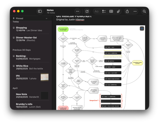
Like, who thought this was a good idea? How does one even begin to understand this screen? It simultaneously wastes an incredible amount of space, and is obscenely cluttered. No "hierarchy" is "communicated" by all the overlap, it's just noise. #LiquidAss
(And whilst I'm being angry, I've remembered to be angry at Finder too — this Finder was bad in Mac OS X 10.0, and it's essentially unchanged in the 24 years since then. They rewrote it from Carbon to Cocoa at some point in that time and took the opportunity to… change nothing. Do they have no ambition? No care? Or does somebody there truly think that this is the unassailable pinnacle of file management?)

@OneSadCookie

I for one like this angry Keith fellow

@OneSadCookie There's the cookie I remember
For some reason, Notes doesn't have the "everything underlaps everything else making it illegible" treatment (yet?), and it's… so much better than Finder. I'm still no fan of the huge rounded toolbar buttons and huge rounded corners, but it's not awful.
@OneSadCookie its communicated by the fact that as you open folders everything moves left, no?
@OneSadCookie I did a big rant a few month ago about Slack and called its use of inner window shadows the pinnacle of misunderstanding the role of shadows in UI design and now this ….
@OneSadCookie Bwa! I actually thought it was a before/after image down the middle until I saw the footer on the bottom. What’s with that weird split in the middle‽
@slembcke each column gets independently darkened under the overlapping controls to increase contrast, but only if scrolled to the point that its content underlaps

@OneSadCookie

What an ugly design, yikes. I would be ashamed to release crap like that. 🤮

#macOS 26 "smear"

@OneSadCookie @cdfinder Looks like on the left another app is overlapping with the Finder window/app…

@jxrxme @OneSadCookie

Yes, it is painful to see. Disgusting, really. What are they thinking? #Apple #BugFest

@OneSadCookie WTF?

The sidebar is detached from the window. The dark shade behind at the top due to the scrolled content makes it literally look like something from the other window’s toolbar shines through.

Why does the status bar end where it does (but the leftmost column shines through the sidebar)?

Why does the “title bar” end above the second column?

Why does the third column go further up?

Why is there no “there‘s more” shade at the bottom of the fourth column? Why is it “Show L”?

@OneSadCookie what a bloody mess, how the hell did that ever get out in public, even in an early beta ...
@OneSadCookie this is the sort of idiocy I'd expect from Microsoft
@OneSadCookie Column view has always been terrible. You could even make an argument that the old toolbar wastes even more space, although appears less cluttered. @lensco

@stevenodb @lensco you have the tab bar showing which is where most of the height difference is.

But I don’t think it’s just familiarity that makes me find the old one far more legible, with far more interface hierarchy communicated.