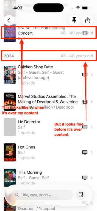
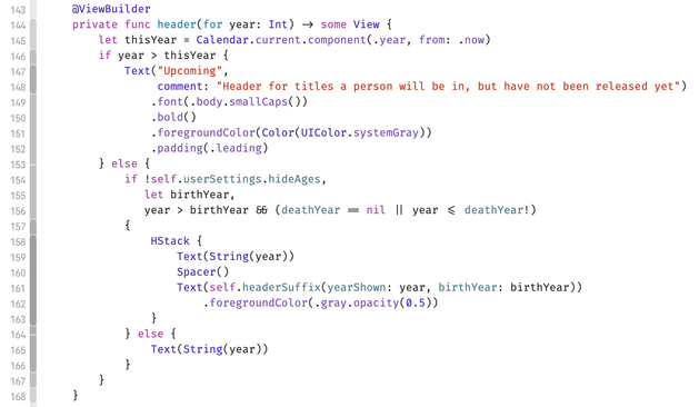
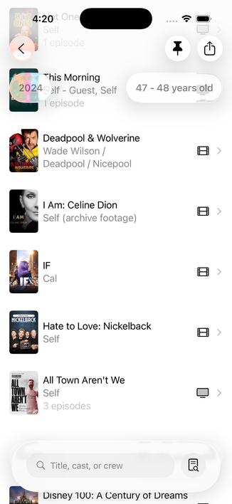
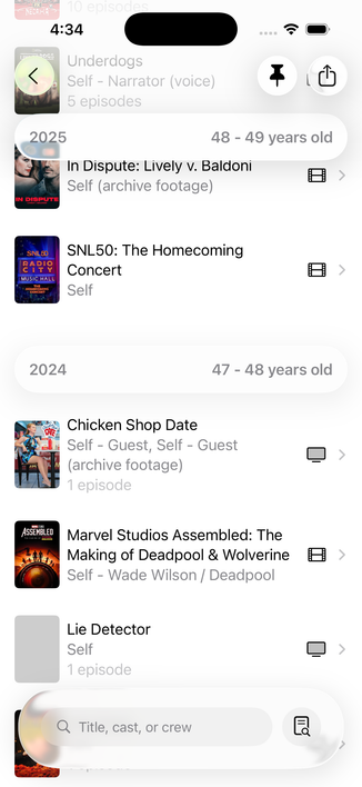
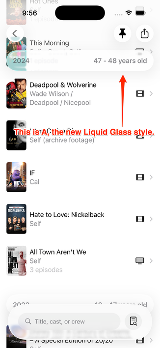
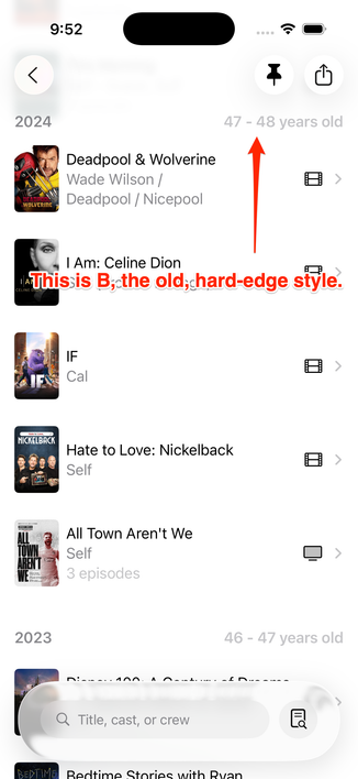
Hey #SwiftUI people: is there any way to increase the opacity for List headers in 26? This looks janky as hell, and it's *basically* stock.

I think I need to ask for some sort of glass affordance behind it; which one do I want in this context?

(Not that removing the `.foregroundColor(.gray.opacity(0.5))` in the code screenshot made no discernible difference)

I _guess_ this is what I'm supposed to do now? 🤨

Pro tip: have a @chockenberry (or a @BenRiceM) to bounce ideas off of, because they'll get you sorted, and fast.

(Both of these fine folks are also available for contract work if you have a need.)

Anyway, Craig advised me to make those one full-width container, and it looks way better now:

Okay, which one of these do we like more? I like that the Liquid Glass one (A) looks more modern, but I think the clarity is far greater on the older-style (B).

POLL FOLLOWS IN THE NEXT TOOT; please vote there!

Vote here, please!
Liquid Glass floaty headers (A)
32.2%
Old, hard-edged headers (B)
61.6%
I’m useLiss and just want to see results
6.2%
Poll ended at .

As a final note, I had no idea you could bring back "hard headersā€; I learned thanks to this toot. I would have tagged Kyle in the prior ones but I didn't want them to get a ton of drive-bys. šŸ˜‡

https://mastodon.social/@kylebshr/115295447988282022

@caseyliss I love drive-bys! Are you using a List there?
@kylebshr Yeah, most stuff in the app is ultimately in List
@caseyliss option c. Glassy hard edge.
@lari I feel like that looks _really_ wonky… no?
@caseyliss that didn’t look as I thought it would.

@caseyliss I like the look of (A) and it's bigger size isn't an issue since it scrolls off screen, BUT seeing it scroll is disorienting. It looks like a button so it shouldn't move and tapping it should do something. I voted for (B). ¢¢

(also this is what size the search bar should be)

@caseyliss FYI, any decent Mastodon client will have a button to show poll results without voting. This ain’t old Twitter!
@siracusa You know old habits…
@caseyliss @siracusa Ronin would be a great ATP movie club pick
@caseyliss @siracusa Ronin! For a long time, best car chase scenes of any movie…
Shia LaBeouf "Just Do It" Motivational Speech (Original Video by LaBeouf, Rƶnkkƶ & Turner)

YouTube

@caseyliss Old, 100%.

The problem is that the ā€œnewā€ style makes the content look like an interactive element, competing with other primary actions in the view.

Best to just sidestep the train wreck of a UI if possible.

@caseyliss I reckon that most people are not voting for the fixed layout, but against Liquid Glass.

Accessibility settings can make Liquid Glass usable, and Apps that are updated to support Liquid Glass are more likely to support accessibility features.

That said, Illegiable interfaces sucked under iOS7 and they suck even more as Liquid Glass.

Floaty interfaces sucked when they were introduced a few years ago and they suck even more as Liquid Glass.

@caseyliss do consider your audience here on Masadon when assessing the outcome Casey! Lots of automatic Liquid Glass haters on here šŸ˜…
@caseyliss I think I would go the way of using custom non-sticky cell instead of using a sticky section header. This way, the cell would scroll the same way that other cells are scrolling, solving your translucency issue.
@caseyliss are you also going to revise the bottom search bar?
@belovedmelody In what capacity?
@caseyliss most search bars are glass, themselves, rather than being grey surrounded by glass. The design shown in your examples seems taller than it needs to be, if that makes sense?
@caseyliss But does Liquid Glass actually look more modern? It still gives me Web 2.0-vibes. Boastful, and distracting. (B) still looks perfectly serviceable.
@lensco @caseyliss Liquid glass just reminds me of KPT power tool or when Photoshop added bevel/emboss…
@caseyliss you’ve got enough glass—no need to add more. B is perfectly good!
@caseyliss Hard edge, but don't make it gray. Make it Black.
@caseyliss I don’t mind glass look but I’d want it to be opaque when you scroll so you can read it vs seeing through to the text below but I voted for old style.
@caseyliss One problem with A is that it’s unclear (ha) if the header applies to the item showing *through* the header, like in your screenshot.
@siracusa @caseyliss I assume this would be more obvious in motion than in a screenshot?
@caseyliss I think that if it would be a good idea, Apple would have had a similar effect in the Contacts app or Settings -> Apps list.

@caseyliss I voted for (B).

(A) (and everybody else’s Liquid Glass screenshots I’ve seen so far) feels like someone poured caustic glue on my eyeballs.

Nothing against you. Your app is great! I only blame Apple for this unnecessary UX decadence.

@caseyliss Definitely B I feel like having two layers of liquid glass elements on the top and bottom don't mesh well. Its cleaner and more legible to have just the toolbar items be glassy
@caseyliss The year left-aligns with the posters in B. In A, it’s just floating unaligned and overlapping the edge of the posters in a weird way.
@caseyliss I have used this feature of callsheet and looking at "A", I had no idea what was going on or what was being displayed or what the data in the bubble was for. And for my eyes, "B" does not look "old and busted". It looks totally fine and normal and modern enough.
@caseyliss (A) but make the text black.
@caseyliss I voted B. I think A *looks* nicer, HOWEVER, it doesn't feel (from the screenshot) that it is providing information about the data *behind* it. It feels completely disconnected from the data behind it, like it's a global piece of info/button/etc without an obvious direct relationship to the data being scrolled behind it. (I hope that makes sense)

@caseyliss you didn't ask but I think the search bar would be better with just the button and search field and not all that padding. The cool new shiny thing seems to be the search button calling up the input field when needed.

Perhaps a work in progress or you have reasons?

@caseyliss

B.

Resist!

I imagine the liquid glass version is supposed to change as you scroll, but I don’t trust it. That is ā€˜eye candy’ I can happily live without.

On other platforms, like iPad and SpaceHelmet , I haven’t the foggiest.

If liquid glass looks three bears just right on VisionOS, maybe it’s ok.

@caseyliss (A) by a lot, even when talking about clarity.

I’ve always had issues telling what’s content and what’s navigation when the toolbar has the same background colors and no shadows, ever since iOS 7.

(Differently colored hard edged toolbar would win clarity though)

@caseyliss Oh. This isn’t even a toolbar… I couldn’t even tell that apart apparently.
@caseyliss I voted for liquid glass because the text had more contrast.
@caseyliss I think what makes A not work is having separate glass elements for all the buttons that are kinda spread out, with a large non-glass space where content shows between them. Can they all go in one big glass element?
@caseyliss I think Apple might have made a mistake naming the new material without having a name for the wider redesign. There’s more to it than the Liquid Glass material. The hard edge effect is a tool in the toolbox of the new design too, even if it looks closer to older UI. Apple use hard edge effects in Xcode, Safari, and Calendar, for instance. B is just how sticky headers work in the new design.
@caseyliss just to confirm, the old style (B) does NOT have any difference in color between the ā€œage/year barā€ and the scrolling content beneath? (As it does currently--see attached photo for what I’m trying to describe)
@scatteredbrain the year is standard color but the age range is 50% opacity. Choice on my part. I wanted to emphasize that’s supplemental data
@caseyliss in my head these are content and so even if you fully embrace the iOS 26 look, the hard-edge style is more appropriate. They're certainly not controls.

@caseyliss the main issue with option A is that the padding makes it seem like a tappable button like the toolbar items above and blurs the sense of hierarchy. I think if you:

A. Reduced the padding so it’s a lot tighter and
B. Present the info with no Spacer and combine it like ā€œ2024: 46-47 years oldā€ for example

then it’ll feel a lot better. If you can add a colored sf symbol (like a calendar?) before the year that also might help with hierarchy/content differentiation. Hope that helps

@caseyliss opinion of one here: that glass cont. that is around the search bar at the bottom… might be less intrusive if it was setup more like the one in the App Store… maybe.

And also, Option A is fine. Lean into the way of glass — even if it’s not perfect… might save you rework down the line when Alan and team get their šŸ’© together. All the other apps are doing it.

@garyj_co I’m not sure that’s possible without a tab bar, which I’m not using
@caseyliss fair point. Settings doesnt have a tab bar or the passwords, mail or contacts app…I think they just use the toolbar though… there has to be a way… can’t be sure, haven’t really looked into it. Could also be a private API šŸ¤·ā€ā™‚ļø

@garyj_co I think that’s the case, unfortunately.

I’m happy to be wrong if you can figure it out though!

@garyj_co PS, the problem is that .searchable() is meant to be attached to a view _unless_ it’s in a tab bar
@caseyliss I don’t dislike the style in A, but I think it’s clearer (no pun intended) to in B where a new ā€œline/yearā€ starts – as you can view in the line below for 2023. As soon as it’s floating, as seen above, it looks more difficult to differentiate between what two lines it’s starting.
From what I can see in the screenshots. Maybe it’s better when using it.
But to be honest, if you want to make it more modern and it’s not taking anything away, use A. People will get used to it.
@caseyliss I missed the poll, but I like the old hard-edge style better. I just wish the text was darker.